 It takes ~ 3 minutes to read
The second half of the 20th century is a time of prosperity and the incredible popularity of minimalism. Originating against the backdrop of an unprecedented leap in technological progress, it becomes the embodiment of functionalism and a noble, restrained aesthetics. No variegation of colors, useless decor and elaborate furniture - only simplicity, practicality and spaciousness in everything that are key components of the design of a living room.
This genre will be appreciated with scrupulous attitude to the order and cleanliness of the hostess, owners of small kitchens and studio apartments.

Features of minimalism in the design of the kitchen
Despite its apparent simplicity, maintaining true minimalism is a rather difficult task. Properly build and fill the space in a minimalist style will help knowledge and compliance with basic principles.

Distinctive features:
- Laconic functional furniture, designed in the same style - no eclecticism!
- A minimum of decorative decoration and accessories.
- Good lighting - natural and artificial.
- The prevalence of light colors, color composition - no more than 3 colors.
- The idea of expanding borders through competent zoning.
- Carefully thought out layout and ergonomics of furnishings.
- Use of built-in household appliances.

Thus, to realize a minimalist interior in the kitchen, it means competently expanding the room, making it as much as possible functional, fill it with light, think over the storage system of kitchen utensils and appliances, otherwise soon from minimalism will remain a trace.

Minimalist color
The problem of expanding space is best done by white. Together with other light shades (beige - considered here, cream, sand) it makes up the basic color palette of design.

As a complement, another 1-2 contrasting or similar in sound colors are used. Favorite combinations - white, light with black (for example, in black and white style), gray, brown. Bold combinations with purple, in red, light green and other bright colors. Use the latter in small kitchens is impractical, because bright shades are able to visually reduce the space.

Light colors are used, as a rule, for the design of walls (read more here and here), facades, the upper group of cabinets, ceiling. Darker or brighter - to create accents, highlight the bottom of the furniture and floor. The design of the ceiling, walls, furniture facades, doors and windows in one color helps to achieve the illusion a single space in which one component flows smoothly into another, becoming its integral part.

Decoration Materials
The ideal option for finishing space is a combination of simplicity, high quality and the absence of decorative ornaments. It is planned to combine artificial materials (glass, plastic, metal) with natural ones (wood - more here, ceramics, natural stone). At the same time, preservation of the natural texture is unacceptable - all surfaces should only be smooth.

Walls
Absolutely even, decorated using wallpaper (also see tips for choosing them), paints, wall panels or plasters. Plain coloring without ornaments and patterns is allowed. Most often - light pastel colors that visually expand the space. Rarely, brighter and darker. As a rule, an accent wall is formed in this way in the dining area.

Apron
Work area stands out glass (transparent or color, without ornament), tiled, wood paneling, imitation masonry.

Ceiling
White matte, less often - glossy. It is covered with plaster, paint. Plasterboard designs are used only in exceptional cases related to the installation features of the lighting system. Fabric ceilings, ceiling painting and photo printing are not allowed.

Floor
Almost any material is suitable for its solution - tile, parquet, laminate, wood, linoleum, granite, etc. Regardless of the finishing material, it should be perceived as a solid surface, as strict and restrained as possible. Preferred colors are gray, light beige, various tones of brown, corresponding to the color scheme of the walls and ceiling, or contrasting with them.

Furniture selection
A dining group and a furniture set with a comfortable working area - the maximum set of furniture in a minimalist manner. All furniture is made in only one style, meets the requirements of simplicity of design, convenience and functionality.

Kitchen set
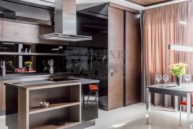
Must have a flat facade with a shiny or matte surface texture. There are no decorative elements - a door opening system is used from pressing them. The exception is thin handles in the form of rails on the lower cabinets.
Modern kitchens in minimalism do not allow the presence of open shelves - all kitchen utensils, including small ones household appliances, should be hidden behind the dull facades in the specially designated internal compartments. Large equipment is built into the set, forming together with the facades a single monolithic piece of furniture.
The design of the kitchen set may include the presence of large cabinets of the "pencil case" type with a spacious storage system or limited only to the lower cabinets, unloading the walls as much as possible and releasing space.

Lunch group
Tables - massive or light, with glass, wooden or veneered, plastic countertops on wooden or metal racks. Round, rectangular or square - the choice is quite large. Chairs in material and shape often resemble office options.
For the kitchen-living room, a table made in the classic combination of a dark or white countertop with shiny metallic legs is suitable. Transform it can and transparent furniture. As if dissolving in the space of a room, they visually make it more spacious.
The use of built-in and transforming furniture - folding chairs, sliding tabletops, various retractable furniture parts is also welcome. Thus, high-tech and modernity of minimalism is emphasized. This feature allows you to embody the characteristic features of style in small rooms where it is problematic to build other solutions.

Features of interior lighting
The minimalistic design is characterized by an abundance of light, which helps to achieve the effect of a spacious room, even in a small kitchen area. Proper lighting design can also enliven a rigorous interior and smooth out the inherent coldness of this genre. It is also recommended to decorate with an abundance of light - more space “opens”.
There should be as much natural light as possible, which is important to consider at the design stage. It is great if there is an opportunity to increase window openings, and leave the windows themselves without textile decoration.

There should be many sources of artificial lighting. Various combinations of a large central chandelier and several spotlights, illumination of a table and a socle, bus lamps, light panels successfully fit in.
The design of chandeliers and lamps is possible both simple and restrained - to have the shape of a ball, prism, square and other geometric shapes, as well as non-standard - in the form of atoms, Japanese origami, etc. But the coloring is only sustained - it is better to save painted shades for another design.
As a material, plastic, metal lamps with glass or wooden elements will be appropriate. They make the interior concise.

Minimalism style in accessories and decor, photo
Laconicism and functionality do not need an abundance of decorative elements. All their beauty is in simplicity and restraint. But the use of a limited number of carefully selected accessories is not forbidden.
As a decoration, it is worth considering the original wall clock, spectacular posters, paintings and photographs, in an amount of not more than three.

An unusual vase, stylish containers for spices, non-standard chandeliers and sconces will revive a strict interior (their choice was considered in this article).
Curtains are better to choose discreet, neat, without extra volume and decorations. Preference should be given to matte plain colors with a simple design. it roman, rolled, bamboo curtains, wooden or metal horizontal blinds. The color of the curtains is neutral or contrasting with respect to the general color scheme.

With the abundance of plastic and the use of a gas stove, single indoor plants - chlorophytums, succulents, ephedra and the like, will become an indispensable element of decor. It is better to place them in wooden, ceramic or plastic pots, the design of which corresponds to the general style.
A kitchen whose interior is designed in a minimalist manner will never lose its relevance. No matter how much time passes, it will remain fashionable, elegant and modern, emphasizing the good taste and subtle sense of style of its owners.
With great interest I always read your comments to my articles. If you have any questions, feel free to ask them, leave, you are welcome, Your feedback in the form below. Your opinion is very important to me. Thanks to your criticism and thanks, I can make this blog more useful and interesting.
I would be very grateful if you rate this post and share it with your friends. Make it simple by clicking on the social media buttons above. Do not forget the article you like Add to bookmarks and subscribe to new blog posts on social networks.


