Russia, Moscow region, Moscow+79041000555

 ~ 1 minute is required to read
The kitchen combined with the living room has several advantages. This non-banal interior is always more practical, the room looks spacious and harmonious, and it is very convenient to receive guests in it. To do this, we used a number of techniques, one of which is the same furniture in the kitchen and living room.
Kitchen made by company Galatea,
galateas.ru
g. Balashikha

Another way is a visual division into zones (floor, plasterboard partition).

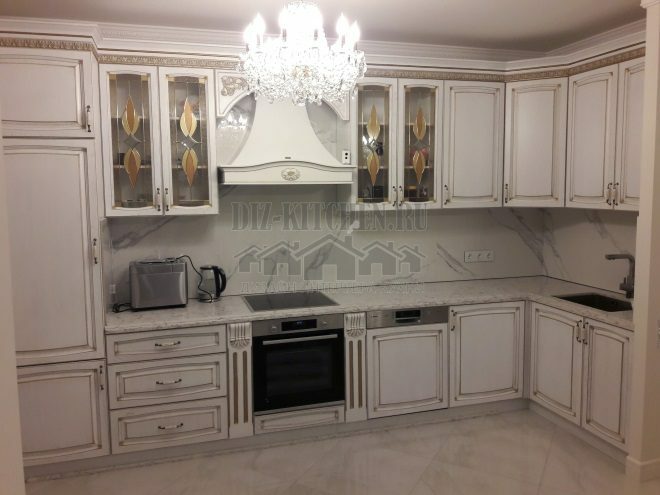
Adele headsets were made to order, taking into account all my wishes. The classic bright kitchen made of solid oak turned out to be strong, reliable and durable. There is plenty of free space in the house, the ceilings are high, but we limited ourselves to the standard sizes of the cabinets.

Furniture facades from solid oak. Oak is a strong and flexible material, it is resistant to changes in temperature and humidity. The case itself and the shelves are made of joinery with veneer in oak. This material is considered one of the best in furniture production - environmentally friendly, moisture resistant and durable.
The back walls are made of plywood, which does not crumble over time. Combined drawers - a case from a joiner plate with oak veneer, a bottom made of plywood. Accessories - Blum (Austria), with closers and rails of full extension. The sink, oven and dishwasher were removed to the floor cabinets, and the dryer and a drawer for kitchen utensils were placed in the upper cabinets.

Separately, there is a double wardrobe with a fridge and microwave. It is located between the door and the main set, does not take up much space and at the same time the center of the kitchen remains free.

Glass showcase is the central element of the headset. Other glass cases were unlit, and in the case it was simply necessary. With artificial lighting, the cabinet looks like a beautiful glass column.

All elements of the decor are painted with quick-drying enamel (tinted according to the RAL standard) and covered in several layers with polyurethane water-based varnish. In this case, it was possible to preserve the natural wood pattern and texture of the oak. All furniture sidewalls do not absorb moisture and last a long time. Only the best paints and varnishes were used in the work: German glue for gluing the furniture board Klebit (KLEIBERIT company), water glue based on PVA.

For the finishing of furniture, concentrated Italian Milesi dyes on solvents, and Spanish polyurethane primers and varnishes from KUPSA were used. The result was ivory with a blue patina. Thanks to this finish, the kitchen looks elegant and respectable.

Worktop and apron from one material - laminated particleboard under white quartz. The apron is located on the side walls and near the hood - for complete protection of all surfaces.

We had one empty pillar wall. We attached 2 wall-mounted lockers to it at a height of human height. Thus, the wall does not seem empty and these cabinets in front of the stairs are an additional shelf.

Near the window of the same materials they made an open carved shelf on which all kinds of trinkets will be located.

The hood is powerful, domed. This is exactly what is needed for headsets from arrays, so that there is no increased humidity. Yes, and smells will not get into the living room.

The kitchens from the array are the most environmentally friendly and comfortable. They are always in a good mood, and real heat comes from natural wood.
With great interest I always read your comments to my articles. If you have any questions, feel free to ask them, leave, you are welcome, Your feedback in the form below. Your opinion is very important to me. Thanks to your criticism and thanks, I can make this blog more useful and interesting.
I would be very grateful if you rate this post and share it with your friends. This is easy to do by clicking on the social media buttons above. Do not forget the article you like Add to bookmarks and subscribe to new blog posts on social networks.


