Kitchens of different colors are able to create a certain mood, it is very important to be able to choose the right saturation and brightness of furniture facades and finishes. Choosing the color scheme for your kitchen, you can use the advice of psychologists and designers, but you should not forget about your personal preferences.

For small kitchens, the ideal option is to use light shades, they visually increase the space. Gray and pink shades act on appetite not in the best way, they will be an excellent option for those who want to get rid of extra pounds, but it is important not to forget about all family members. But orange, red, on the contrary, will stimulate appetite.

The most comfortable for cooking and eating food are natural materials and colors, that is, those that are found in nature. Dark monophonic headset helps to create a gloomy atmosphere.

If the kitchen is combined with the dining room, or has impressive dimensions, then the use of exclusively light colors for its design will give a feeling of desert space. The solution here is simple, it is enough to use bright accents in the decor, bright curtains and other textiles, for example, pillows on chairs.

Color and style
Each style has its own palette of shades, which must be taken into account when creating the interior, the only way to create a really cozy and harmonious space. Nowadays, there are a lot of styles for the kitchen, but let's focus on the most popular of them.

Classic is a plain gamut of dark or light shades. You can use a combination of pastel colors and gilding, also this style is characterized by milk, cream, beige and brown shades.

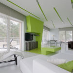
Art Nouveau is a combination of bright and neutral shades, light and dark. In other words, it is not necessary to use only a light gamut of tones here, it can be successfully diluted with bright and saturated shades.

Provence implies the use of muted pastel tones - lavender, pale green, light blue, white, cream. You can combine white with natural shades of nature, for example, sky blue or grass.

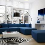
The Scandinavian style is based on white color and its shades. In order for the space not to look too strict or boring, you can add bright decor items. The combination of white with blue, steel, brown and gray looks great.

-
 Kitchen Color - Practicality and Feng Shui Tips
-
 Colors in design - which is better not to use?
-
 The choice of color for decorating the kitchen
-
 What color combinations are better not to use in the decoration of the kitchen
-
 Bright tropical shades for interior decoration indoors
-
 What colors in the bedroom can lead to bad sleep
-
 Which color of the ceiling is better not to choose
-
 Dark blue color in the interior
-
 Peach color in the interior
-
 The use of low contrast in the design of the room
-
 Light gray tint in the interior
-
 Autumn palette in the interior
New publications are published daily on our channel in Yandex. Zen
Go to Yandex. Zen