The easiest solution is to use ready-made palettes. It is worth looking for interiors that are pleasing to the eye. Imagine how they will look in the apartment. The fact is that the situation is often the same as with perfume: the fragrance is very popular, but it is impossible to apply.

To try on color, you can visit furniture stores. They often exhibit interiors in various color schemes. Looking at the finished examples live, it will be easier to visualize them on the repaired room.


An important point: the ratio of colors. In order not to overload the interior, the 60/30/10 rule is suitable:
- 60% should occupy the main color. Usually it is the decoration of walls, floors, large elements of furniture;
- 30% - suitable in tone to the main, or neutral color;
- 10% is left for bright accent decisions.

A win-win option is to make the main part of the interior in muted colors. They do not have to be monochrome. But on the remaining 10% of the color, they will already be able to recoup in full, because it is they who will make the interior special. In addition, they are easiest to change. Accents can be textiles, vases, posters, hanging shelves, plants, storage accessories, mirrors, light sources and so on.

Three examples of interior for color harmony
A good example of color combinations is the eclectic maximalism style. Advanced designers and studios are increasingly demonstrating work in this direction. Most interiors have already lost their relevance.

Now the design is becoming more crazy, with an abundance of unexpected colors, textures and prints. If you look closely, in this interior most of the colors are restrained, but due to the upholstery of chairs, interesting lamps, for example, the space will sparkle.
For those who want to do everything stylishly, but with restraint, creating a cozy space, the loft style is perfect. Wooden beams, expensive interior, dark brick. It is because of the black color that the room will acquire originality and some zest.


Small accents can also be set with the help of the bathroom. For the design of the bathroom, you should choose a color-balanced style. It does not cause any negative emotions. You can try the reception with different tiles and contrast grout. Such a chip will make the interior more interesting, the room will look populated and functional.
You need to play with color! If there is no fear of experimentation, then the interior will be special!


-
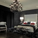 Black color in the bedroom interior is a sign of aristocracy
-
 When tired of pastel colors
-
 Green bathroom - fresh and positive
-
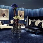
 Why rich people choose blue color in the interior of rooms
-
 Why has the yellow color become stylish in the interior
-
 Bathroom season trend in blue
-
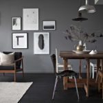 Why do many people like the gray color in the interior
-
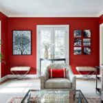
 Red color in the interior: distinctive features and characteristics
-
 Tiffany in the interior - the color of successful people
-
 The color scheme of the bathroom, a combination of colors and shades
-
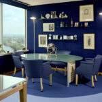
 Blue color in the interior: properties and combination with other shades
-
 Red color in the interior
New publications are published daily on our channel in Yandex. Zen
Go to Yandex. Zen