In the interior of apartments and houses, designers quite often now use peach color. Ideas with its help can be embodied the most diverse. The gentle shades of peach are subconsciously perceived by people as soothing. Staying in a room filled with them causes a feeling of security. If we are talking about brighter versions of this color, the effect is different. Such colors make a person happier and optimistic.

Peach color has a multifaceted palette. It can be romantic, relaxing, positive and so on. The room seems warmer the more saturated the color option is used. Peach adapts to any style quite easily. It can be both basic and complementary. But at the same time, peach is really revealed only in the presence of contrasts. Thanks to this feature, you can create unusual and interesting combinations, conduct a variety of experiments.

In both classic and ultramodern interiors, peach looks very harmonious. National styles can also be implemented with its use, because there are a lot of shades. Country and Provence also do not exclude peach surfaces and products. It combines very well with natural materials and floral motifs. The inclusion of peach in minimalism or hi-tech softens the originally austere interiors.

Peach is often used to divide rooms into separate functional zones. It is suitable for creating installations, decorating walls in an artistic style, as well as highlighting certain spaces. The room looks more lively and fresh. If dark furniture is used in this color, the sophistication of the latter will become apparent. You can add romance to the interior with white furniture.

There are several options for curtains for interiors in which there is a peach color. Against the background of the walls, plain materials of the same color, but a slightly different shade, will stand out a little. Chocolate blackout curtains are perfect for rooms with windows facing the sunny side.

Canvases with a pattern will be interesting to look in an eclectic design, if the image is matched according to other textiles.

It is important to consider that monotony is perceived quite hard, so you should not immerse the entire room completely in one color. The interiors in which surfaces are combined, but at the same time differ from each other in color, look more modern and interesting.


-
 Top of the best white interiors of a small room
-
 The most practical colors for the floor in the apartment
-
 Trendy ideas for using raspberry color in design
-
 Bright tropical shades for interior decoration indoors
-
 Review of the white kitchen, why there are many pluses and few minuses
-
 The use of low contrast in the design of the room
-
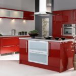 Red cuisine: combination rules
-
 The choice of color for the design of the kitchen
-
 What color of walls will psychologically press you
-
 Sunny yellow hue in the interior: combinations
-
 Colors in design - which is better not to use?
-
 Dark blue color in the interior
New publications are published daily on our channel in Yandex. Zen
Go to Yandex. Zen