Minimalism is gradually gaining popularity, and its supporters prefer to adhere to the principle of simplicity while working on the color palette of the room. Often, the basis is only one color, which in addition can have several shades in a variety of proportions. This technique helps to achieve volume thanks to the game of textures and laconic lines. But some people prefer to act the exact opposite, to take the most catchy and contrasting colors.

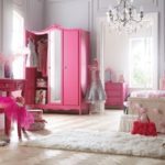
A variety of situations happen, and no matter how stupid everything looks, in fact, even the most daring combinations look simply incredible. For example, who would have thought that a dense black color and rich pink could perfectly harmonize nearby, or a carbon gray shade would blend perfectly with neon green. In general, all options have a place to be, the main thing is to plan and execute everything correctly so that the end result is pleasing to the eye but for many years. But still, designers recommend focusing attention when designing a low-contrast palette.

To design a room, almost every designer offers the consumer to study the color wheel, and during the design determine one, the most suitable color, and select the rest of the shades that are located in close proximity to each other from friend. That is, select the most similar colors, blue with blue, yellow with light green, warm red and orange, and so on. On the one hand, there is a contrast, but on the other it looks like a whole, they do not interrupt each other, they emphasize the created lines and shapes. And since there are an incredible amount of shades, each person, starting from personal preferences, will be able to decorate the room, both in warm colors and in cold ones.

For example, it is worth considering tones of natural origin, these are:
- Gray-brown earth tones;
- The buffy paint of the autumn forest;
- The light brown color of the tree bark.

These options can be the basis of any interior, and are guaranteed to create a single overall picture that certainly does not seem boring. Such tones perfectly complement themselves and create a feeling of comfort.

The palette of the sea coast is also a gift of nature. Of course, this option is more suitable for the bathroom, but in some cases and in the premises, fresh tones prevail, which help to relax and create a good mood.


-
 Top of the best white interiors of a small room
-
 The most practical colors for the floor in the apartment
-
 Trendy ideas for using raspberry color in design
-
 Bright tropical shades for interior decoration indoors
-
 Review of the white kitchen, why there are many pluses and few minuses
-
 Light gray tint in the interior
-
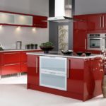 Red cuisine: combination rules
-
 The choice of color for the design of the kitchen
-
 What color of walls will psychologically press you
-
 Sunny yellow hue in the interior: combinations
-
 Colors in design - which is better not to use?
-
 Peach color in the interior
New publications are published daily on our channel in Yandex. Zen
Go to Yandex. Zen