When thinking over the interior and design of rooms, many focus on the decoration of walls, ceilings, color space, but forget that the floor sets the tone no less than everyone else elements. At the same time, it is not difficult to make a mistake with the choice of color.

The efforts of the hostesses to add light and expand the space often lead them to think of a very light shade of the floor. However, this usually leads to an imbalance of space, especially if it is not covered with rugs at least in places. Human perception is so arranged that gender is perceived as something stable, steady, reliable. And pale tones do not give this feeling. To exacerbate the situation, light patterns and wavy lines can. In addition, any pollution here will be too noticeable. Such an option is also not suitable if light furniture is provided.

The other extreme is a black or too dark floor. It too narrows the lower part of the room, makes the atmosphere heavier and carries stress. The spots on it will be just as striking as on white. If there is a gloss, greasy traces will also be added to them. The matte dark floor will completely cross out all the light and lightness of the room, no matter how pronounced they are.

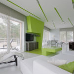
Fans of bright colors should stay on slightly whitened or pastel shades. Too saturated color of the floor will constantly attract attention. Especially unpleasant visual effects give juicy variations of yellow, light green, pink and blue. It is more appropriate to choose a muted basic tone, and on it to place a carpet or tracks of your favorite color (but in moderation).

The only place in the house where you can afford saturated colors is the kitchen, the thing is where the tiles a similar shade can easily be alternated with a calmer color, adapting to the design walls.

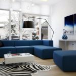
The contrast of dark and light will be most appropriate in the living room, but the bedroom should have smooth color transitions.
Those who want to spend less time on cleaning and have maximum freedom in changing furniture, carpets and other mobile elements of space it is worth paying attention to the so-called medium-gray color. Strictly speaking, this is the average color of dust and similar debris.

The choice of color for the floor does not tolerate fashion. Whatever the designers say, today's current tone may not be necessary tomorrow. Therefore, when choosing it matters only the personal taste of the owner, the harmonious design of the room and practicality.


-
 The choice of color for the design of the kitchen
-
 Sunny yellow hue in the interior: combinations
-
 Colors in design - which is better not to use?
-
 What color combinations are better not to use in the decoration of the kitchen
-
 Why you should not use bright colors in the interior
-
 What colors in the bedroom can lead to bad sleep
-
 Which color of the ceiling is better not to choose
-
 Light gray tint in the interior
-
 Dark blue color in the interior
-
 Autumn palette in the interior
-
 Use of low contrast in the design of the room
-
 Pink color for millennials in interior design
New publications are published daily on our channel in Yandex. Zen
Go to Yandex. Zen