Probably everyone once heard that the use of certain colors for painting the ceiling can significantly affect the overall perception of the room. Sometimes, a wrong color scheme is not only unable to complement the interior, but also significantly reduces the visual perception of space.
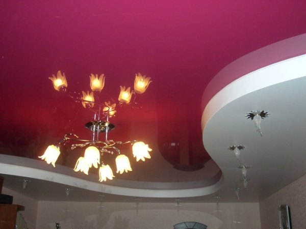
One of the unsuccessful color schemes is the choice of dark tones. Even a large hall with a graphite or brown painted ceiling can underestimate its space, resulting in a gloomy atmosphere.
Of course, there are exceptions. After all, it will be very difficult to create an oriental, medieval style or English classic in the room with light and bed tones on top.

Important is the fact that some colors can affect human psychology. To the extent that the ceiling is often completely open, it is worth giving preference to those palettes of paints that can positively affect the emotional state.
For example, a blue tint helps to relax when you are in the room. It is perfect for bathing a room or living room. But the blue ceiling in the office would not be the most successful solution. It is unlikely to help tune into a working mood.

There are several simple rules, following which, the choice of color for the ceiling will be greatly simplified:
- Do not use gray, black and brown shades for ceilings with low heights.
- If the distance from the floor to the ceiling is too large, then the white color will increase the space even more. It is important to consider this point.
- You should not choose cold and dull colors if the windows of the room pass a small amount of light due to vegetation or go to the north or west side.
- Sun oversaturated rooms will not need extra orange and yellow ceilings.

Repair of any residential premises is a heavy burden, which not everyone can lift. Interior design, combining different colors and other aesthetic issues occupy a special part of the whole process. Having no design experience, it is sometimes difficult to achieve the desired result. You should first try on dozens of color options in order to understand how much they fit together and fit the general style. The ceiling is no exception. There are some rules for its color design, adhering to which, you can prevent unnecessary mistakes, as well as create a cozy atmosphere in the room.

-
 The choice of color for the design of the kitchen
-
 Sunny yellow hue in the interior: combinations
-
 Colors in design - which is better not to use?
-
 What color combinations are better not to use in the decoration of the kitchen
-
 Why you should not use bright colors in the interior
-
 What color of walls will psychologically press you
-
 Review of the white kitchen, why there are many pluses and few minuses
-
 Light gray tint in the interior
-
 Dark blue color in the interior
-
 Autumn palette in the interior
-
 The use of low contrast in the design of the room
-
 Pink color for millennials in interior design
New publications are published daily on our channel in Yandex. Zen
Go to Yandex. Zen