Content
- 1 How to use color
- 2 How to eliminate the coldness of color
- 3 What styles are suitable
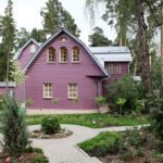
Recently, unusual bright colors have been used to decorate the facade, as they allow you to create an original exterior and give the building a special luxury and sophistication. That is why purple is especially popular. This combination of red and blue is therefore considered mysterious. Please note that you need to use the presented color very carefully, as it can negatively affect a person’s state, his mood. Consider the main design options for the purple facade, how to use it correctly, combine with other colors.
How to use color
Almost everyone believes that the selected color can negatively affect the health and condition of a person, since the brightness of the tone causes irritability, depression. In order not to create such an influence, it is worth considering the following rules for designing a modern facade:
- Plain arrangement. To design the surface of the walls outside, this option is rarely used. This is due to the brightness and saturation of the tone. That is why you need to use lighter shades, close to lilac. In this case, the exterior will be softer, creating the comfort of a personal territory. A bright home improvement option is only suitable for unusual styles, such as art deco;
- Accent application. This is the most common solution, because in combination with a light palette, purple color looks more impressive, elegant. It allows you to get rid of the monotony of the house, adding a special charm;
- It is also worth remembering that the facade, executed in this color, is very difficult to combine with homestead territory and landscape design. That is why it is best to contact specialists who will help create harmony on the land.


How to eliminate the coldness of color
It is worth noting that the purple hue refers to the cold color palette, so this design solution is best used for houses located in a hot climate. This will help make relaxing on site more enjoyable. But if the colder colder is not for you, then you need to combine the presented color with softer tones, taking into account such factors:
- Beige hue positively affects the visual perception of purple. It will look softer, more gentle. At the same time, it is best if there is as much pastel palette as possible. That is, a brightly presented tone should act as an accent;
- You can also apply other bright shades, but they should relate to a soft, light palette. These include yellow, orange and even red. But at the same time, it is best to turn to specialists, since it is very difficult to conduct such an arrangement yourself;
- It is believed that the best combination is purple and white. It will “dilute” the color saturation, make the exterior more attractive and original. The ratio of colors of the facade can be different, it is best if there is as much light tone as possible.
What styles are suitable
Please note that the presented type of arrangement is not suitable for every exterior style. It is best to use it for arranging the original modern direction. For example, if the house has strict geometric shapes, that is, is made in the style of hi-tech or minimalism, then the use of bright colors will be advantageous. It can be combined with black or white. The second option is more practical, since you can avoid creating a dark, dark exterior. This is definitely worth considering while working.
-
 Facade gray
-
 Delicate blue facade for the house
-
 Original yellow facade
-
 Blue panels for the facade
-
 When tired of pastel colors
-
 Brown facade tile
-
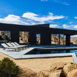
 Original black facade tile
-
 Red facade tile
-
 How to use black facade panels
-
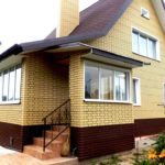
 We choose a facing tile for a facade of white color
-
 Attractive red building facade
-
 Brown facade panels
New publications are published daily on our channel in Yandex. Zen
Go to Yandex. Zen