Content
- 1 What to consider when choosing
- 2 Psychological impact
- 3 Ideal shades for the facade
The color palette is an important aspect of the choice of finishing materials for decorating the exterior of the house. Today there are a variety of materials that give the room an attractive appearance and create practicality during installation and operation. Designers recommend the use of panels that have light colors, as they visually make the building a little larger, while the garden area can be decorated in various ways. But, one way or another, the red color of the facade remains popular. This color has a positive effect on the exterior of the room and the condition of the person. Consider with what colors to combine the red facade, what shades to pay attention to, what to consider during the selection.
What to consider when choosing
In order for a bright color to suit your building, it is very important to analyze and take into account a lot of other factors, these include:
- The presence and shades of other buildings in the territory. For example, if the summer kitchen, the gazebo is executed in a saturated red color, it is best to avoid using the same shade. It is better to choose lighter tones, in which case the territory will not be too catchy, bright;
- Climatic conditions. If you live in a very hot climate, it is best to avoid using too saturated tones. Red refers to a warm palette of colors, which is why it is appropriate to use it for home improvement in a cold climate or located in the northern part of the world;
- Features of psychological perception. It is worth noting that the color does not affect a person’s condition, his mood and even health. Features of red we will consider further.


Psychological impact
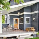
Despite the fact that the color is not present inside the house, it can also affect not a person. Red is distinguished by brightness, due to which it creates a good mood, tunes in the activity of physical and mental activity. Do not use a large amount of the presented color, as it can cause irritability and even depression. That is why it is recommended to combine the palette of the bright facade with white, beige or gray. In this case, you will receive an original beautiful building, while adding bright notes to it.
Ideal shades for the facade
If you like this tone, it is important to choose the right shade. It is worth noting that it has a variety that allows you to use it for almost any exterior style, to create a different effect. Modern designers strongly recommend paying attention to such shades of red:
- Red burgundy. A very saturated tone, while it will look great in interaction with white. The plain facade looks very beautiful with a white window trim. At the same time, some decorative elements of the walls on the outside can be decorated in white, if used;
- With a touch of orange. In order to make the building softer, it is best to apply a red tone with a hint of orange. Please note that such a facade is best suited for modern interior styles. The use of a glossy texture will help to give an incredible appearance. It is worth noting that it is not recommended to use paint for work. The best option for this shade is vinyl siding or other color panels;
- Hue bardo. It is very saturated, so it is recommended to “dilute” it with a gray or white tone. It will also look very original in combination with black. Please note that this option is not suitable for the classic exterior. Bardo looks great in the design of simple geometric shapes.
-
 Original purple facade
-
 Delicate blue facade for the house
-
 Facade gray
-
 Blue panels for the facade
-
 When tired of pastel colors
-
 Brown facade tile
-
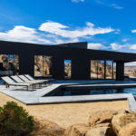
 Original black facade tile
-
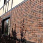
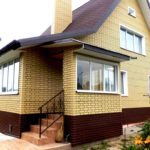
 Red facade tile
-
 How to use black facade panels
-
 We choose a facing tile for a facade of white color
-
 Original yellow facade
-
 Brown facade panels
New publications are published daily on our channel in Yandex. Zen
Go to Yandex. Zen