People make a lot of mistakes when choosing a palette for creating an interior. The list of possible shortcomings can be very large. In particular, they often try to combine shades with each other that cannot be combined. If you make a mistake in choosing a tone, a terrible result is obtained in pairs of yellow and gray, brown and blue and some others.

Another common path to error is excessive restraint when choosing a color. Neutral gamma is often chosen in order to avoid bright colors, which are harder to use. There is nothing wrong with this, but there should not be monotony. A variety of textures can revive the atmosphere of the apartment, even if only muted shades are used. A dull beige color can drown the interior if it is too much.

White color in the interior is used quite often. His fans of minimalism are especially fond of. However, it is not worthwhile to color everything white without thinking, since the room with an abundance of this color turns into a hospital room, which is very uncomfortable to be in. Too many colors and shades can also not be a good solution, because the interior becomes too colorful and overloaded with many elements.

Comfortable colors can be chosen by a professional designer. He always takes into account the tastes of the customer. Even red can be used to color the bedroom, if the client has such a desire. Yes, this color is exciting, but there are techniques that can reduce its aggressiveness. There is nothing reprehensible in the desire to make the room bright, but not always and not all colors are appropriate. Productive work or rest can easily be disturbed if you introduce irritants in the form of bright colors into the decoration of your office or bedroom. But a bright wall may be present. To paint with such paints, for example, you can wall at the head of the bed so that it does not catch the eye during the rest.

You need to know the measure in everything. Nobody denies the decorative function of color, but at the same time the effect will turn out blurry if there are too many “decorations” in the room.

Minimalism and simplicity are the main trends in modern interiors. Introduce any shades should be metered. Carefully use graphics and prints. Particular attention is required to small rooms. Any mistake in them will be striking and spoil the whole impression.


-
 Top of the best white interiors of a small room
-
 The most practical colors for the floor in the apartment
-
 Trendy ideas for using raspberry color in design
-
 Bright tropical shades for interior decoration indoors
-
 Review of the white kitchen, why there are many pluses and few minuses
-
 The use of low contrast in the design of the room
-
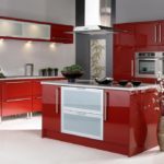 Red cuisine: combination rules
-
 The choice of color for the design of the kitchen
-
 What color of walls will psychologically press you
-
 The main color of the current year
-
 Sunny yellow hue in the interior: combinations
-
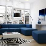 Dark blue color in the interior
New publications are published daily on our channel in Yandex. Zen
Go to Yandex. Zen