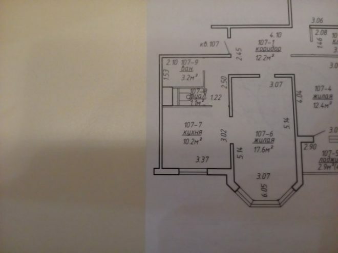
The story of how we waited for the construction of our apartment is long. Finally, we got the cherished square meters and set to work on the arrangement. We started with the kitchen, because the project for this room was created long before the start of the renovation. It remains to bring your plans to life.
Photo source - realty.tut.by
Attention! Earned on our website kitchen designer. You can familiarize yourself with it and design your dream kitchen for free! May also come in handy wardrobes designer.
The apartment was rented out without finishing, so repairs on 10 square meters started from scratch. The walls are primed, the floor is screed. When monitoring prices for building materials, it turned out that the differences between different manufacturers and sellers are significant.
To implement our idea with a bar counter and a tall cabinet with a pencil case, we had plenty to choose from. As a result, a brand new plastic set with yellow glossy facades has appeared in our kitchen, it looks very warm and sunny.
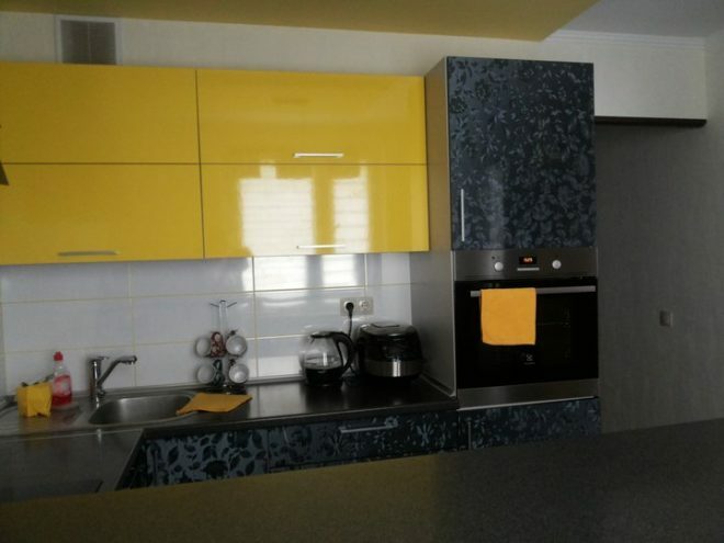
The ceiling was decorated with waterproof plasterboard, graceful curly overhangs were made. We thought about the arrangement of furniture in advance, so we preliminarily moved the places where the pipes for water and sewage exits, determined the points of dislocation of sockets and switches.
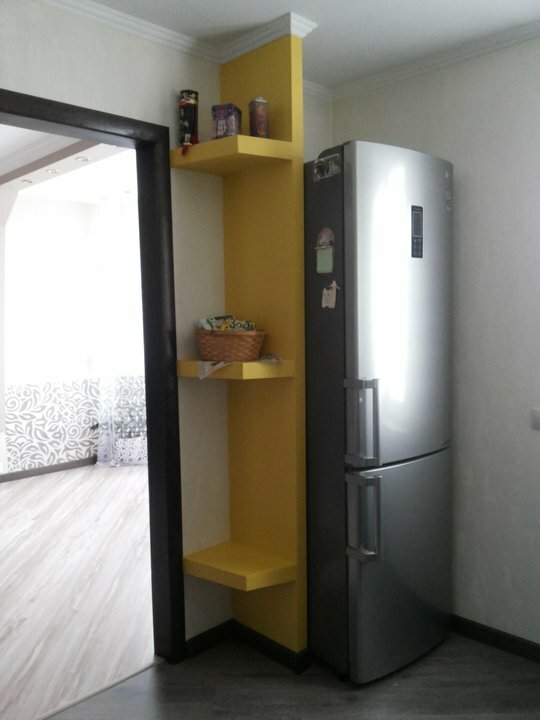
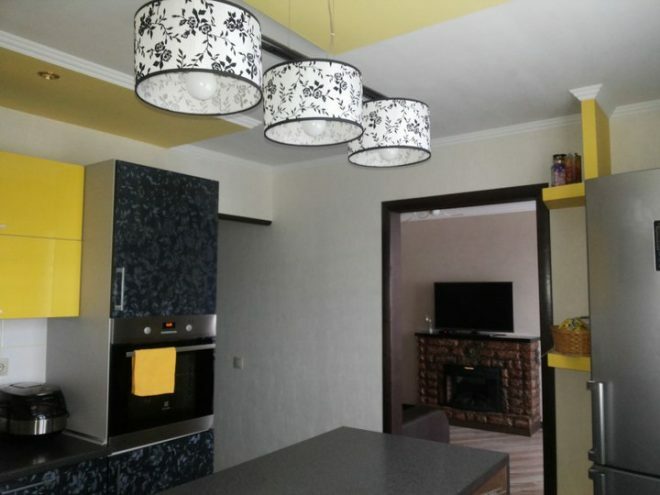
A separate place had to be allocated for the refrigerator, which was fenced off with drywall. At the installation site of the rack, a connector for the TV was identified. The doorway leading from the kitchen to the living room had to be slightly narrowed, but the area did not suffer from this.
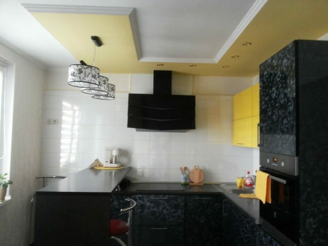
Initially, they wanted to decorate the working wall, but faced negative reviews on the Internet from families who use this apron design option. Therefore, they simply finished the wall with white square tiles, it has a small pattern and looks unobtrusive.
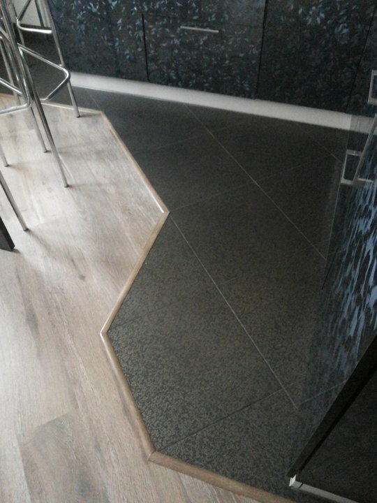
The floor next to the working area is decorated with large black tiles, the surface has small light blotches that dilute the color and make it more pleasant and soft. The rest of the kitchen area is covered with laminate, the masonry was chosen diagonal, it allows you to visually make a small room larger.
Light vinyl wallpaper is the most suitable option for the kitchen. We were looking for them for a long time, the surface has an unobtrusive pattern, with which bright facades are perfectly combined. Non-woven-based material, in texture it looks more like decorative plaster, and very pleasant to the touch.
The plasterboard structure with comfortable shelves, which hides the refrigerator, and part of the ceiling was painted with high-quality Finnish paint. The tinting is interesting, it goes well with the furniture.
Last but not least, they installed a set, black and yellow facades with a holographic pattern.
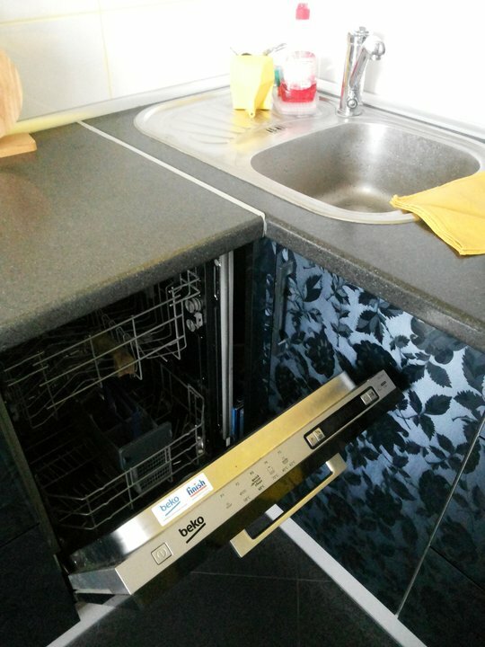
An induction hob, a built-in oven, and a dishwasher were purchased for the kitchen. The sink was chosen from stainless steel, a mixer with a double tap was installed. Very convenient, you didn't have to buy a separate tap for filtered water.
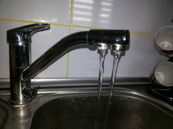
A powerful hood was installed above the hob, and a water filter was installed in the cabinet under the sink.
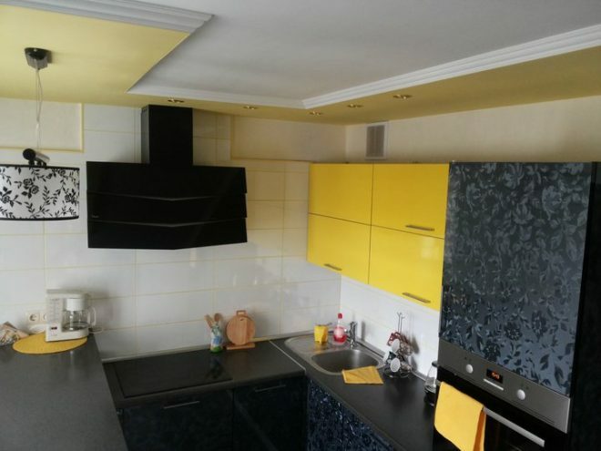
There is a lot of storage space, we were satisfied. All household gadgets, dishes, kitchen utensils, food supplies and even a place left on the shelves in the cabinets. Under the counter were placed devices that are used every day - a sandwich maker and a toaster, and the refrigerator fits perfectly into the space near the window.
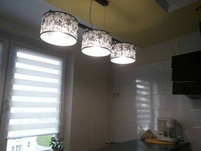
A separate lamp was hung over the bar. General lighting in the kitchen is represented by five spots above the work surface and lighting, which was launched along the bottom of the hood.
The hood copes with its task perfectly, which allowed us to refuse to install the door. We decided that without filling the doorway, the room looks more free and complete. From the side of the corridor and the kitchen, the exit is decorated with platbands, the same color with baseboards.
Day-night blinds were hung on the windows, a convenient solution that allowed to preserve natural light as much as possible. The windows face the north side, so there is no need to hide the room from the sun's rays.
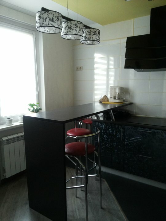
We bought high bar stools with metal backs, leather seats. In the future, there are plans to sew yellow covers on them. There is still a place for the TV, which we have not yet purchased. It seems that he is not particularly needed, since sitting at the bar you can watch TV programs in the living room.
We had to spend more than 250 thousand rubles on the device of a functional, convenient and practical kitchen. Most of the funds were spent on the purchase of furniture and kitchen appliances. The estimate is approximate, we took into account the main costs.
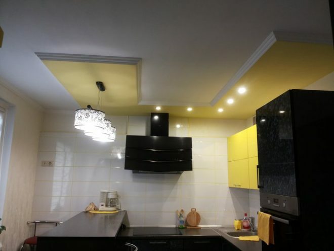
Ten squares in the kitchen is a lot, we managed to get a convenient and comfortable space. Let the bar counter "eat up" a lot of space, but we dreamed about it when choosing the interior. In our opinion, the kitchen is very light, light, it is pleasant to be here. And when guests come, they are attracted to this room like a magnet.
average rating 0 / 5. Number of ratings: 0
No ratings yet. Be the first to rate.


