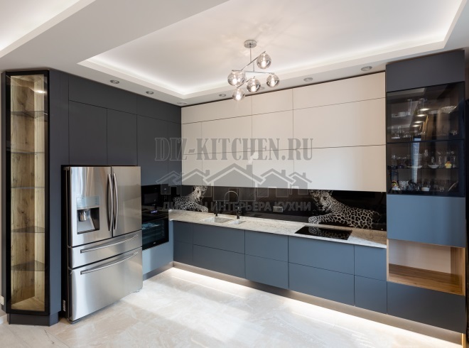
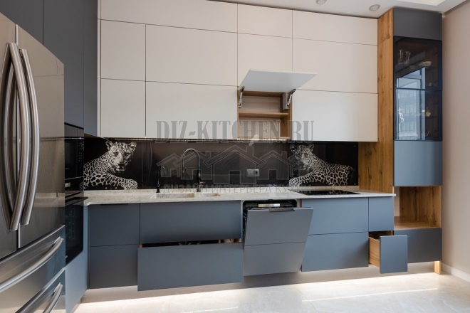
Our kitchen gives the impression of a beautiful and monumental interior. The abundance of glass and chrome, the image of noble animals, verified lines, clear geometry and a contrasting combination of interesting shades - all this creates a very harmonious picture.
Made in the company Lavelle kitchens,
lavellakitchen.ru
G. Saint Petersburg
Attention! Earned on our website kitchen designer. You can familiarize yourself with it and design your dream kitchen for free! May also come in handy wardrobes designer.
The interior has very successfully combined aesthetics and minimalism, wood and stone, glass and matte surfaces. Each material emphasizes and sets off the neighboring one.
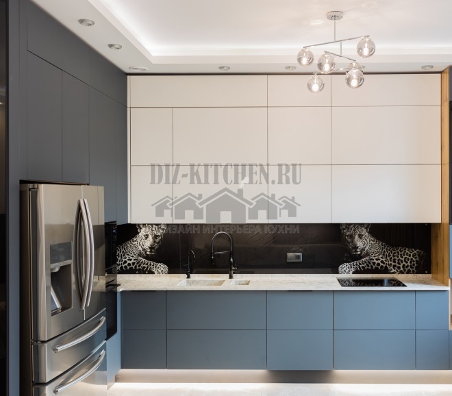
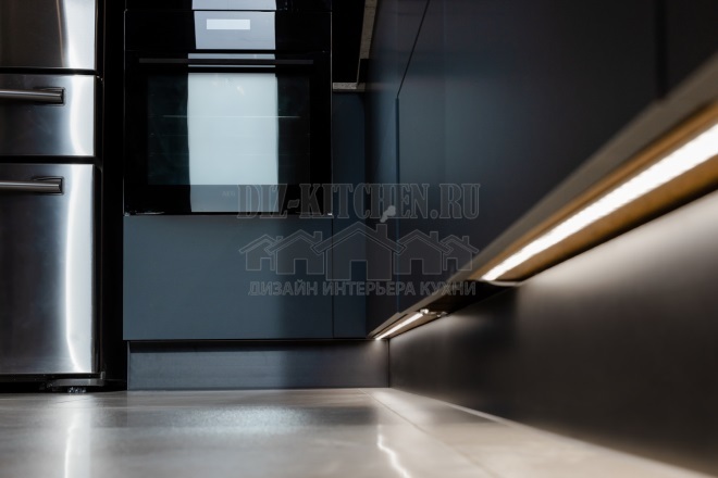
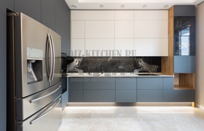
The composition is based on a slight contrast of two trendy shades, which is enhanced by an interesting LED-backlighting under the lower row of cabinets. Thanks to her, the kitchen does not seem austere and gloomy, it seems to float in the air. The illumination is uniform and comfortable for the eyes.
The pattern on the wall panel has become a bright accent against the background of matte facades. The leopard image symbolizes grace and strength and is best suited for such a spectacular kitchen. Two leopards around the edges seem to be guarding the house.
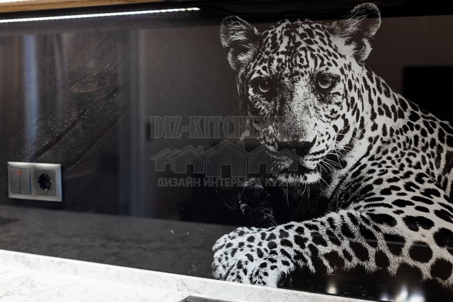
The combination of noble gray and milky white shades adds up to a spectacular image, which is enhanced by an original glass apron with a photo print of a graceful animal. In addition, it is very easy to walk behind such a persistent moisture-resistant surface. There are simply no seams on a perfectly flat surface.

The furniture frame is made of laminated chipboard (Egger). The peculiarity of the facades is the Italian nano-plastic Fenix on an acrylic basis HPL with a thickness of 16 mm. Matte surfaces are super scratch resistant, have an “anti-finger” effect and can even be repaired with dry heat.
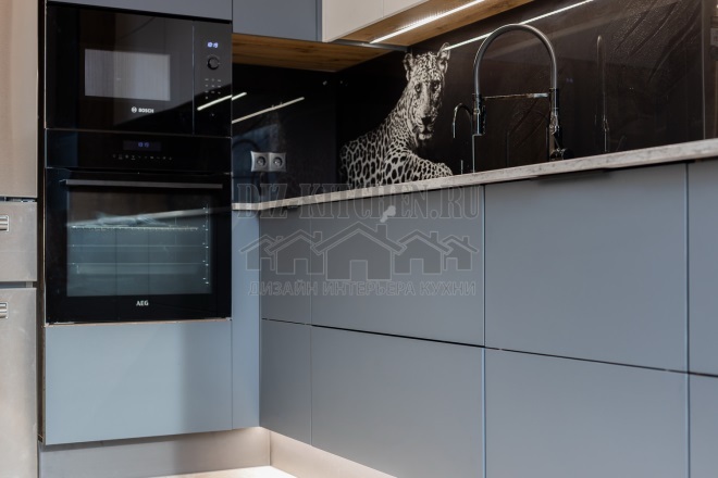
Facades in two colors: GRIGIO BROMO (gray) and Bianco Male (white). There is more gray, it dominates over white. The light center (facades and countertops made of artificial quartz), surrounded by gray, looks calm and peaceful. There are no sharp contrasts in the interior, it is soft and calm.
Side panels with imitation of rare wood have become an additional tone. They shade well the rest of the surfaces, bringing warmth and comfort.
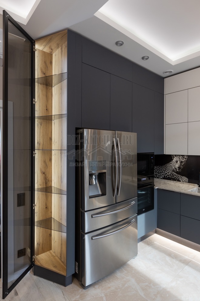
Simple rectangular facades were revived and glass showcases on both sides of the corner set became another decoration. Their shine makes the whole room more elegant and stylish. It is lightness and airiness that deaf facades with low reflectivity are always lacking, but in our case this was compensated in full.
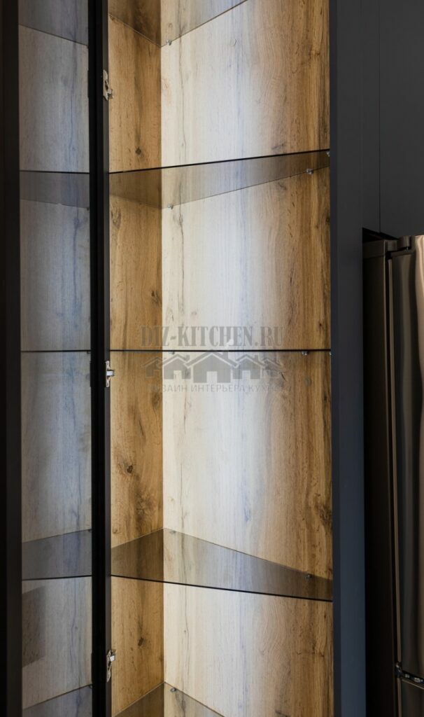
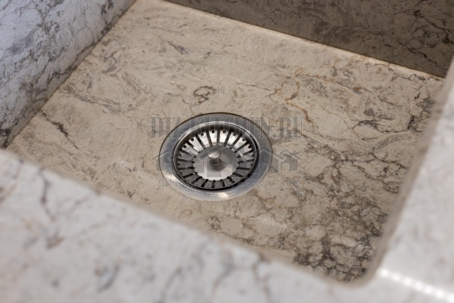
The quartz stone countertop imitates light marble. The material does not trap food odors, and dirt and liquids can be easily removed.

The inset sink is made exactly under the countertop and does not seem like a foreign body, as is usually the case.
Blum fittings (door closer hinges, lifts) have made kitchen work a pleasant experience.

Everything is thought out in the ergonomics of the kitchen: there is a place for a huge refrigerator, the fronts without handles open automatically after pressing the panel, a large number of drawers and shelves provide ample opportunities for comfortable storage of kitchen accessories.
average rating 0 / 5. Number of ratings: 0
No ratings yet. Be the first to rate.


