Many believe that White color boring and sterile as well grey - depressed and gloomy. Is it so? This opinion is erroneous. White is clean, airy and light; gray - deep, sophisticated and elegant.
We all spend a lot of time in the kitchen. It is important that there are no irritants in this space. That is why such an unusual and unusual combination of tones was chosen.
The room is quite standard. The kitchen is rectangular. The location of the window is convenient. It faces north, so it is always quite dark here.
Attention! Earned on our website kitchen designer. You can familiarize yourself with it and design your dream kitchen for free! May also come in handy wardrobes designer.
The owners have always dreamed of a luxurious white kitchen. The birth of a child was the impetus for the realization of this dream.
Another point of optimal realization of what was conceived is the magnificent collection of floor tiles from renowned Italian production. It consists of ten tiles with unique patterns. At the same time, the tiles are practical with a matte surface. It is wear-resistant porcelain stoneware.
Photo source - rebenok.by
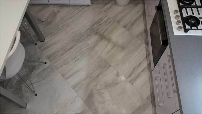
When we thought over the finishing of the apron, it was decided to experiment. This tile was laid out where the backsplash was supposed to be. The sizes fit perfectly. At the same time, the seams between the tiles were minimal.
This choice paid off. This is a really practical solution. That being said, the aesthetics are impressive. Guests who came to the owners of the apartment did not notice that identical tiles were used on the floor and on the wall. The thing is that it looks completely different.
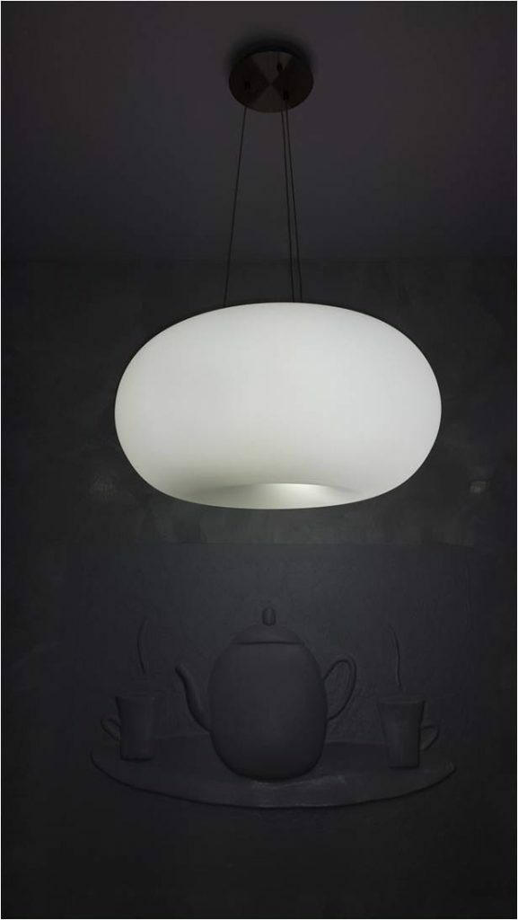
The walls are in basic gray. They have become the perfect backdrop for a crisp white kitchen. The entire wall next to the dining area was effectively highlighted with decorative-type plaster. In tone, the pattern resonates well with the tiles. Only here it is not so clear and softer. For practicality, this wall is also covered with acrylic lacquer. This makes the surface easy to clean. Above the table in the center is a relief-type painting made of the same materials.
Initially, the owners had doubts. But now it became clear that everything is appropriate here. A pot-bellied, cheerful hare brought coziness and warmth. This is handmade, so no one will have a second one. The painting was left in white and also covered with acrylic-based varnish.

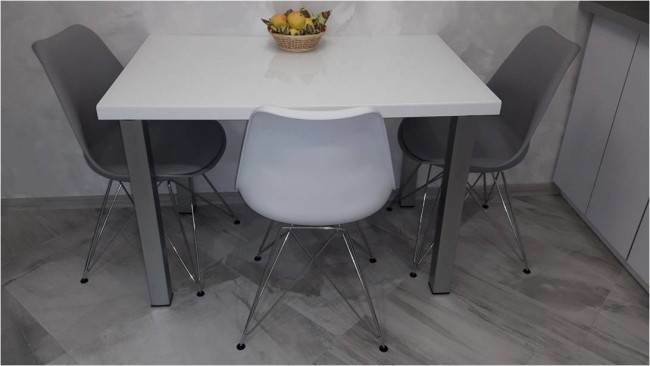
The dining area has a white rectangular table. Impact-resistant glass is provided on top. It can be washed easily. On the snow-white glass, stains are invisible. This is a very practical option. The chairs are made of plastic. They are gray, one is white. The height is small. They are made in an unusual space style. They are comfortable and incredibly durable.
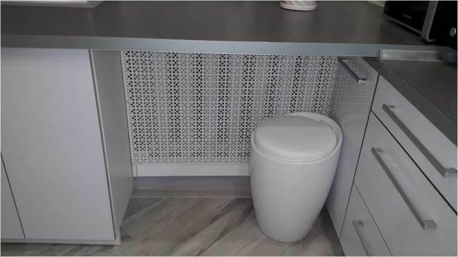
A table top is provided under the window. There was a place under it for an additional stool. The battery is protected by a white MDF screen.
Stretch ceiling is provided. The surface is glossy.
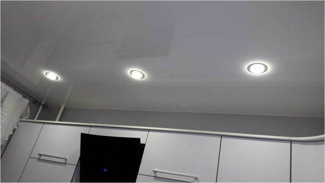
There are three LED lights above the hob and cooking area. There is a separate lamp to illuminate the dining area. It is made in the form of a light air cloud.
A fluorescent lamp is also installed on the area for preparing culinary masterpieces. It is fixed above the cabinets from above.
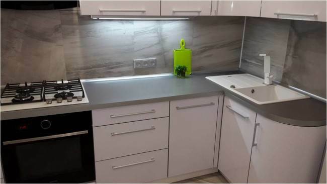
A cooking area and a hob are provided along the wall. On the opposite wall is the dining area. Since the window is closer to the functional area, it was decided to replace the window sill with a table top. It was extended to the end of the wall.
The headset has gained integrity. It was possible to provide an additional work area, as well as optimal storage space for food and kitchen utensils. These are the two closets at the bottom. Their width was 70 and 60 cm.
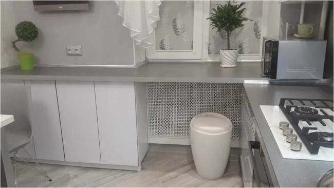
The level of the main working area and the window sill is slightly different. But they did not align it, so I did not want to add additional height. It was decided to superimpose part of the countertop on top of another part. This is where the microwave was placed.
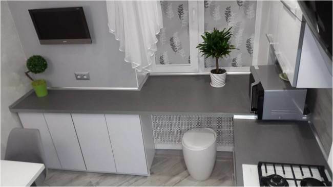
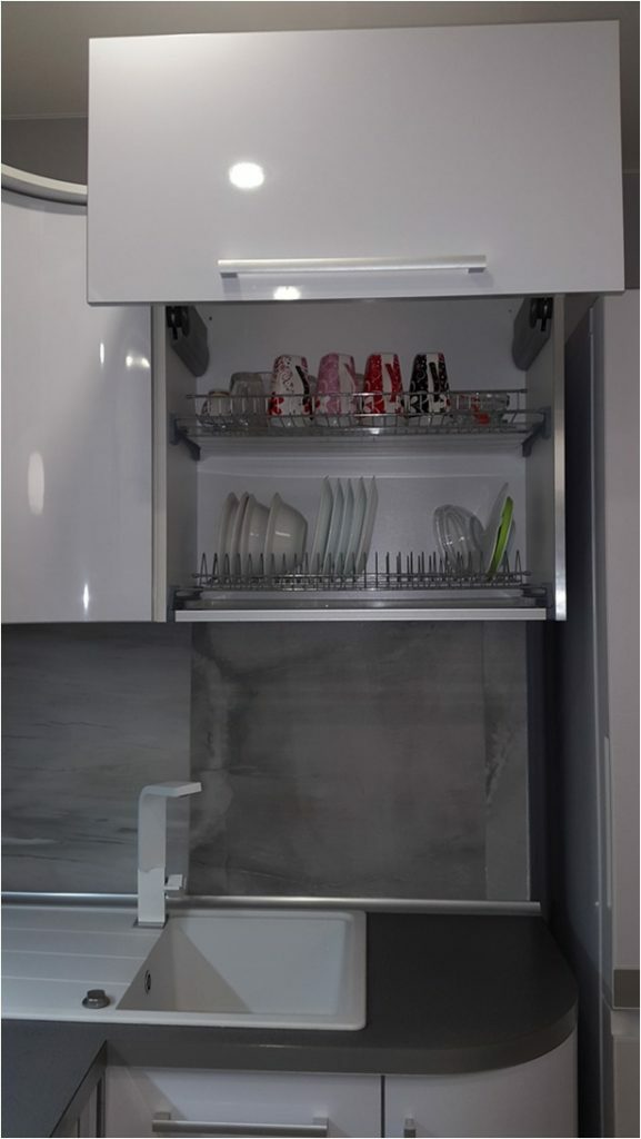
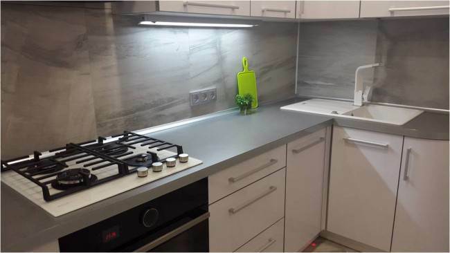
There is another work area to the left of the hob. Its width is 60 cm. To the right is the main cooking area. Its width is 100 cm. This space is located between the sink and the hob. There is a sink in the corner of the headset. There is another 30 cm countertop between it and the refrigerator. This option is very convenient. There is a drying system above the sink. Its width is 70 cm.
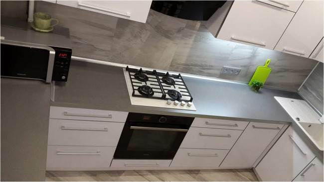

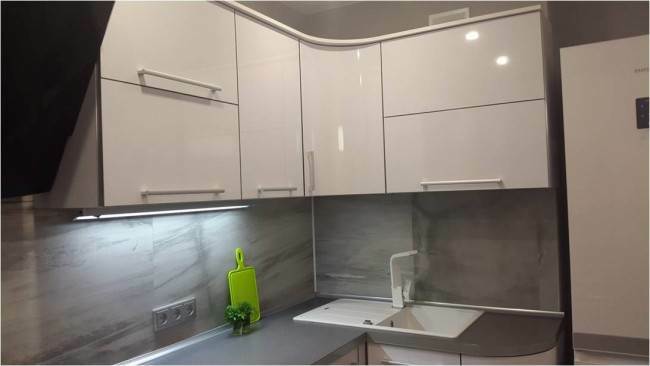
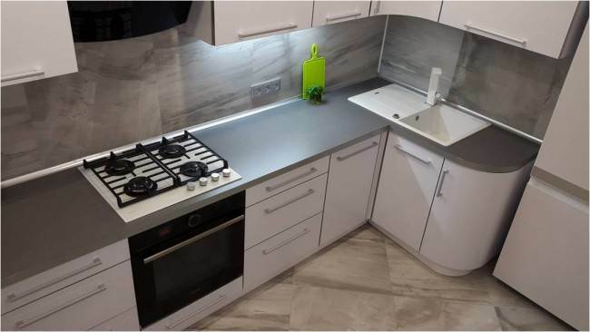
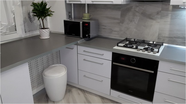
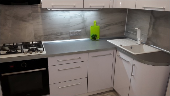
Durable plastic is used for the kitchen facades. The surface is glossy white. Bottom and top of the same shade. The table top contrasts with the color of the fronts. It is dark gray in color.
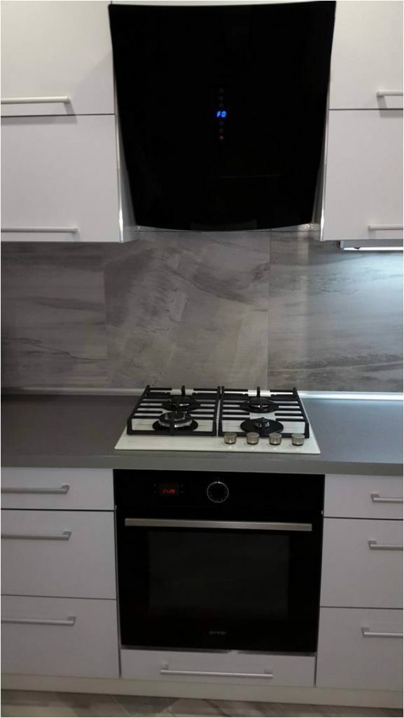
The oven and extractor hood are made of black glass. Against the background of white facades, they look very elegant. The sink and hob are white. They look good against dark countertops.
The owners decided to dilute the interior a little and create accents. Oven and hob from one well-known manufacturer.
The hob is made of white tempered glass. This option is incredibly convenient. On this color, spots and stains are completely invisible. There is also a special burner and comfortable grills.
The oven is powered by the mains. Touch panel. It is incredibly easy to operate. The range of programs is impressive. An optimal wall-mounted hood with sufficient power has been installed.
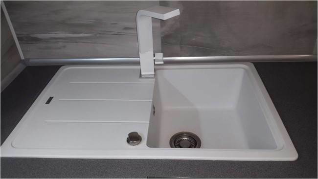
The sink is made of durable artificial stone. Its color is white. The width is 78 cm. It is easy to maintain the surface. One hygienic cleaning is required per week. Installed a white tall mixer with a fancy shape.
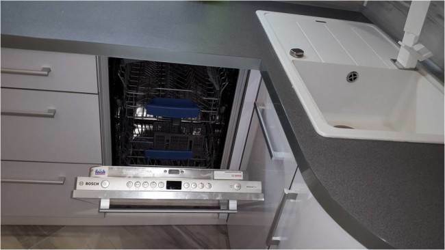
To the left of the sink is a built-in dishwasher. Its width is 45 cm.
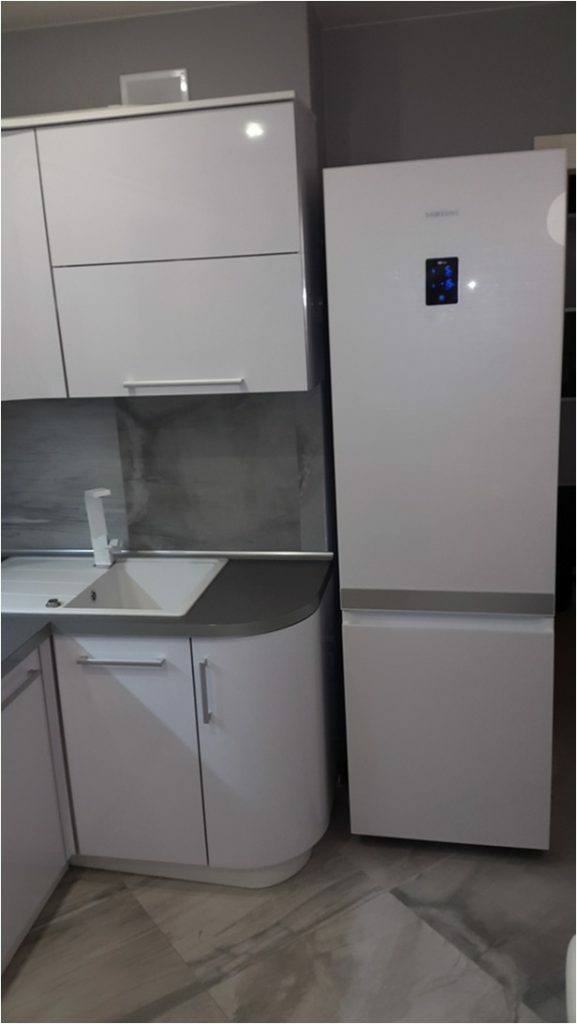
Refrigerator height 200 cm. There is a ventilation shaft directly behind the sink. On the right, there is a niche in which the refrigerator is ideally located. It does not block the passage at all. Access to the sink is unlimited.
The front panel of the refrigerator is made of white glass. It perfectly complements the white gloss of the kitchen. A single headset is created. It echoes well with the white dining table and the crystal-colored ceiling.
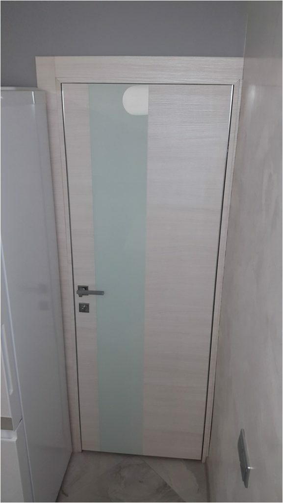
There is a luxurious interior door to the right of the refrigerator. It is made of solid wood covered with eco-veneer. There is also a vertical insert made of frosted white glass. The magnetic lock ensures silent closing.
White is used on a variety of surfaces. In this case, the owners selected one shade. This is a white snowy cold monochrome.
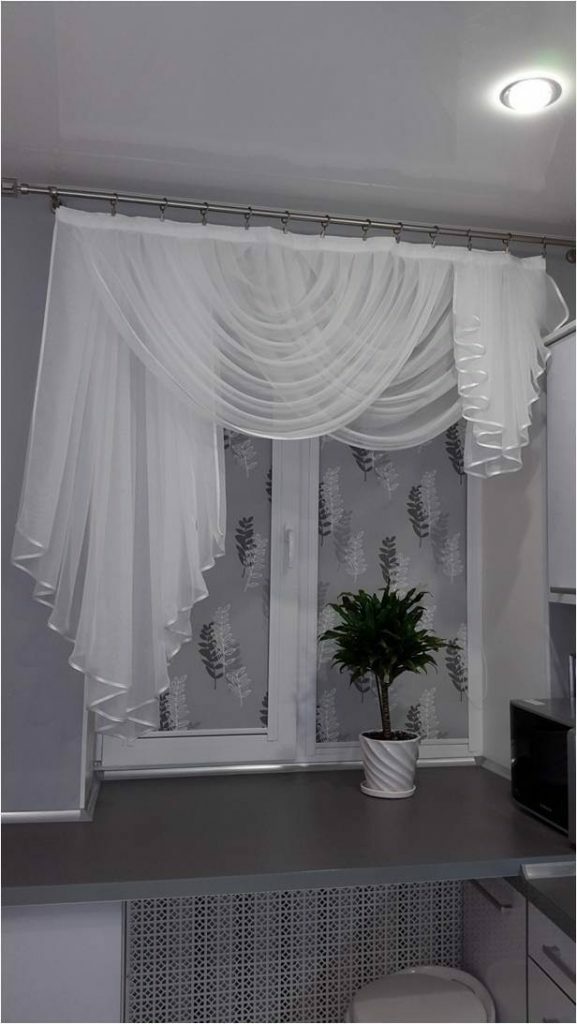
For window decoration, it was originally planned blinds white with a nice gray print pattern. But then it was decided to make an additional frame in the form of an elegant curtain made of light transparent polyester.
We managed to create coziness, airiness, lightness and completeness of the interior.
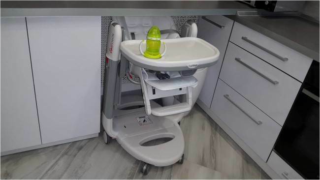
A highchair was purchased relatively recently. It also fits perfectly into the concept of the created interior. At the same time, this piece of furniture can be easily folded and removed under the countertop under the window. This frees up valuable space in the kitchen.
Don't be afraid to experiment. You need to boldly move towards the realization of your dreams. What was conceived will definitely be carried out.
average rating 0 / 5. Number of ratings: 0
No ratings yet. Be the first to rate.
