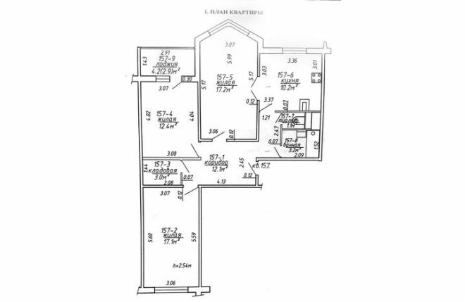
The kitchen with a smooth transition to the living room looks very elegant and unusual. The cost of its arrangement was about 360 thousand rubles. The family bought an apartment in the secondary market, it is a standard three-ruble note in a Mapid's house. The plan shows that the kitchen has two exits - to the corridor and to the living room.
Photo source - realty.tut.by
Attention! Earned on our website kitchen designer. You can familiarize yourself with it and design your dream kitchen for free! May also come in handy wardrobes designer.
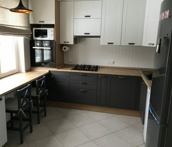
We didn't just have to equip the kitchen, but completely redo everything, starting with the rough finish. First of all, we decided to decide on the kitchen furniture, and ordered a set at the ZOV factory. We chose an interesting option with fashionable facades and unusual fittings. We decided on the color scheme right away, I really like the strict but stylish combination of dark and light colors.
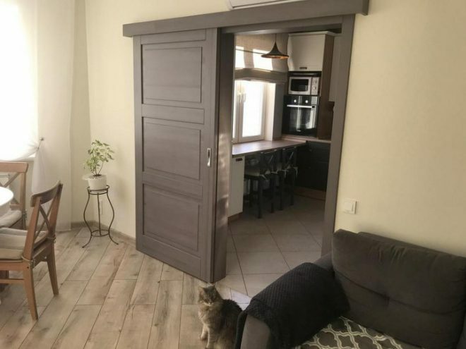
At first glance, two doors may seem superfluous, since the area next to it cannot be used. But we decided to leave everything as it is, to turn this drawback into a feature of the room. The living room has two main areas - a dining room and a seating area with upholstered furniture. The bay window looks unusual, which is the main highlight of the apartment.
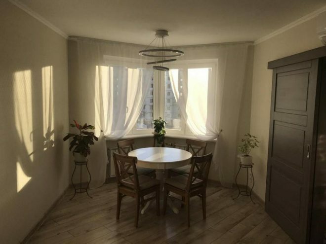
We decided to arrange a dining area near this window; in the center we installed a large round table. It worked out well, there is a lot of free space, and this part of the room is well lit.
Light sheer curtains were hung on the window next to the dining area so that natural light could flow in unhindered. I had to order a special cornice for two rails, repeating the shape of the bay window.
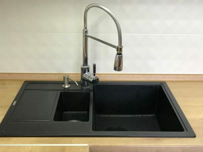
I love to cook, I spend most of my time in the kitchen, so it's important for me to feel comfortable. Even at the stage of creating a project, I decided that I needed a wide work surface. I also need a lot of storage in the kitchen. I chose a large sink, leaving room for an extra freezer.
At first they wanted to order a built-in freezer, but then they turned out to be from this idea. It turned out to be small, and every centimeter is valuable to me. As a result, a chic black Atlant with four voluminous freezers appeared in the kitchen. I didn’t regret at all about the choice I made; in terms of color, it fit perfectly into the overall style.
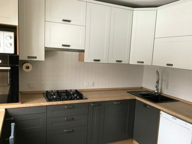
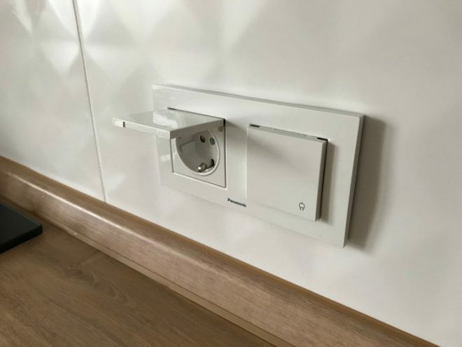
In the construction market, we bought all finishing materials, lighting fixtures. When choosing, they were guided only by their own preferences. The floors and apron were finished with Polish tiles, and the walls were covered with wallpaper. The sockets were purchased with covers, I remember how difficult it was to wash the open sockets, especially in the kitchen, where dust and grease constantly accumulate in them.
When buying an apartment, we noticed that gas pipes and a massive meter take up a lot of space, so we changed the meter for a new project.
The husband made a separate lighting for the working area; he installed LED lighting under the upper tier of the cabinets. Our microwave oven and refrigerator are old, they moved with us from the previous apartment. A very convenient double sink with a high spout, a removable hose and even a shower mode. The oven was placed upstairs.
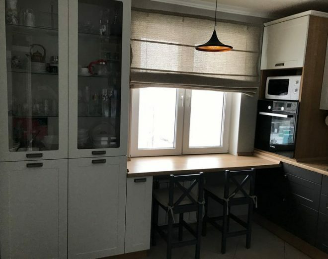
The window was curtained with a Roman linen curtain, and pillows for chairs were sewn from a similar material. My mother, a needlewoman, made them herself. Our chairs are non-standard, we ordered them specially. This is not a bar option, but neither are classic stools. I dyed them myself, for this I underwent special training. The tone matches the color of the fronts of the lower cabinets. As a result, the chairs look very harmonious.
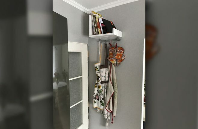
The space behind the door is also used. There is a shelf for cookbooks here, and a railing for little things hangs. We did it ourselves, the idea belongs to me and my husband. We will replace the doors with new ones in the near future.
The TV was specially hung on the wall opposite from the kitchen in the living room. We turn it on most often for the background, so we took this unit outside the kitchen. Yes, I am never bored, I turn on my tablet or watch through the window what is happening around the house, for the neighboring boys playing football on the playground nearby.
Overall, I like our cuisine. The color scheme is very pleasant, not flashy, there is no pretentiousness. I am pleased to be here, cook, spend the morning with a cup of coffee and meet guests. Even though some design solutions do not meet generally accepted ergonomic standards, I believe that the interior is functional and meets all needs.
The classic working triangle is sustained, the room is spacious, light and cozy. The project is as simple as possible, but at the same time understandable. There is a pleasant feeling upon entering the kitchen. We are also pleased that the repairs cost us relatively inexpensively, we spent no more than 350 thousand rubles for the arrangement.
The kitchen set with assembly work cost almost 190 rubles. My favorite sink together with a mixer cost 16 thousand rubles, a custom-made cornice - 4.5 thousand. 18 thousand rubles were spent on the design of the window opening, these costs include replacing the window in the kitchen and the cost of materials for curtains.
New household appliances - a hob and an oven, an extractor hood and a dishwasher - cost us 125 thousand rubles. Another 5 thousand were spent on replacing the gas meter, for which we received a separate permit. This is not a complete list of costs, I did not consider minor costs, as well as the costs of building materials, which we bought not only for kitchen renovation, but in general for the apartment.


