With the purchase of an apartment by us, the whole epic with the renovation of the kitchen began. We wanted to achieve something special, so we bought a two-room apartment with an open plan. At first glance, this is a common combined area in a panel house, but we decided to highlight the kitchen with the help of a wall, since it was important to make a separate sleeping place.
Photo source - realty.tut.by
Attention! Earned on our website kitchen designer. You can familiarize yourself with it and design your dream kitchen for free! May also come in handy wardrobes designer.
Our family agreed that we need a calm, quiet place, where there will be no strict lines, angles and minimalism. True, initially they had neither a project, nor an exact understanding of what exactly we want to get.
While visiting home improvement stores, I stumbled upon elegant floor tiles that brought insight into what kind of decoration I wanted. This first click started our renovation. The Russian-made collection fit like nothing else. Naturally, we ordered all the material from the online store.
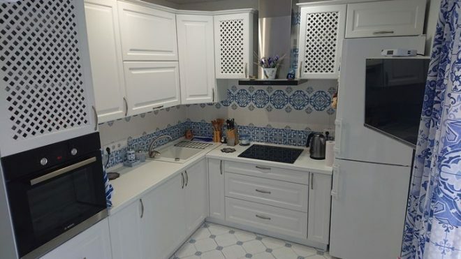
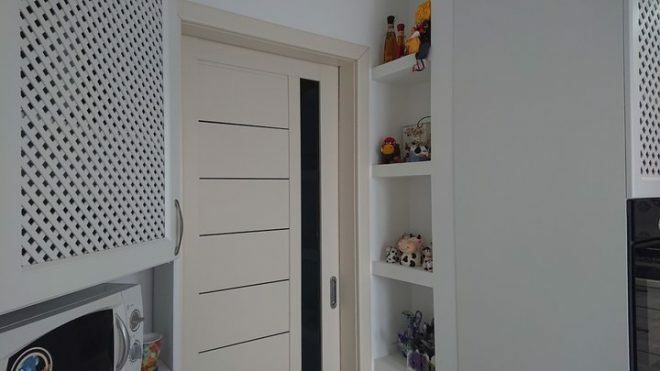
It was important for us that the kitchen was bright, so a white set was chosen. Inside, I realized that this solution was not very practical, but everyone liked it. I made a slight mistake in my calculations and ordered furniture 20 cm shorter. The master suggested a way out, he suggested using this place with benefit, and made a niche of drywall with shelves. It turned out very conveniently, here we store all sorts of lovely trinkets.
We painted the walls white, choosing a washing paint, we did not regret it at all. She washes wonderfully. For two years now I can't get enough of the fact that cleaning the kitchen takes a minimum of time, and the repair remains like new.
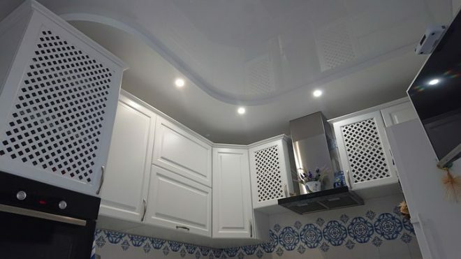
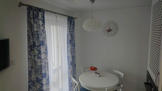
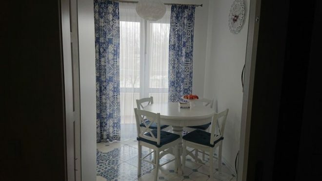
There is a small dining area in the kitchen, a round folding table and chairs with high white backs fit perfectly into the interior. When receiving guests, we lay out the table, and up to 10 people are quietly accommodated. Most of the equipment was purchased in Poland, the quality is excellent, and it turned out to be cheaper than if we bought everything in Belarus.
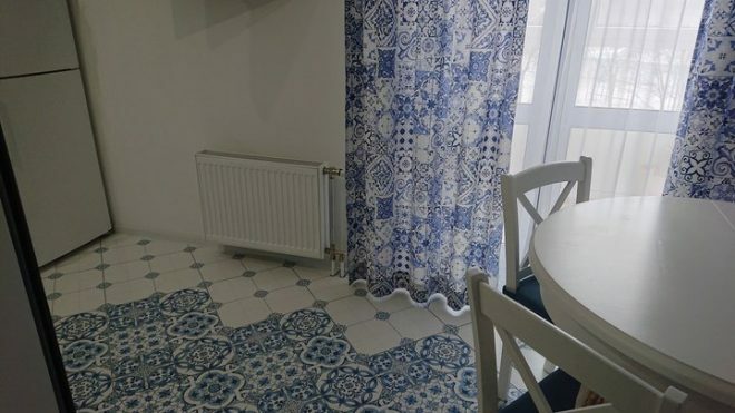
I consider the most attractive window in our kitchen. I managed to find curtains that organically combine with the colors and patterns of the tiles on the floor. Repeats the style and wall of the work area. The result is a very harmonious space.
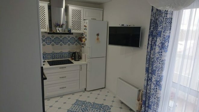
I cannot say that our kitchen has a particular style. It seems to me that the design is closer to the classics. Most importantly, we managed to create a very warm, comfortable, cozy space where you can spend your time comfortably.
About 250 thousand rubles were spent on repairs, most of the money was given for furniture and household appliances. Maybe we went overboard with some of the details of our kitchen, maybe something doesn't go well with each other.
But I believe that it is thanks to these little things that the room acquired its individuality. My favorite area is the dining group by the window. And even an excess of patterns does not load the space, but looks light and natural.
average rating 0 / 5. Number of ratings: 0
No ratings yet. Be the first to rate.


