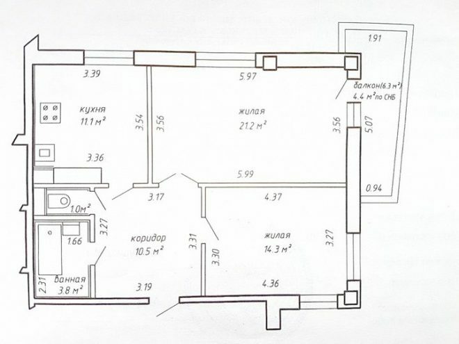
In the summer of 2017, we became the owners of a two-room apartment with a spacious kitchen located in a building near the metro station. We bought housing in the secondary market, and it became clear that repairs simply cannot be done. We started with the arrangement of residential premises, since the budget after buying a home was very limited.
Photo source - realty.tut.by
Attention! Earned on our website kitchen designer. You can familiarize yourself with it and design your dream kitchen for free! May also come in handy wardrobes designer.
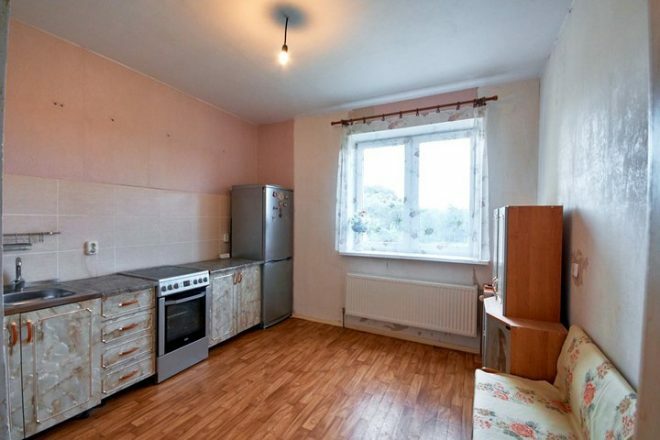
The two-room apartment had an old renovation, there was linoleum on the floor, and the walls were covered with wallpaper. An old electric stove and a small amount of furniture remained in the kitchen, which allowed us to hold out for a while. Only a year later, we took up the design of the kitchen, while the main task that faced us was to preserve free space as much as possible.
It was important for us that even after the installation of new furniture and kitchen appliances, there was a feeling of spaciousness. The kitchen area is large enough, 11 squares. The shape of the premises is successful, it allowed to turn around and create a comfortable and functional area. At the same time, initially, I vaguely imagined what in the end we want to get.
Since we had no experience in carrying out repairs yet, I started by looking at pictures on the Internet, studying what is kitchen interior design, what options are there. The lack of free funds for the furniture and equipment you liked was very noticeable, and there was no money for the services of an experienced designer. Therefore, all the details had to be thought out independently.
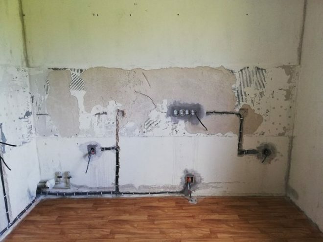
We started by removing old tiles from the wall, which was previously considered an apron. The tiles fell off right with the pieces of plaster, so funds had to be allocated to level the wall. Otherwise, you can simply forget about a beautiful and fashionable skin. The photo shows the condition of the walls after removing the coating.
We carried out almost all interior design work on our own, with the exception of stretch ceilings. They decided to entrust this important matter to specialists, they were afraid not to cope with it themselves. We chose this option for a reason, I heard that when flooded by neighbors from above, they perfectly hold back water, floors, walls and furniture do not suffer.
We purchased materials for repairs in the construction market. For a long time, they could not decide what material to use for finishing the floor. The choice was between laminate, linoleum or tiles. Our apartment is on the ground floor, so we decided that the floors with tiles would be too cold. And it is too expensive to make a warm floor system.
We could not find a high-quality linoleum suitable for our interior, so we bought a moisture-resistant laminate - an excellent choice even for a kitchen. I really liked it, and after some time, I did not regret my choice at all. Wish we put it everywhere.
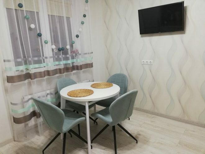
We chose light-colored vinyl wallpaper on a non-woven base, which made it possible to give the space additional lightness and airiness. In general, light colors make the room more spacious, and this is exactly the effect we achieved. A light milky shade was diluted with a colorful pattern on one of the walls.
However, when choosing a print, we did not compare how the selected shades are combined. Therefore, it seems that the wallpapers are very different, as if they are from different collections. When it comes to keeping cleanliness issues, vinyl wallcoverings are good for wet cleaning. It is worth sometimes wiping the surface with a cloth, and they are like new again. Dirt is easily rubbed off.
The hardest part we had was when choosing kitchen furniture. We decided to purchase a high-quality headset so as not to change it in a few years. Therefore, according to an individual project, we ordered it from an individual entrepreneur. We decided on the color right away - white. Convenience lies in the fact that the location of the lockers can be changed countless times.
For me, as a hostess, it is very important that there is a large and comfortable work surface and enough storage space. Therefore, they made a choice in favor of a corner set, otherwise, after installing the equipment, there would be simply no room for dishes and stocks. The angled model made it possible to create a long work surface and adhere to the working triangle rule, I am very pleased.
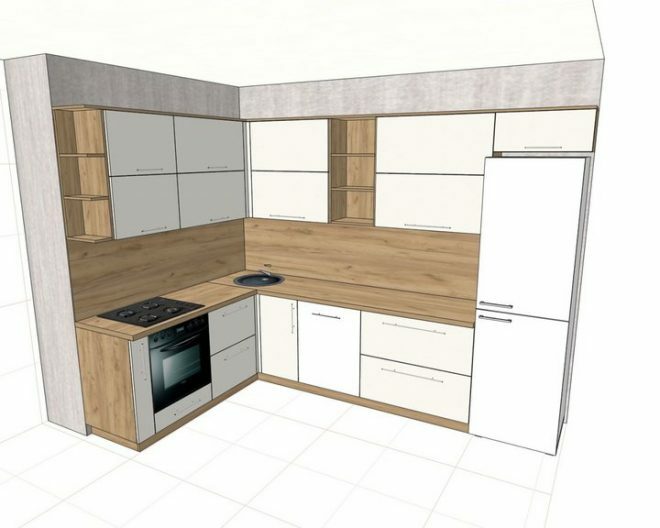
The working, side surfaces, skins are made of chipboard, the wood-like surface looks impressive, the facades are made of acrylic. It may seem that white surfaces are completely impractical, but after six months of use, the doors remained snow-white. There is little care for them, and the white color gives a feeling of spaciousness and lightness. The kitchen always requires attention, it's easy for me to keep it clean.
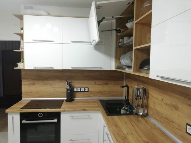
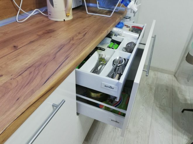
The lifting mechanisms and closers installed in the cabinets are very convenient, there is a cargo mechanism in the outer cabinet, which allows efficient use of space. I am glad that there is a lot of storage space, today there are still free shelves. Some of the upper shelves are open, which visually relieves the space, making it lighter.
We chose the most common handles on the doors, I considered different options, but it is the tubes that look elegant and do not attract much attention. The headset is exactly what I dreamed of. No wonder I flipped through catalogs with furniture a thousand times.
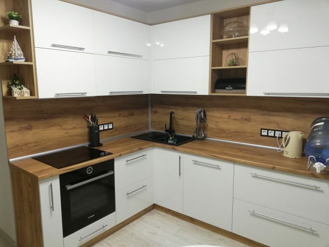
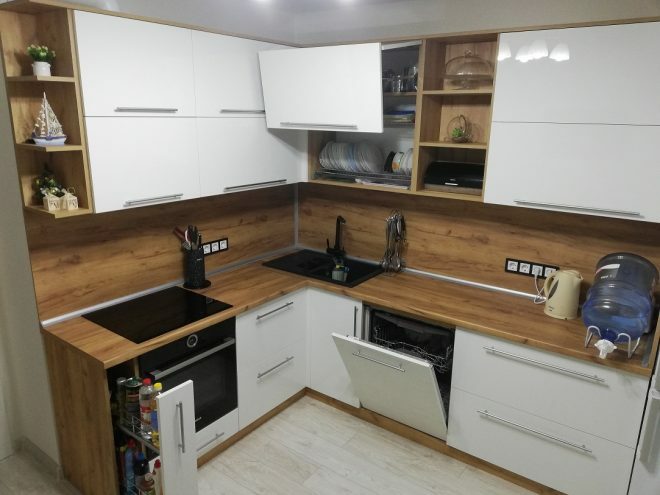
Kitchen appliances were purchased via the Internet, all gadgets and appliances were made in Belarus. The induction hob, dishwasher and oven are built-in, a built-in hood was installed above them, it is hidden in the cabinet and therefore even invisible. True, I had to buy special dishes for the stove, but I don’t regret the choice, cooking on it is a pleasure.
The microwave was put in a cupboard so that it was not in sight. She, like the refrigerator, moved with us from the old apartment. There is a small cabinet above the refrigerator, it is very convenient to store all sorts of little things in it. Thanks to our master for the advice, it was he who suggested using this space with benefit.
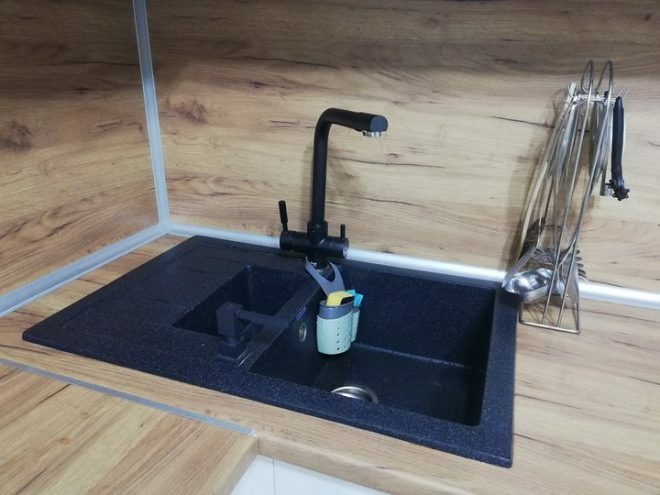
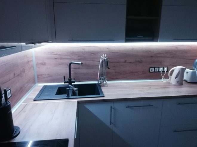
The two-piece black stone washbasin looks austere and elegant. The small section is great for defrosting food. A mixer was purchased to match the sink. Sometimes it seems that the black color stands out too much, the sink, oven and frames for sockets could have been made less bright, it would have been possible to maintain neutrality in the atmosphere. The sink was installed in a corner; many people think it is too inconvenient. But it was important for me to make good use of the whole place. Besides, I'm already used to the angular layout.
The work surface is illuminated by LED strip lighting. There is an opportunity to remotely adjust the brightness and choose a color, my husband jokes that you can safely arrange gatherings with light and music. A switch and two sets of sockets were installed on the working apron-skinny. Since there are a lot of kitchen appliances and everyone is in use, spare outlets will never be redundant.
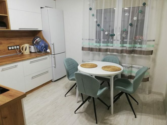
I could not imagine the dining area without a sliding round glass table, the color repeats the tone of the headset facades. There is always enough space for guests. The chairs look like office chairs at first glance, but they are very comfortable. The color of the chairs and curtains follows the pattern of the waves on the wallpaper to give the interior a sense of integrity.
The door to the kitchen was initially absent, we did not change anything. I liked the idea of decorating a free doorway, it seems wider and there is no feeling of separation of space. The husband made platbands from milky planks. At first, we were worried that the smells of cooking food would get into the rooms, but a powerful hood helped to solve this problem.
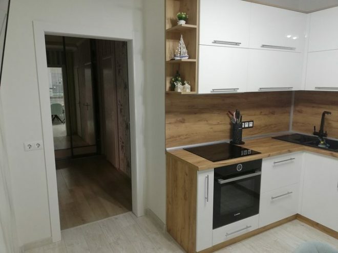
It took enough time to renovate, in three months we managed to create a kitchen that everyone likes for its practicality and convenience. The combination of white with wood-like decor looks elegant and light, the strict handles add style to the interior, reminiscent of the interior of Northern Europe. The kitchen set does not look too massive due to the open shelves.
I love my kitchen, which we completely designed with our own hands. Ideas that are close to me are embodied here, I do not pretend that we did without artistic flaws. But I think the main thing is that our whole family is happy with the result and spends time here comfortably.
We also managed to save money; in total, about 350,000 rubles were spent on repairs. We spent about 50.0 thousand rubles on finishing surfaces and building materials, a kitchen set cost 135.0 thousand, decorating a dining area - 35.0 thousand rubles. We spent about 100.0 thousand rubles on built-in equipment.
average rating 0 / 5. Number of ratings: 0
No ratings yet. Be the first to rate.
