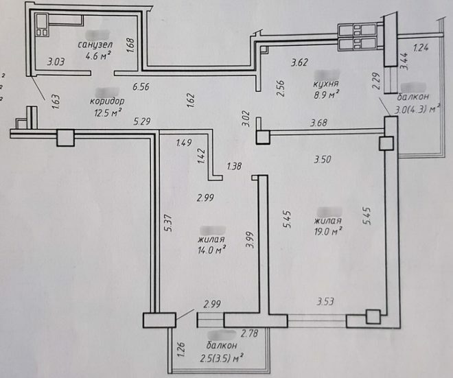
January 2017 was marked by a joyful event for us - we became the owners of a two-room apartment. After reviewing the plan, we decided what to be redeveloped. Initially, the kitchen was not very convenient. Moreover, the footage of this room did not suit us in any way. The elongated corridor was also unsuccessfully created, because of which a lot of space was simply lost. It was necessary to remove some partitions and redo the doors.
Photo source - realty.tut.by
Attention! Earned on our website kitchen designer. You can familiarize yourself with it and design your dream kitchen for free! May also come in handy wardrobes designer.
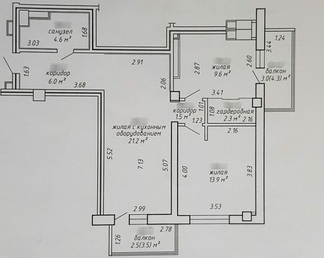
The redevelopment was entrusted to specialists, professionals in their field, they quickly received all permits and the repair began. According to the new plan, our apartment has turned into a so-called eurotrack, it has two bedrooms with separate entrances and a spacious living room, which is combined with a kitchen. This option suited us much more.
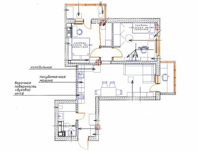
After the redevelopment, we started the renovation. In the spring we wondered where to order a kitchen set. Appeals to the company showed that not only the proposed projects, but also the cost, are very different. Choosing a design, we unanimously decided to focus on light furniture. It will stand in the back of the room, this can be seen on the furniture arrangement plan, the window is located far away, so dark surfaces would look gloomy here.
We arranged the kitchen modules rationally and conveniently, resulting in a functional working area. The classic working triangle is observed, the cooking surface is wide, it is located between the sink and the hob. The set looks very aesthetically pleasing; there are also open shelves that visually make it lighter.
I assumed that the kitchen was more of a female territory, so the main choice was for my wife. My wife chose a manufacturer, a kitchen set, a complete set of cabinets, installation of mechanisms and other details. In order to have enough space for everything, we chose a tall set with cupboards under the ceiling. It's not just storage space, because there is already enough of it, tall cabinets reduce cleaning time. After all, dust does not accumulate on top.
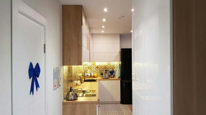
The facades were made of painted MDF, the doors were decorated with integrated handles, this option looks just fine. The skirting board was abandoned by the fact that the lower cabinets fit perfectly right under the work apron. I sealed the remaining small gaps with silicone putty, thanks to which moisture does not penetrate there.
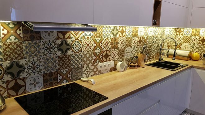
The dining area, according to the design project, is decorated with wood-like porcelain stoneware, which visually distinguishes it from the general background. The living room has a few more bright accents, the yellow color in the interior is perfectly supported by napkins of the same tone on the table. Two pear-shaped lamps were hung on the wall next to the dining group; they create a pleasant mysterious atmosphere.
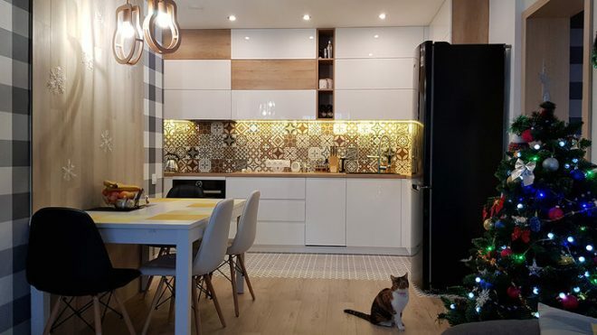
The appliances in the kitchen are mostly built-in; they were bought in Poland. We managed to save a lot on household gadgets and a sink made of artificial stone. A powerful hood and refrigerator were already bought in Minsk. An oven with a built-in microwave also came from Poland. All our equipment is of high quality.
The dining table can be expanded to accommodate not only our family, but also numerous guests. We bought this furniture in Moscow. The chairs are in contrasting colors - two white and two black.
The interior has only benefited from this unplanned purchase, they can be combined in any way. This interesting decision seemed at first rather bold, unexpected, but now we understand that such a contrast makes the room unusual, gives the setting individuality.
Combining the kitchen with the living room made it possible not only to expand the premises, but to create a cozy and airy space where it is pleasant to cook, relax and gather with friends for fun gatherings. I often enjoy helping my wife cook.
Remembering the difficulties that we faced when redeveloping, moving and removing walls and partitions, we do not regret our decision at all. It was a deliberate step that allowed to get a kitchen combined with a living room. Perhaps it is not very convenient that the cooking zone is visible immediately upon entering the hallway, but it turned out to be free.
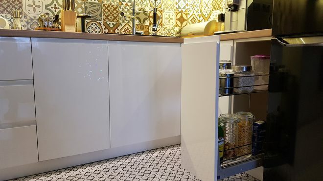
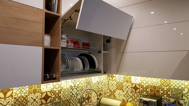
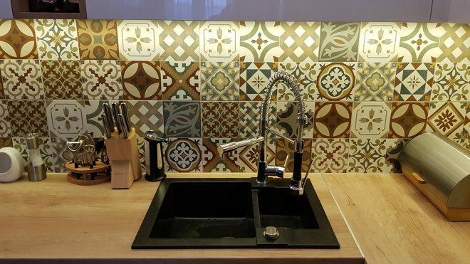
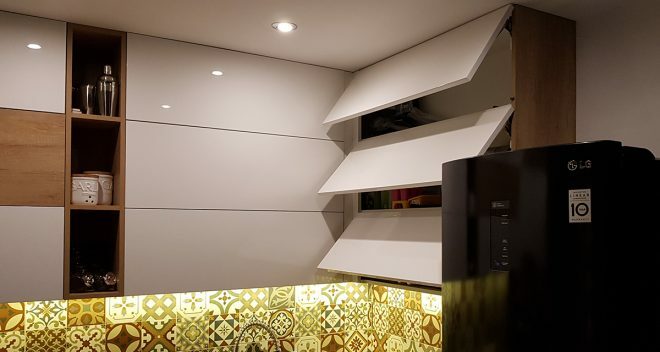
The interior design of our kitchen is quite rich, it has a lot of decor and contrasting elements, which, against the background of the main classic combination of white and wood grain texture, look very harmoniously. Maybe someone will not like this setting, but we are happy.
The lunch group cost us 20 thousand, about 200 thousand rubles were spent on the kitchen set. This amount included not only the furniture itself, but also delivery, work on the assembly and installation of furniture. A black luxurious refrigerator cost 58 thousand rubles, built-in furniture - more than 110 thousand, a sink with a tap - 14 thousand rubles.
Thus, we spent more than 450 thousand rubles on the renovation of our non-standard, but beloved kitchen-living room, but it was worth it.
average rating 0 / 5. Number of ratings: 0
No ratings yet. Be the first to rate.


