I have always dreamed of my own kitchen, large, spacious, cozy and comfortable. My dream came true after the birth of a child. While still pregnant, we thought about our own housing, and successfully joined the collective of individual developers - KIZ. At the same time, we put up for sale a one-room apartment in which my husband and I lived.
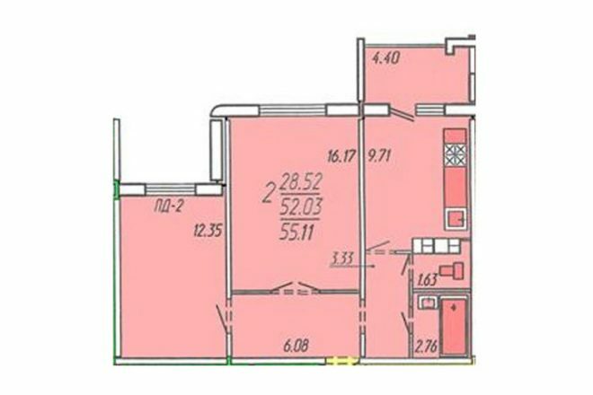
Photo source - realty.tut.by
Attention! Earned on our website kitchen designer. You can familiarize yourself with it and design your dream kitchen for free! May also come in handy wardrobes designer.
Naturally, we did not expect that everything would turn out on time, construction is always unpredictable. By the time the baby was born, the developer did not have time to rent the house, but by the time she was six months old, we received our housing, and had already begun to transport things to a new place of residence.
An apartment in a new building required repair, my husband took up this business. He chose a headset similar to the one we've been using for years. We were completely satisfied with the furniture, so we did not consider other options. And the new model Simon, which I dreamed of for a long time, pleases me now in the new kitchen.
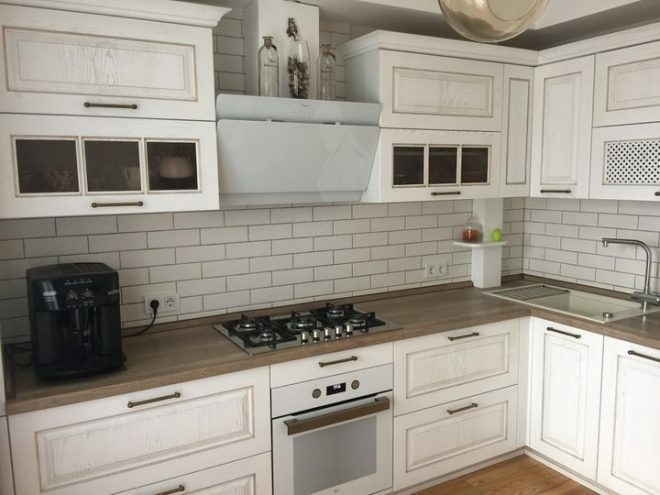
We had the technical documentation ready, all the drawings were drawn, the lists of household appliances were created, we just followed the ready-made plans. Two cabinets with a cargo system were installed in the kitchen. It is very comfortable. There is a dish drainer in the upper tier, we have improved this cabinet and installed hanging glass holders. The space is now used more economically.
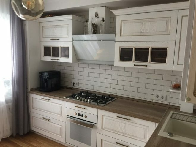
The floors throughout the apartment are parquet, ash wood and oiled. The board is very high quality, warm, we gladly walk barefoot at any time of the year, and boldly release the baby on the floor.
From the kitchen you can get to the balcony. By replacing the balcony door with a double-glazed window, we achieved more light in the room. The lighting of this part is represented by lamps. The light is dim because the lamps are tinted. They look simple but stylish. We bought them in a regular hardware store, with a good discount.
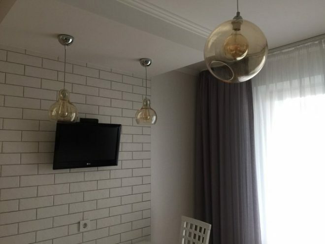
We bought Ukrainian-made wallpaper in bulk for the whole apartment, white Polish textured tiles on the wall look very organic, it goes well with a gray fugue. A feature of the apartments located on the first floor of the building is the inconvenient placement of the gas pipe. It takes place in the kitchen and in the hallway. I had to sew it up with drywall, and move the counter to a cabinet with a sink.
The window was decorated with curtains and tulle. They sewed to order in the local shopping center at the market, the work was completed very quickly, literally the next day the order was already ready.
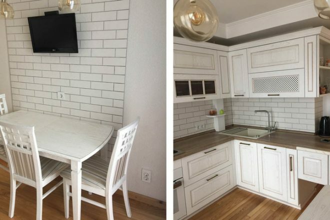
From the new technology we have purchased a hob from the Teka company, a dishwasher and a powerful high-quality Faber hood. The rest of the kitchen appliances were taken from the old dwelling. We managed to save money on the purchase of a TV, an oven and some small things.
I especially liked the range hood. Glass, white, it starts to work on its own if strong steam comes out of the dishes. About 140 thousand rubles were spent on equipment. In total, our repairs cost a little more than 400 thousand rubles.
Our kitchen turned out to be nice, cozy, kind. If you wish, you can find flaws in any design. In my opinion, the most important thing is that our family is happy with the result. There is such a particularly warm atmosphere in the room that we just love being here.
average rating 0 / 5. Number of ratings: 0
No ratings yet. Be the first to rate.


