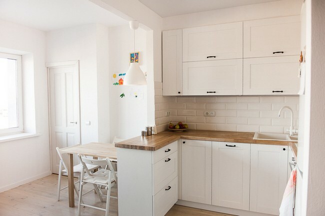
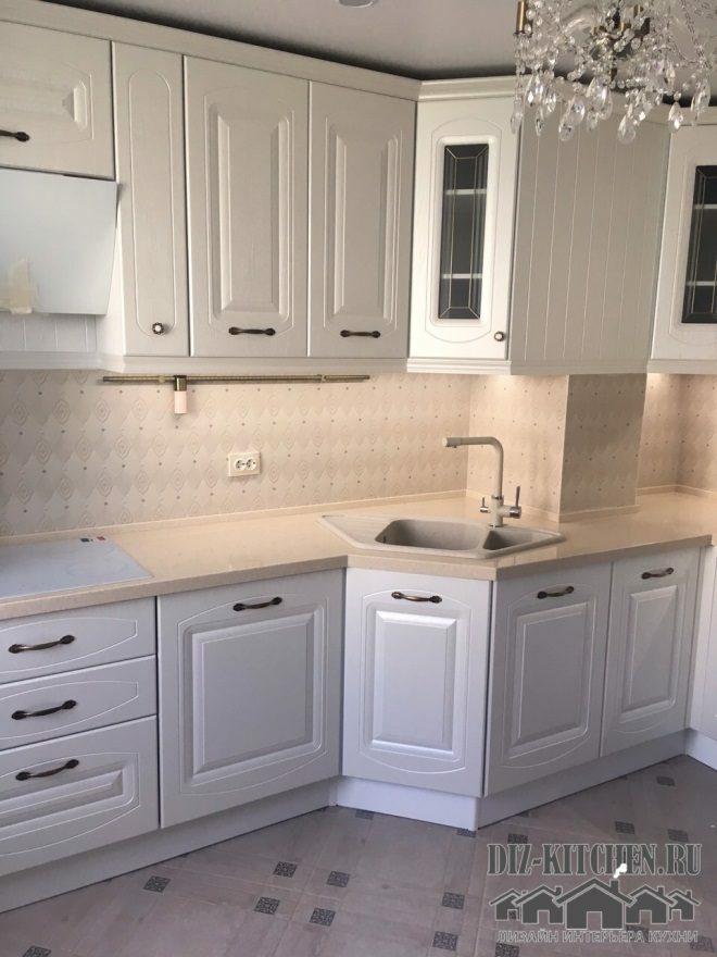
White-wood combination of colors can rightfully be considered the most practical and aesthetic. It's always beautiful and you still have to manage to spoil such a tandem.
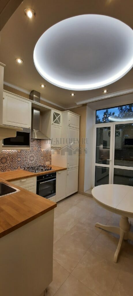
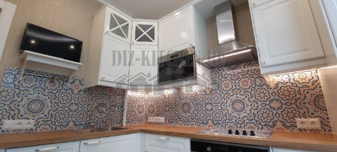
We have got a harmonious interior - a bright center (wood and apron), white wardrobes around, light ceiling and walls. Despite the classic elements, the kitchen looks very modern and cozy at the same time. That's what it means - competent design.
Attention! Earned on our website kitchen designer. You can familiarize yourself with it and design your dream kitchen for free! May also come in handy wardrobes designer.
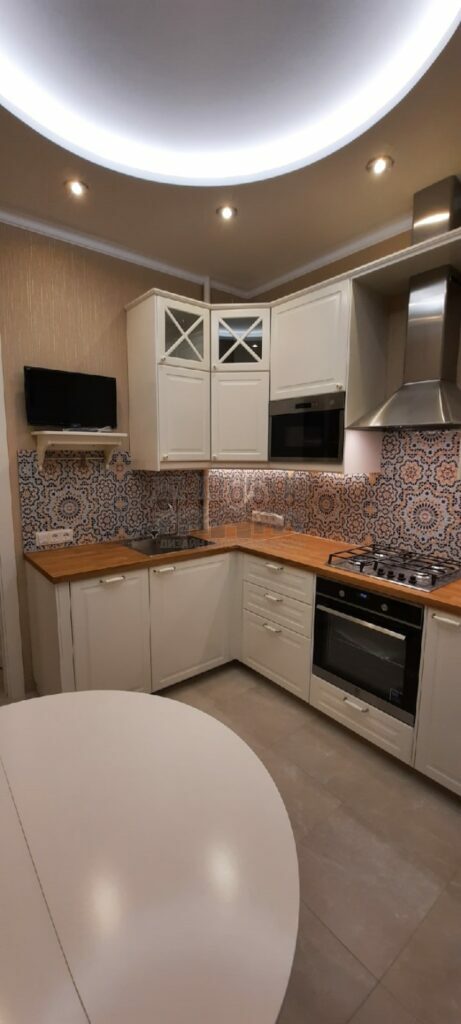
The matt surfaces of the painted neoclassical MDF facades are solemn and noble. This is an imitation of natural materials, but very high quality. The glass doors of the fronts with white frames are also reminiscent of the classic style.
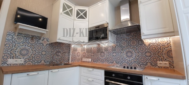
Corner set, in a room with spacious windows, with an abundance of natural and artificial light. A zest and a bright accent of our interior was a tiled apron with an ornamental pattern. He incredibly revived white matte facades, bright blotches turned out to be very necessary for this interior.
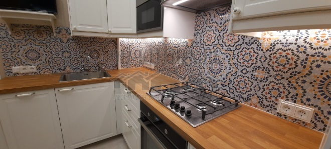
In the top row, we have only 4 small cabinets, but the wall does not seem empty, since they also installed a small TV, a microwave oven, an extractor hood and a built-in refrigerator.
We digested the gas pipe and now there are practically none of them in the working area. The pipe was taken down, it only crosses the countertop and the apron in one place, passes next to the sink and reaches the stove through the lower cabinet.
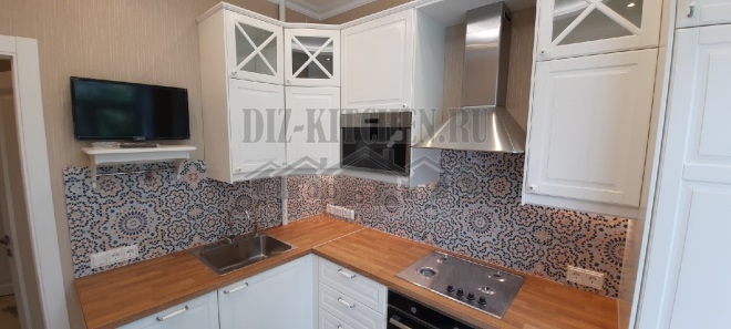
The wall panel contains sockets, switches and a thermostat with a frame. There is no skirting board between the worktop and the backsplash. The joints are closed with silicone sealant. It turned out very neat and looks much better than with a regular skirting board.
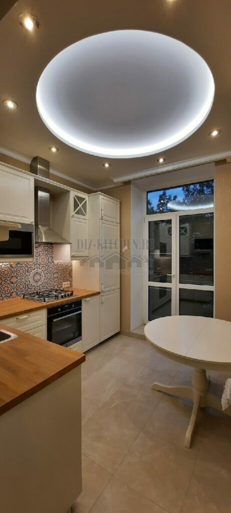
The shaped ceiling does not allow the areas to merge, complementing the facades well. The round dining table is almost exactly the same as the plasterboard circle with lighting on the ceiling.

Built-in refrigerator, hidden behind white facades. Thus, it does not violate the general line of the cabinets at all. And above it, so that there is no empty space, they fixed another small mezzanine cabinet.
Illumination is installed almost along the entire tabletop. It is not bright and not annoying, but with its function - full-fledged illumination of the working area, it copes remarkably.
Beautiful, harmonious, light - this is all about our cuisine. She is special and that says it all!
average rating 0 / 5. Number of ratings: 0
No ratings yet. Be the first to rate.
