 ~ 1 minute is required to read
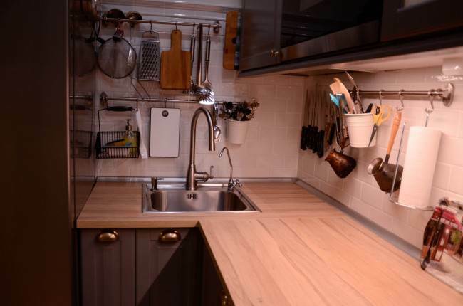
We live in a panel house. The area is small and it was especially depressing after I compared my apartment with the housing of a relative living in a new building. When we decided to repair, we turned to the designer with the main desire - to make the kitchen visually seem larger. Its cost amounted to 189 thousand. rubles, but the result is impressive - with the help of simple tricks the room now looks more spacious.
Kitchen made by company "Wenge furniture",
http://wenge51.ru
g. Murmansk
In our case, it can be argued that everything ingenious is simple. The kitchen consists of lacquered MDF facades from Alternative. We chose high-gloss plastic because of its sheen and smoothness. Modern UV varnish coatings are easy to care for, and stains and dirt literally evaporate from the surface thanks to a special finishing layer.

In addition, the colors of the Stich (Latte and Mocha) look very glossy in the glossy version. A stitch implies small inconspicuous strokes in a chaotic manner. Mocha below and Latte above can be called a time-tested classic. We also have a bit of wallpaper with a touch of dark coffee.

Mirror surfaces further expand the space and reflect light, which was not superfluous for our small kitchen.

The upper tier is two rows of lockers. Blum accessories were used throughout the kitchen: door closers, clips, extension systems.

And even between the main cabinets there was a place for a small visiting organizer.

I always loved to decorate the walls with paintings. This design element cannot be called a novelty, but at the same time it never loses relevance. The painting on a white background made the room bigger, which is absolutely not superfluous for a kitchen of 6.5 m2. Thanks to the glass apron made by photo printing, it is immediately clear which place in the kitchen is central. We ordered two identical pagodas (saving a little) and an additional picture in the form of a blurry coppice. Skinali stretches across the kitchen. So we protected both the washing surface and the cooking surface.

Not only for me, but also for all family members, the picture has a pacifying effect. This is probably because the image has incredibly positive energy. Despite the fact that the novelty effect is no longer there, you still want to examine the smallest details, especially when you relax, drink tea and you do not need to rush anywhere.

The mirrored surfaces of the apron complement the gloss of furniture. And especially in the morning, when there is an abundance of sunshine, the abundance of "bunnies" on the surfaces makes the atmosphere summer and warm. The drawings are reflected in the glossy facades, creating a kind of stereo effect. And if a bright light is not needed, then with one motion of a dark curtain, the kitchen ceases to glare.

We thought for a long time where to place the TV. We have a beautiful watch over the door, without which there is no way. Yes, and constantly raising your head is uncomfortable (even sitting at the table), and positioning the screen at eye level is harmful. We decided to hang it on the brackets under the upper cabinets. This turned out to be a good option, as it turns out to watch TV not only from the table, but also while washing dishes.

The question of whether or not to buy a built-in outlet was decided quickly. Pulling the cords from below is inconvenient, and spoiling the glass apron would be sacrilege. An empty and uncluttered countertop has always been my dream. In addition, we have a good pantry, where there is the opportunity to clean the slow cooker, food processor and other infrequently used things. Therefore, the mortise socket block for 2 cords, which also hides completely in the countertop, was very useful in the overall design of the kitchen.

The hood we built in the upper cabinet. The fact that it is is indicated only by a small panel above the hob.

But we placed the microwave on an open shelf next to it, because we decided not to bother with buying a new one.

An artificial stone countertop with integrated sink does not have a single seam. At the same time, the design looks quite stylish and it would not work in any way to select the color so perfectly. Another advantage of artificial stone is that there are no joints along the entire countertop. And that means dirt and grease at joints.

Our kitchen has turned out, so to speak, “festive”. Light, mirror, spacious - you want to be in it as much time as possible. And so I feel not only me and my family, but also incoming guests.
With great interest I always read your comments to my articles. If you have any questions, feel free to ask them, leave, you are welcome, Your feedback in the form below. Your opinion is very important to me. Thanks to your criticism and thanks, I can make this blog more useful and interesting.
I would be very grateful if you rate this post and share it with your friends. Make it simple by clicking on the social media buttons above. Do not forget the article you like Add to bookmarks and subscribe to new blog posts on social networks.


