Russia, Moscow region, Moscow+79041000555

 ~ 1 minute is required to read
This kitchen is an example of how you can beat simple painted geometric facades. Contrasting colors, cabinets of various sizes, several textures of materials - and the interior turns into a memorable and ultramodern.
Kitchen made by company Actual,
www.actual32.ru
g. Bryansk

The motto of the minimalism style is a maximum of air, freedom and space; minimum partitions; lack of excess. Recently I learned that this trend originated in Japan, where residents can not afford large areas. But such an idea is also good for larger rooms. The style is fully sustained: built-in appliances, neutral colors, laconicism of furniture forms.
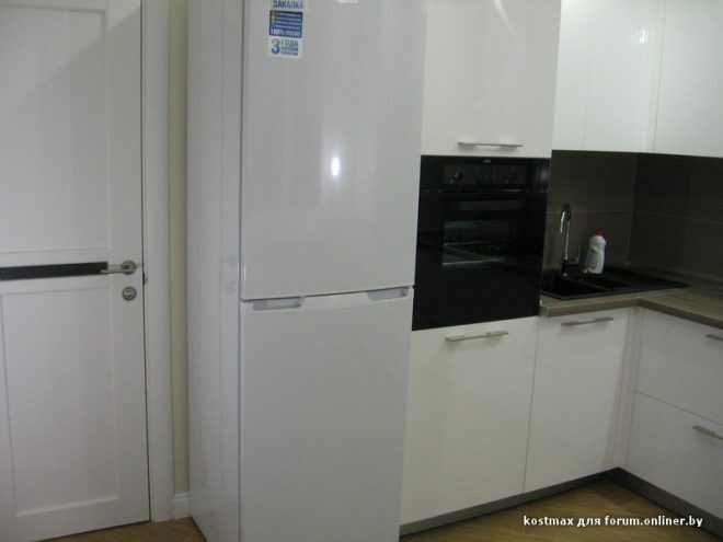
Dark monophonic walls only emphasize the purity of light facades. This classic color combination has always been a win-win. A kitchen set with simple metal handles-brackets contrasts with gray textures, which is the main idea of the design. Matt white is shaded by a variety of gray (quartz countertops, wallpaper on the walls, marble apron). And each surface is interesting and extraordinary in its own way.

The case is made of Austrian chipboard by Egger. Facades and part of the building - painted MDF. The upper and lower sections are blind sections with a simple finish, but high-quality fittings.

The area of the straight part is 2500 mm. All facades have different thicknesses, and one row is made in gray. Thanks to this technique, headsets do not seem commonplace. The hob, sink, cabinets and refrigerator were placed in the unit. Furniture cost - from 32 thousand rubles m \ p. All Blum fittings (TANDEMBOX extension systems and hinges with closers).

The countertop is Technistone quartz agglomerate (its price is from 9500 per linear meter). Czech products are safe in contact with food, resistant to household stains and modern household chemicals. A sink made of polished granite was built into the countertop. I managed to choose a color almost under the countertop.

The pencil case and bar table have dimensions of 600 mm * 2000 mm. This module separates the work area from the rest of the living room. The countertop of the bar counter is slightly recessed into the cupboard and it seems that it can be put into a pencil case. Under the work surface there is nothing but a box at the bottom of the pencil case. The design gives the whole interior lightness and airiness.

Our kitchen always has order. It is non-standard, but comfortable. And this non-standard comfort is neat and thoughtful.
With great interest I always read your comments to my articles. If you have any questions, feel free to ask them, leave, you are welcome, Your feedback in the form below. Your opinion is very important to me. Thanks to your criticism and thanks, I can make this blog more useful and interesting.
I would be very grateful if you rate this post and share it with your friends. This is easy to do by clicking on the social media buttons above. Do not forget the article you like Add to bookmarks and subscribe to new blog posts on social networks.


