Russia, Moscow region, Moscow+79041000555

 ~ 1 minute is required to read
The kitchen is 10 square meters and is decorated in a modern style in beige color. The design looks very attractive, U-shaped layout provides plenty of space for storing the necessary kitchen utensils and convenience for work. The floor and apron are tiled.
The room is small, so it is quite difficult to distribute the space in such a way as to ensure ergonomics and functionality. Therefore, the choice was stopped on a U-shaped headset. This allowed to use the corners of the room, and leave space for a dining group.
The set was made high, at the request of the owner of the housing, there should not be space between the upper cabinets and the ceiling. The furniture was covered with a roof and built-in lights were installed. On the upper shelves placed items that do not require constant access.
Photo Source - mebel86.com

On the scheme-plan of the U-shaped kitchen, it is clearly visible where and what was planned to be installed and arranged.

The kitchen is fully equipped. built-in appliancesincluding fridge. This decision made it possible to preserve the external attractiveness of the room and maintain the harmony of space. The microwave and oven are built into one cabinet, it is convenient to use the oven, and the microwave is located a bit high, children will have to stand on a chair or stepladder to warm up food.

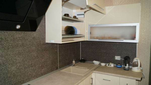
The working surface is small, despite the selected layout option. Therefore, they did not install a large sink, they confined themselves to an elegant round ceramic sink. In the color of the sink, a double water mixer is installed. This helped to avoid installing a separate filter for drinking water.
A two-burner stove is enough for the family, so a small hob was chosen. Tabletop and apron made of one material - light plastic.

The hob is integrated in a cabinet with three drawers. Here are items that should always be at hand. The top drawer is a tray with cutlery, a grater and towels. To the left is arranged tall and narrow bottler. The drawer also extends, which is convenient for cooking.

A corner cupboard is occupied by a dish rack. This is not very convenient, since it’s far to reach the corner of the cabinet. But subject to a lack of space in the kitchen, this is the only right decision. Perhaps it would be better to place the lattice for low cups at the bottom, it is easier to get plates from the upper shelf.

The dining area is separated by a bar counter, on the wall is a wine bar with a mirror wall and backlight. This design looks interesting and non-trivial, the mirror visually increases the space. The bar has a collection of wines that the landlord collects.


The dining group is a table on metal legs with a square tabletop, it has rounded corners, and a soft corner, where guests can comfortably sit.

With great interest I always read your comments to my articles. If you have any questions, feel free to ask them, leave, you are welcome, Your feedback in the form below. Your opinion is very important to me. Thanks to your criticism and thanks, I can make this blog more useful and interesting.
I would be very grateful if you rate this post and share it with your friends. This is easy to do by clicking on the social media buttons above. Do not forget the article you like Add to bookmarks and subscribe to new blog posts on social networks.


