 It takes ~ 2 minutes to read
Light green kitchen in the interior, the photo of which does not always convey the beauty of this color, has become popular not so long ago. She must be seen live and then not falling in love with such furniture is simply impossible. Today, the kitchen in light green color is on the wave of popularity, it is very cheerful and bright, perfectly blends in with modern design.

The benefits of green in creating an interior kitchen
He has a lot of epithets: perky, positive, memorable and extraordinary. In addition, color is associated with garden greens, healthy foods, and may even reduce appetite. In general, there are plenty of arguments for the kitchen to play with bright green colors.
Surprisingly, lime is very practical. Scratches and stains on such furniture are not evident. This shade is also universal. If used on the shady side of the room, it will become brighter. And when it hits the surface of the sun, it will sparkle with brighter colors. Using lime as the background design of the walls, you can highlight, emphasize and put in a winning light almost any kitchen furniture.

Secrets of choosing a green shade
- You should adhere to the rule - the brighter the color you use, the less flashy shades it should be complemented. Then the composition will not be annoying.
- If you have a light green kitchen in the interior, then the rest of the atmosphere should be neutral and muted. The brighter the headset, the more calm the walls.
- Provence, eco and modern are the most preferred styles. Provence is not complete without floral motifs and lush vegetation, and light green color in the interior will be very welcome. Shades of fresh greenery will decorate the ethno-interior, and there will always be a light, sophisticated and unobtrusive atmosphere in it.
- It is not necessary to tint all the walls in green, you can select one (wall-accent). Now popular are wallpapers in which the pattern on one side combines (or contrasts) with the other three. And this design always wins in comparison with the classic, and the boring design of several neutral colors is transformed.
- If you decide to paint the walls greenish, then it should be muffled, and other colors warmer. The combination is the opposite - light walls and light green kitchen (or an apron area) are no less attractive. And if you make additional lighting of furniture or skins, then your rich green will be magnificent not only during the day, but also at dusk and in the evening.

The best options for combining green in the kitchen
Your task is to determine the main shade, select the correct additional shade for it, use them in the required dosage, and also select the other accessories.
Today, the range of green kitchen sets is quite large. There are plenty to choose from, the main thing is complementary colors of warm shades. They are friends with light green.
You can dilute the interior with textile accessories (tablecloths, curtains, chair covers). The dishes in the tone of furniture or walls complement the original design of the kitchen.


White
The best shade of a headset in a tandem with greenish walls is white. This combination will visually expand the space and create a feeling of freshness in the kitchen. Therefore, for a small room, this range is best suited.
If you have white and light green furniture, then the surfaces can be matte, mirrored, made of colored glass or with chrome elements. This design fits perfectly into the hi-tech or modern style kitchen.
It looks good light floor, white furniture and a bright kitchen apron, complemented by other green elements.

Brown
It is more difficult to add lime to the classic interior. For wooden facades, which are often made in brown tones, a pastel tone of green is perfect. This is especially true for light and honey shades of wood. But the darker colors (wenge) will appear in contrast, creating a dynamic interior.
If you add a third complementary color, it is best if it is white or sand. And of course, wooden furnishings or furniture look best in retro surroundings.

The black
Black and light green cuisine - a very spectacular emphasis in minimalism. In addition, now there are a lot of kitchen appliances in black, and in this case we get a clear two-tone interior without any extra color splashes. Just remember that busting black will be depressing.
Sometimes black and white details are used for a more expressive effect.

Yellow
See how the yellow-green kitchen in the photo will sparkle with colors. This is one of the most striking and unusual tandems. In such a house it will always be joyful and sunny, but there will never be sad thoughts. Two-tone furniture, in which this kindred palette resonates, creates an unusually juicy atmosphere in the kitchen. It is very good to use them in a dimly lit room or in which the sun's rays do not look - the room will seem warmer than it actually is.

Orange
If you decide to use terracotta or orange, you should adhere to a strict ratio of 50:50. Otherwise, the dominant bright color will draw all attention to itself. And the third additional shade will be inappropriate.
Screaming and eye-catching paints are suitable for futurism, kitsch, hi-tech and art deco. If you need a bold and extraordinary picture, then using orange and lime, you will get it.
But there is a nuance - independently combining two such energetic colors in the interior, you risk turning the kitchen into a parody of a nightclub or getting cognitive dissonance. Remember that the more colorful the paint, the more they suppress neutral ones.

Gray
This tandem is for a design that gravitates to naturalness (romanticism, Provence, modern). It is rather difficult to enter gray-lime kitchen into the interior, since you will need an impeccable knowledge of all the nuances of the color palette and their correct dosage.
Against the background of gray walls, the greenish headset looks good, the main thing is to choose the right shades. The balancing rules will help you - the brighter the greens, the brighter the gray should be, and vice versa.

Beige
Creamy, creamy, milky notes - all this looks great in a room with shades of fresh herbs. Warm light colors, especially the ivory floor, will well shade the plain light green kitchen. On beige, furniture shapes are especially noticeable, especially glossy overflows on surfaces.

Violet
This combination is considered not very successful, especially when using dark shades. Excessive violet will create alarming feelings, and the interior itself will become gloomy, gloomy and tiring. Therefore, no matter how you like saturated orange or purple - it is better to entrust the design to a specialist.
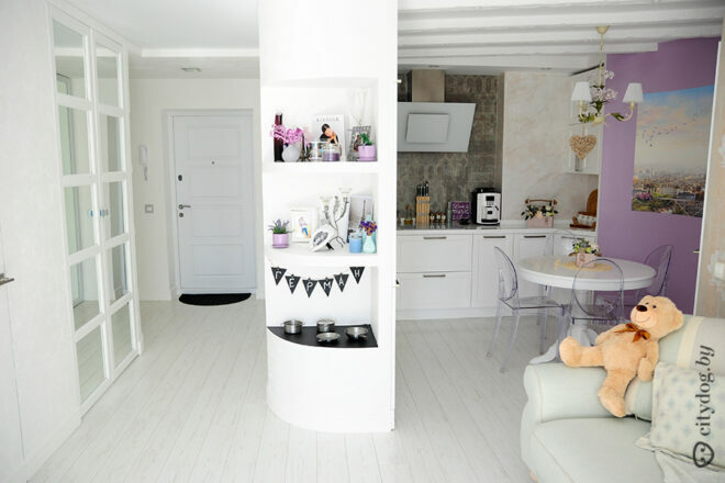
But the pastel shades of fuchsia, lavender, lilac, light or dark pink are allowed, but with caution.

Where to use color correctly
- The lime kitchen set has one indisputable advantage - the type of surface is completely unimportant to it. Metal, gloss, glass or opaque facades - everything combines perfectly and each texture in its own way reveals shades of color.
- The main rule when applying greenish - you should not allow its overabundance. Therefore, you either have a light green kitchen on a neutral background, or bright green walls, and furniture in additional shades.
- Most often, the light green color in the interior of the kitchen is found on the facades, then there are walls, an apron area, textiles, a ceiling and additional accessories. But on the floor it is quite rare, and on sale green floor coverings are not common.
- If you have a juicy and bright accessory, then in most cases there should be only one such emphasis. Otherwise, you will get a motley and ridiculous oversaturated interior that cuts the eye.
With great interest I always read your comments to my articles. If you have any questions, feel free to ask them, leave, you are welcome, Your feedback in the form below. Your opinion is very important to me. Thanks to your criticism and thanks, I can make this blog more useful and interesting.
I would be very grateful if you rate this post and share it with your friends. This is easy to do by clicking on the social media buttons above. Do not forget the article you like Add to bookmarks and subscribe to new blog posts on social networks.


