 ~ 1 minute is required to read
At the end of 2016, we got our own housing. We have been waiting for this gift for the new year for a long time, and we had to spend a lot of time on repairing the newly acquired apartment. I want to share how we arranged the most important room of our apartment - the kitchen. We have it small, only 7 square meters, but did not begin to expand the area.
Photo Source - realty.tut.by

Repair started immediately in the whole apartment. From the beginning, we prepared the surfaces, leveled the walls, made a screed on the floor. After carrying out the rough work, they took up electrical work, installed all the plumbing fixtures.
After which it came to the kitchen, because I spend a lot of time cooking, morning and evening we are going here as a whole family to eat and discuss urgent matters, often friends come to us Cup of tea.
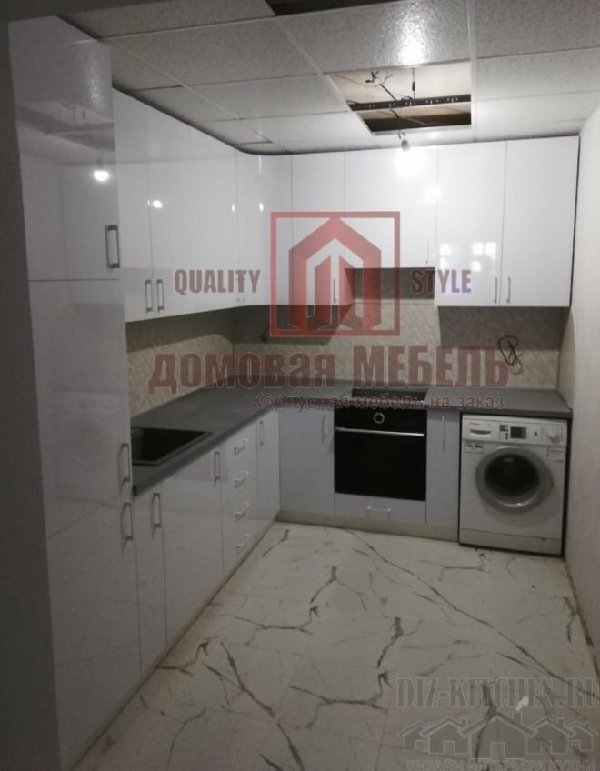
Our layout is successful, and we settled on the corner version of the kitchen. The color was chosen almost immediately, we wanted soft tones to make it a pleasure to relax. Light shades also allow you to visually make the room larger, lighter.
In addition, the window opens onto a balcony, and there is not enough light, so the white colors are better suited for this room. Glossy facades also supported the concept of bright space.

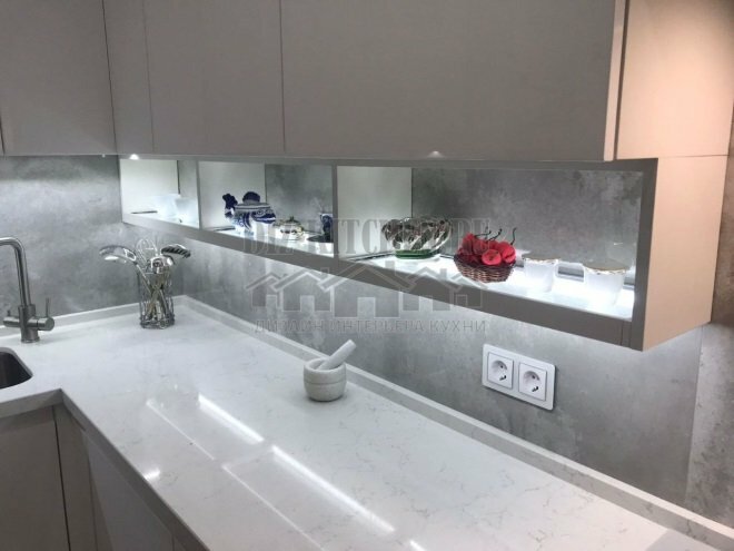
For the design of the apron, porcelain tiles were chosen to match the color of the countertops, a very organic picture was obtained. In size, it goes well with the laminate on the floor.

Choosing the material for the design of the floor, abandoned ceramic tiles immediately. It seems to me that it is too cold. At first glance, laminate flooring is not a very practical solution, but the moisture resistant option is very well suited for such a room. The remaining rooms in the apartment are also laid out with a laminate, similar in style to the interior design in the kitchen.

Long chose wallpaper on the wall. There are a lot of materials, but always something stopped, then me, then my husband. Finally, after we toured almost all of the city’s construction stores, we came across a great option. This wallpaper perfectly combines tenderness, peace and vibrant floral prints that refresh the atmosphere. Just what we needed.

The lighting was made point on the perimeter on a suspended two-level ceiling made of drywall. The classic version, and there was enough natural light in the kitchen. We also plan to add illumination of the work surface so that it is more convenient to cook.

We purchased all the equipment of the domestic manufacturer, and did not fail. Hob, oven, refrigerator - all purchased in Minsk. The only exception is the imported hood, powerful and, most importantly, silent.

The sink is in tone with the facades of white, made of artificial stone. Great material for such products. It goes well with a bronze mixer, which combines the role of a water filter. A convenient solution, given that from one tap you can get both flowing and filtered water.

The window was decorated with curtains, we successfully managed to pick up finished products suitable for design and color. I already thought that I would have to sew curtains to order, which would cost, of course, more expensive.

The lunch group - a folding table and chairs, went to us for the action. In the near future we plan to hang a chandelier, install the TV on a wall free of lockers, and purchase chairs with backs.
The arrangement of the kitchen cost us a little more than 100.0 thousand rubles. Naturally, most of the money was spent on furniture and appliances. I really like the result we got. White in the kitchen is just enough to make the room not look like a hospital room.
The lack of excessive decor allows you to turn around, and if you want to add bright details, transforming and changing the room according to your mood. Simplicity and calm shades in the interior give a feeling of peace, comfort, warmth.
With great interest I always read your comments to my articles. If you have any questions, feel free to ask them, leave, you are welcome, Your feedback in the form below. Your opinion is very important to me. Thanks to your criticism and thanks, I can make this blog more useful and interesting.
I would be very grateful if you rate this post and share it with your friends. This is easy to do by clicking on the social media buttons above. Do not forget the article you like Add to bookmarks and subscribe to new blog posts on social networks.


