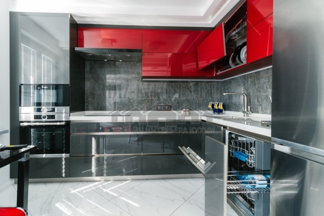
We do not have the largest corner set, like the kitchen itself - 8 meters. But the play of colors, lighting in the right places and an interesting combination of textures turned the interior into bright and solemn, with some kind of futuristic notes.
Made in the company Delta Furniture,
bigmebel-cherepovec.ru
G. Cherepovets
Attention! Earned on our website kitchen designer. You can familiarize yourself with it and design your dream kitchen for free! May also come in handy wardrobes designer.
Despite the unusual tandem, the color complex turned out to be quite balanced. Bright red visually brings the top row closer and compresses the space. Therefore, it seems that the room has a lot of furniture of different geometric shapes, although these are standard modules of 2600 x 1900 mm.
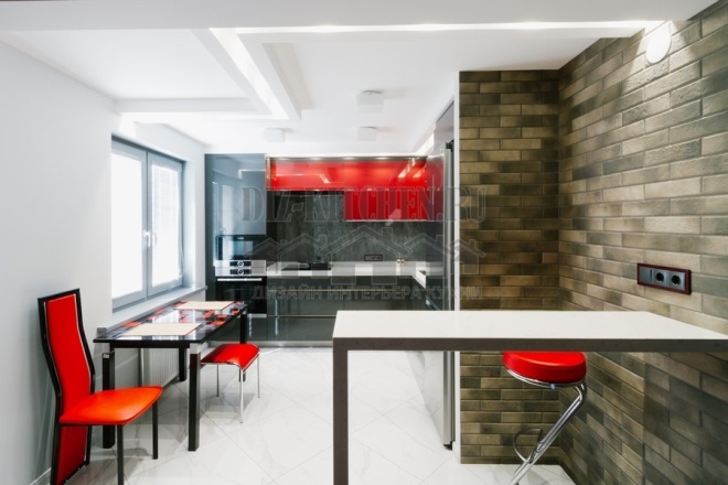
Neutral gray counterbalanced the active red hue. Both colors harmonize well with steel appliances and frosted glass. There is much less red, so it does not overwhelm or irritate, but only acts as a bright accent for achromatic gray.
All materials are similar in color (MDF facades, stone countertops, household appliances), but differ in texture. And this does not stop them from creating a harmonious and stylish environment. Even the silver chrome refrigerator fits perfectly into the big picture.
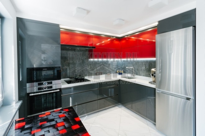
The tabletop was specially made white so that it did not allow the upper and lower tiers to merge into one color spot.
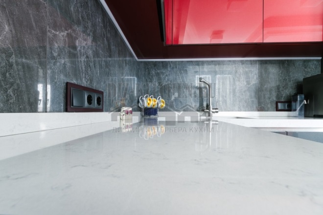
The wall panel is a marble stain. When the backlight is on, the stone transforms and plays, forming a deep volumetric niche.

Our kitchen has 2 tables - the main dining room with a glass red and black top and a small, dainty bar counter at the other end of the room. The red and black surface of the table and chairs complemented the bright modules of the facades.

Despite the main gray color, the interior turned out to be not at all difficult for perception, but on the contrary - catchy and stylish.
average rating 0 / 5. Number of ratings: 0
No ratings yet. Be the first to rate.
