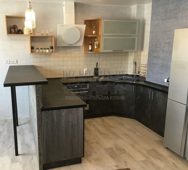
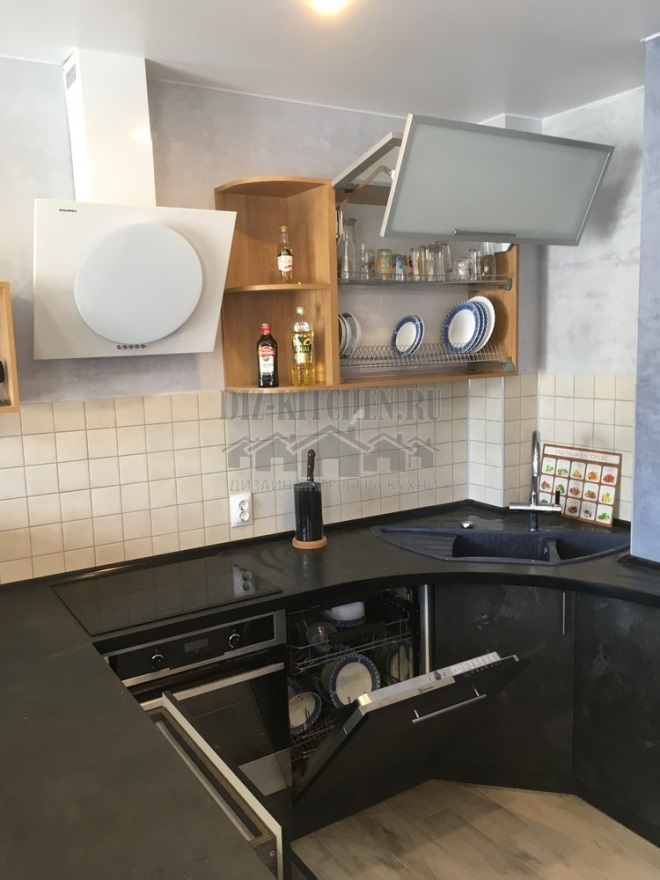
Our kitchen is a mix of strict geometric shapes, interestingly combined with each other: a round hood, square shelves next to it, a multilevel countertop. The kitchen itself is U-shaped, but it does not extend from wall to wall, but moves closer to the window into an elegant bar counter.
Made in the company Delta Furniture,
bigmebel-cherepovec.ru
G. Cherepovets
Attention! Earned on our website kitchen designer. You can familiarize yourself with it and design your dream kitchen for free! May also come in handy wardrobes designer.
The main color scheme is a combination of light (top) and dark (bottom) wood. A balanced tandem of colors does not seem boring at all. Although the facades are made of MDF in PVC foil, both look solid and warm. Laconic facades without frames and panels are decorated only with a noble walnut pattern.
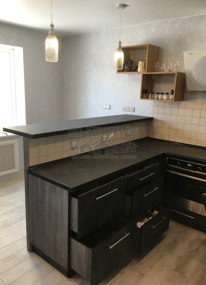
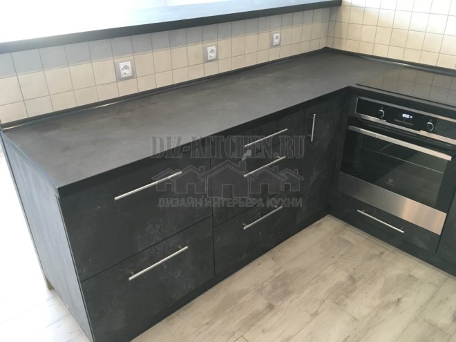
A darker bottom is more practical. It balances the proportions between all furniture and the rest of the objects. Chrome-plated details of handles and household appliances harmoniously complemented the dark palette.
The kitchen area is small, and it was thought to place both the table and the main set on one side. We decided the issue a little differently - now the furniture does not occupy the entire wall. It ends with an impromptu bar counter, which acts as a divider into zones.
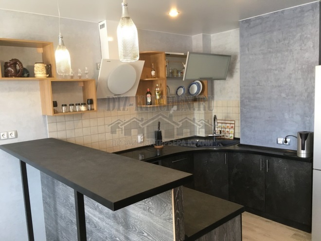
I wanted something unusual in the interior and this object was the dining table-bar counter, which, in combination, acts as a continuation of the table top. On the one hand, this is an ordinary work cabinet, on the other, it goes into a high side with another surface.
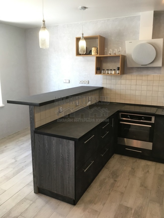
Attaching high bar stools to it, this design can easily replace a dining table. The table top is supported by 2 graceful legs for greater stability.
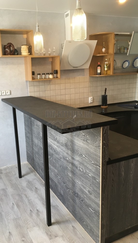
In the top row, we have only one module. The rest of the space is occupied by an inclined hood, an open shelf and a ledge on most of the wall. Thus, solid monolithic cabinets do not seem very bulky and heavy, and glass fronts and open shelves brought lightness and airiness into the overall picture.
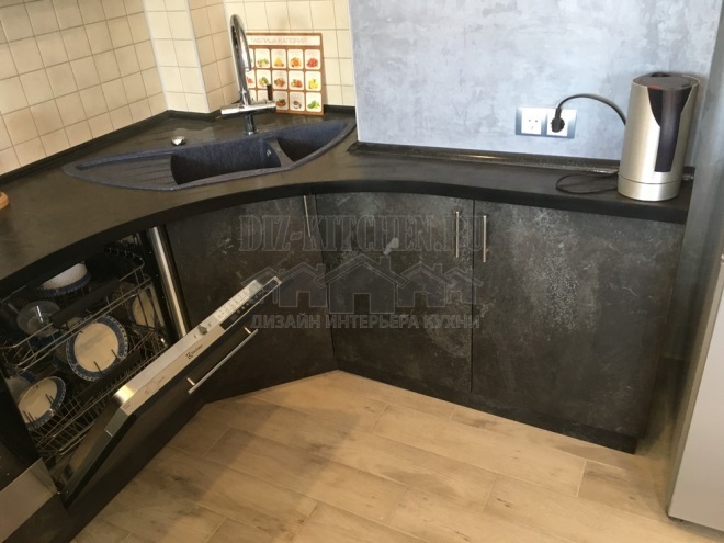
There are many protrusions and corners in the wall, but they are all beaten without damaging the main line of the headset. The worktop and cabinets gracefully wrap around all corners, all thanks to custom-designed furniture. The sink is in the corner, next to it is a dishwasher and an oven.
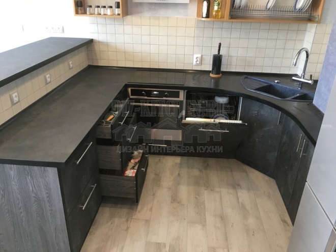
The upper facade folds in half. Large, heavy doors slide up easily, leaving plenty of headroom overhead. The entire lower part of the wall cabinet was taken up by a dryer.
Our kitchen solved many problems at the same time - it correctly organized the existing space into a single whole, while transforming it into an interesting and memorable interior.
average rating 0 / 5. Number of ratings: 0
No ratings yet. Be the first to rate.


