My mother unexpectedly (for me) got married a second time and left for another city. And our family had the opportunity to live in a separate apartment and feel like masters. And also part-time designers, artists, etc.
PTC "CLASSIC"
G. Moscow
More about the companyI don’t know how to whom, but travel and renovation bring me the greatest joy in life. Preparation is somewhat similar to each other - first, a long thinking about the concept, then working out the details and the grandiose event itself. An impressive result then warms the soul and gives the best emotions. You can only enjoy the renovation for a long time, but from the trip only photos and memories remain. But all the same, I want to repeat both of these actions over and over again.
Therefore, we made the decision to renovate almost immediately after the move. We put a lot of effort into the kitchen, as this is the place where the family spends the most time. I painted the wallpaper myself, having received great pleasure in the process. Our apartment is a full-length stalinka building with a ceiling height of 320 cm. Therefore, together with the designers, it turned out to embody on an area of 14 m
2 many ideas.Attention! Earned on our website kitchen designer. You can familiarize yourself with it and design your dream kitchen for free! May also come in handy wardrobes designer.
The kitchen is designed in a modern style. Italians know how to make furniture that will look modern, stylish and expensive for a long time to come. Linen colors are always relevant and popular. Ash shimo added light and coziness to the room, and gray cold wallpapers only set off the warm wood. Light-colored ceramic tiles on the floor also match the furniture facades.

The decoration of blind facades is simple - toning of veneer with etching. Thus, the texture of the wood is emphasized. Scully Lino's Italian facades (22 mm thick) were used. The furniture body itself is made of Austrian laminated chipboard by Egger, the frame and the veneer inside it are made of ash.

The height of the ceilings made it possible to arrange as many as 2 rows of cabinets in the top row and also to sew up the rest of the space with plasterboard (on which wallpaper was pasted). We placed the exhaust and water pipes in the drywall.

Below we used a Volpato base. The slats are made of aluminum, covered with brushed steel effect foil. In addition to the fact that the joints of the surfaces are completely sealed, the base itself is perfectly combined with the handles and the oven.

Inside the cabinets there are Blum mechanisms. All top cabinets are equipped with Aventos lifts, so large and heavy fronts can be opened with ease. The latches allow you to keep the doors completely open and this is very convenient during cleaning and when you put dishes in the cupboard. Moreover, if you have as many as 2 rows of upper cabinets and you use them most often.
A built-in refrigerator and a similar freezer (countertop floor on the right) is another dream come true. It is the refrigerator in almost any kitchen that is allocated with a foreign body. The exception is metal surfaces, but this is the kind of kitchen I would like to myself the least. Having covered the household appliances with a wooden facade, we got a more harmonious interior.
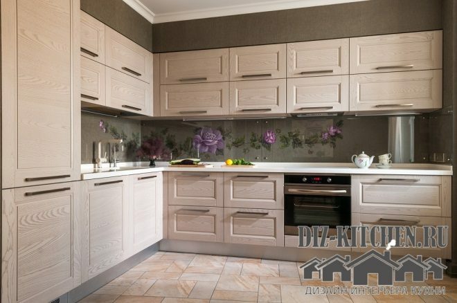
The dishwasher (to the left of the stove) was also placed under the double façade. On the lower facade, one knob is false, it is needed to keep the general line.
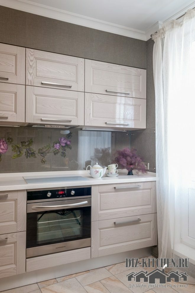
The apron is hand-painted on the same wallpaper as throughout the kitchen. I couldn't pass up the opportunity to make my kitchen unique. An art school, graduated in childhood, has become necessary more than once in adulthood. This skill came in handy this time too. True, for the first time I had to draw on the floor (since the surface is large), but I think I succeeded.
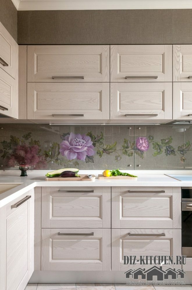
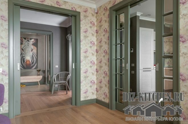
I really love purple and lilac shades, especially in the form of accents. Chairs, delicate blossoms on the wallpaper in the corridor - my favorite color scheme is present a little throughout the apartment.
And even from the purple scumpia growing under the house, I create small compositions)))
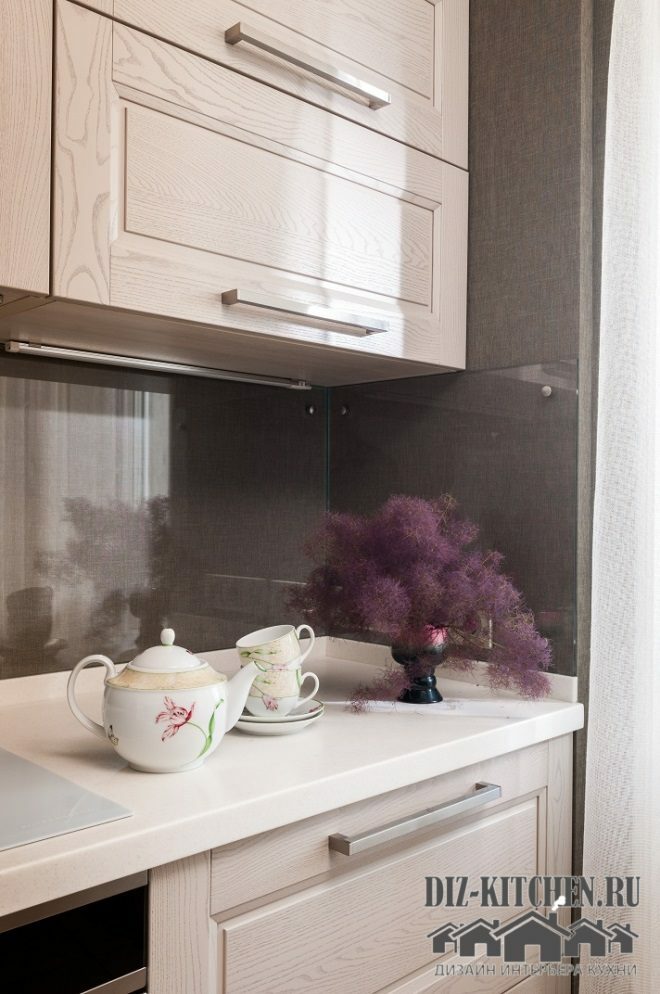
Flowers made the apron delicate and stylish. I used acrylic water-based paints for painting. They are bright, dry quickly, do not smell, and the pattern itself can be corrected in the process.
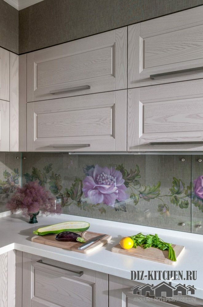
To protect the wallpaper, we ordered tempered glass, which not only withstands impacts and oil splashes, but also does not distort the pattern on the wallpaper. The apron has become such a necessary accent without overloading the interior in the least.
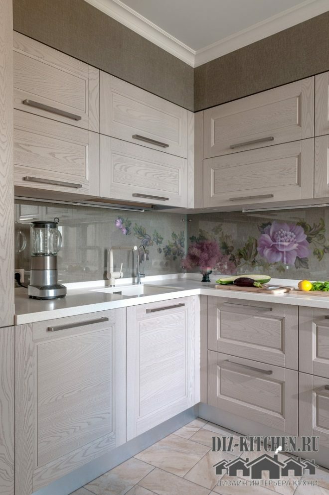
Our table top is made of artificial stone TriStone (Art Nouveau series). By the way, on the classic white acrylic surface, streaks and water stains are practically not visible (unlike dark ones). And taking care of her is as easy as shelling pears.

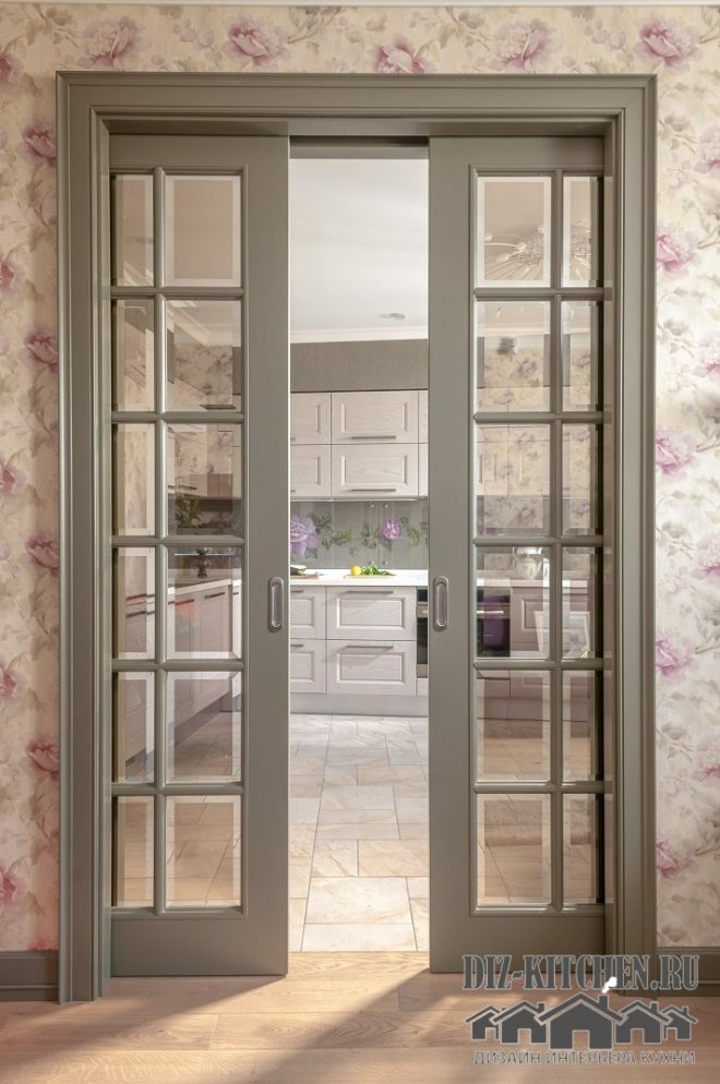
We decorated all openings in the apartment with green (basil), using sliding doors. Thus, we saved a little space in the corridor.
In general, how good the kitchen is is up to you. Personally, I really like the end result. And yet I am not tired of answering the most common question of guests: "Where is your refrigerator?"
average rating 0 / 5. Number of ratings: 0
No ratings yet. Be the first to rate.
