A small kitchen of 10.5 square meters looks best in light colors. This design allows you to create a light, airy space, visually enlarges it. Corner layout Is a great option to save space. The modern style emphasizes the refined taste of the apartment owners.
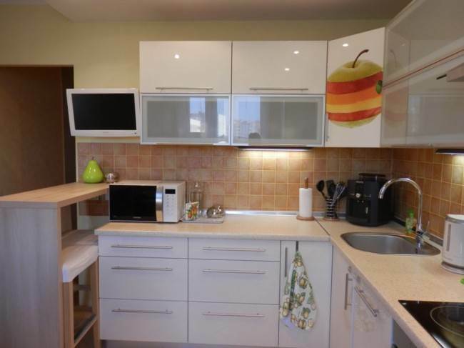
The kitchen set with painted glossy fronts in white has frosted glass inserts in aluminum frames. They allow you to hide items stored on the shelves. The body of the furniture is made of MDF. There are both free-standing and built-in appliances.
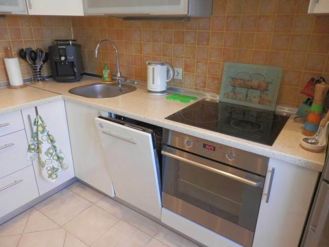
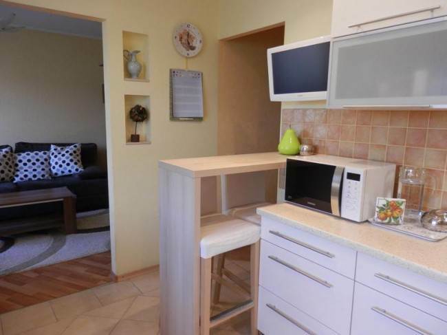
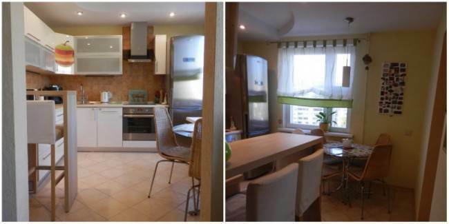
A refrigerator with a silver door nestles comfortably by a window in the corner. Nearby there is a built-in oven with a hob, then there are a work surface and a sink. There was a place on the tables for a multicooker, a coffee machine and a microwave oven. The working area is large enough to comfortably prepare food.
Attention! Earned on our website kitchen designer. You can familiarize yourself with it and design your dream kitchen for free! May also come in handy wardrobes designer.
Photo source - rebenok.by
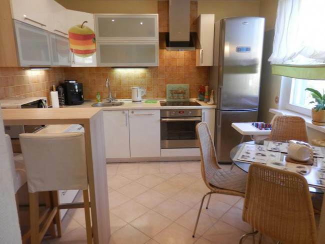
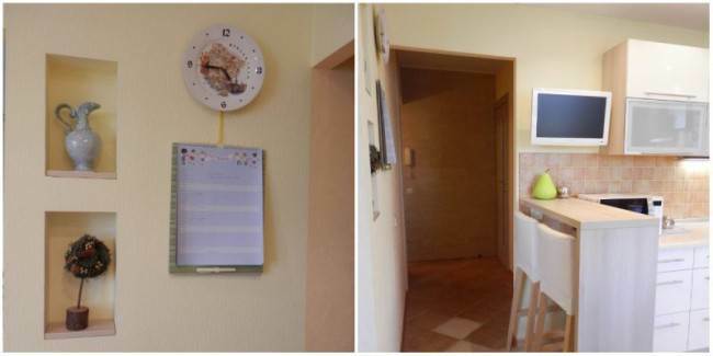
The layout of the kitchen is very successful, there are two exits at once, one of which leads to the living room, and the doorways are open. The owners completely abandoned the doors. This neighborhood provides several advantages, the main of which is the ability to visually expand the kitchen space.
The living room area is small, this room is a walk-through. The absence of doors allows the family to communicate more freely while cooking. The hostess can calmly observe what is happening in the next room, which is very important when there are small children in the family. An open doorway does not interfere during cooking either, since a powerful hood is installed in the kitchen, and odors do not spread throughout the house.
Renovation work in the kitchen was carried out before moving into a new home. At the first stage, a stretch ceiling was created, floor tiles were laid, the walls were covered with wallpaper. Kitchen apron decorated with ceramic tiles. It is worth noting the complex geometry of the ceiling device. This was done in order to hide the corrugation from the hood under the tensioning structure.
The stretch ceiling has created high-quality lighting. Many spotlights are mounted on its surface along the perimeter. With the help of lighting, a work area and a place for eating were highlighted.
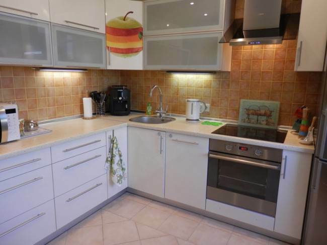
Decorating floors with ceramic tiles solved several problems at once. It is a practical and inexpensive material with a long service life. The choice in favor of tiles made it possible to create electrically heated floors, a thermostat was installed below. The kitchen is always warm, especially during the off-season, when the central heating is not yet turned on. This question is relevant for families with children.
Wallpaper for painting for this room was not chosen by chance. Any minor defects and damage that appear during operation can be easily removed with a roller and paint. The living room and the adjoining corridor are decorated with similar material. This made it possible to unite the space of the premises in a single style.
Lemon walls and an apron in juicy orange tones look very elegant. The battery is also painted lemon yellow so that it does not stand out against the general background. The arrangement of the kitchen began after the rest of the apartment had been completely decorated, and the first thing a large roomy refrigerator appeared here.
During the organization of the kitchen interior, the apartment owners did not have the opportunity to contact professional designers, so all decisions on the arrangement were made independently. Various directions were considered, from classical style to high-tech. Interior magazines were studied, dozens of catalogs with kitchen furniture were looked through, until all family members agreed on a common opinion.
The design of this room is based on the principle of openness. When creating the kitchen interior, the owners of the apartment decided to be guided by the ideas of creating a practical and functional space, the color scheme is light and pleasant. Being in this room should not only be comfortable, but also set a positive attitude for the whole day.
As a result, it was decided to purchase a white headset, which the owners did not regret at all. White furniture fits very organically into the overall interior, it looks elegant and not pretentious, makes the kitchen visually spacious. The feeling is created that the headset seems to dissolve in space.
Caring for a light surface seems difficult only at first glance. It is enough to wipe the glossy surface of the facades once or twice a week with a rag and spray for glass cleaning, and it is like new again. On it, streaks, drops, fingerprints are absolutely not visible. The hostess does a complete cleaning of the room with the help of a steam generator once a quarter, this is quite enough to keep the kitchen clean.
When setting up the kitchen, special attention was paid to the technical components. Installed high-quality three-stage drinking water filters. They are equipped with a convenient tap with a built-in channel, made in Spain. There are main filters at the inlets of hot and cold water.
They did not save on the arrangement of cabinets either. All doors are equipped with Austrian-made door closers and fittings. The bottom of the cabinet, where the sink is placed, is protected by a mat from leaks and damage. Separately, you can turn off the water supply to the dishwasher, tap and filter unit.
The working area is very well equipped. There is an independent illumination of the working surface, three switches are separately brought out, allowing you to determine the zone lighting. Arranged illumination of the table top. On the surface of the working area, all the necessary kitchen devices used daily are located, the rest of the equipment is located in the cabinets.
Although the base triangle rule is not followed, cooking is convenient. The angular layout has created a small, linear work area, with all the necessary household items at hand.
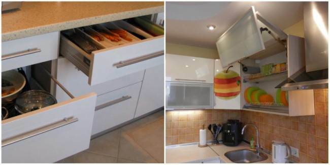
In the future, you can increase the free working area by abandoning the stationary microwave, replacing it with an oven with similar functions. During operation, it became clear that hanging cabinets under the ceiling would be more convenient, this would increase the useful space and reduce the time for cleaning. Combined wardrobes with a common door are more convenient to use, a large front has fewer handles.
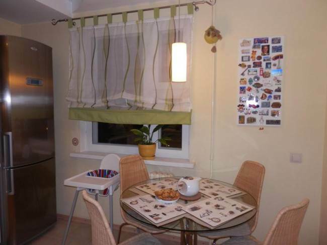
But rebuilding a finished kitchen is more difficult and more expensive than buying a new headset. Therefore, these ideas had to be abandoned. But the dining group is very pleased, the main component of which is a round glass table. Glassware looks elegant and does not burden the space, like the original wicker chairs.

The second eating area is bar counter, which is located at the entrance to the kitchen. It can easily accommodate two people. At the counter it is pleasant to have a cup of morning coffee, it is convenient to sit with a laptop or spend the evening with a glass of delicious wine. It is also used as an additional serving surface when receiving guests.
A large dining area nestles comfortably by the window. Family feasts are held here. The table top is attached to the leg with suction cups, which makes it easy to remove if necessary. The entire structure can be easily moved to an adjacent room. If a large company is going, then a special folding table is used.
Nice little things add personality to the kitchen - an interior sticker in the shape of an apple, a board with magnets that appear after family travels. A laconic Roman blind hangs on the window, serving napkins and pillows on chairs are made in the same color scheme. All together this allows you to create a pleasant environment that will give you an excellent mood for more than one year.
average rating 0 / 5. Number of ratings: 0
No ratings yet. Be the first to rate.
