Russia, Moscow region, Moscow+79041000555

 It takes ~ 2 minutes to read
The kitchen was originally an isolated space. But then the redevelopment was carried out. She became one with the living room. The Scandinavian style was chosen to create the interior. Some of the elements were borrowed from other styles popular today. Writes an online magazine about Minsk CityDog.by
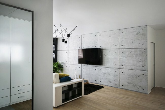
The unique elements of this space are concrete. In the living room, the wall is decorated with concrete tiles. In the same design, the lamps that are provided above the table. Concrete objects are unusual accents. The rest of the interior was created in the usual Scandinavian style.
Attention! Earned on our website kitchen designer. You can familiarize yourself with it and design your dream kitchen for free! May also come in handy wardrobes designer.
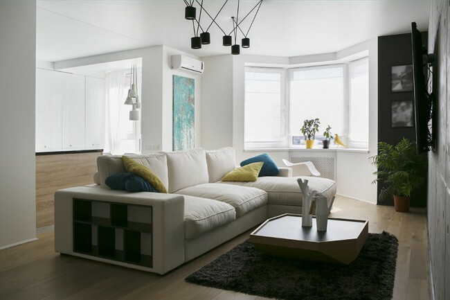
The redevelopment made it possible to fill the room with maximum light. At the same time, the space is decorated in the same style. The room becomes visually larger. This is ensured by the abundance of light, as well as the unusual arrangement of the furniture. Suitable colors have been chosen for the interior. This is natural wood,
grey and white. Natural wood can soften gray and white. These colors become much calmer.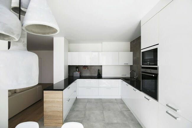
The headset is large. Into it built in irreplaceable technique. It is located in special cases. Height of cabinets to the ceiling. They look monolithic. The dishwasher and sink are located to the left of the sink. The hob is provided on the wall in the center. Pull-out storage boxes are located directly below it. The classic rule of the triangle is observed - this is a stove, a sink and a refrigerator. Between the listed vertices of this triangle there are surfaces for preparing delicious dishes. They allow you to prepare culinary masterpieces in the most comfortable conditions.
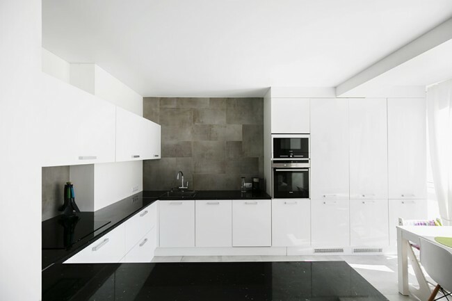
The color of the fronts is white. Their surface is matte. The table top is finished in a contrasting black color. Combined apron. Behind the hob and in the sink area without cabinets, dark gray porcelain stoneware was used to decorate the walls. Other walls are crystal white.
The kitchen is separated from the living room by shallower cupboards. They become optimal storage systems. Also, if necessary, they ideally replace the bar counter.
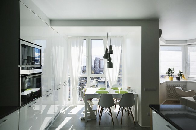
Opposite the window is dining group. The color of the table and chairs is crystal white. Luminaires made of concrete are provided. On one side, the table rests directly on the wall. This position is optimal for comfortable placement along the long sides. White tulle was chosen for window decoration. It transmits light well.
Kitchen is not only furniture... Which one would you prefer?
Japanese
17.35%
Georgian
15.31%
Thai or Korean
8.16%
Russian
59.18%
Voted: 98
In order not to lose, tell your friends
Follow us on social networks


Dear visitor!
With great interest I always read your comments to my articles. If you have any questions, do not hesitate to ask them, leave, please, Your feedback in the form below. Your opinion is very important to me. Thanks to your criticism and thanks, I can make this blog more useful and interesting.
I would be very grateful if you rate this post and share it with your friends. It's easy to do by clicking on the social media buttons above. Do not forget the article you like Add to bookmarks and subscribe to new blog posts on social networks. 
Anna, editor of diz-kitchen.ru
© 2015 - 2022 | All rights reserved. At a reprint of materials the active link to the source is required. | User agreement and privacy policy
All characters and stories are fictional, and any coincidence with real or living people is accidental.
