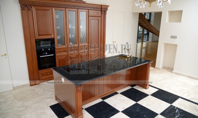
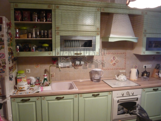
About three years ago we bought an old house. The total area was 80 square meters, but the layout was just awful. Seven tiny, partly walk-through rooms, a small kitchen lacking the most important thing - space and light. I had to conjure over the redevelopment project, and finally, we settled on the most optimal option.
Photo source - realty.tut.by
Attention! Earned on our website kitchen designer. You can familiarize yourself with it and design your dream kitchen for free! May also come in handy wardrobes designer.
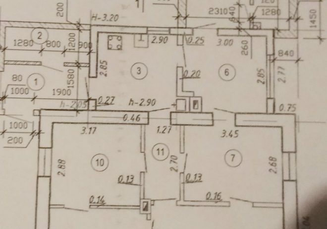
I have always dreamed of a large, spacious kitchen-living room, and according to a new project, we had to combine three rooms and a small corridor. The result is impressive - we got a large and bright space of 29 square meters. Now there was where to turn around.
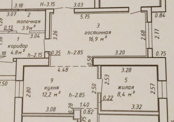
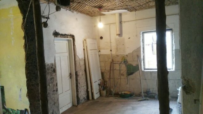
Before the renovation began, the premises were in a very poor condition.
For the arrangement, we chose the highest quality materials, we decided not to save on repairs, because we did it for ourselves and for more than one year. I must say that this is a life decision, because once we already made the mistake of buying a cheap kitchen. A year later, they regretted it. Despite the fact that they used it very carefully and carefully, soon the light surfaces turned yellow, the coating swelled up, and the fittings became unusable.
Our new home was to become our reliable fortress, so the choice in favor of high-quality natural materials was a foregone conclusion. A good headset will not only last a long time, but will also delight the eye. We dreamed about Yavid furniture for a long time, so we went to a specialized furniture salon.
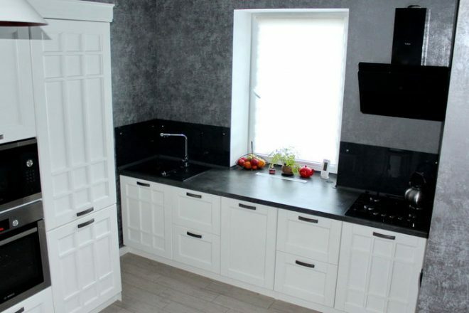
We were completely satisfied with the approximate calculations of the project, the expectation and reality in terms of quality and the prices matched, and we ordered a white set of Verona model with high quality fittings of the famous brand. A round sink made of artificial stone, which we received as a gift from the company, perfectly matched it. It’s even strange that before we were frightened by the prices of modern high-quality kitchens.
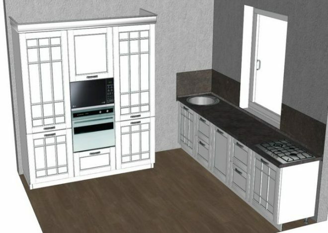
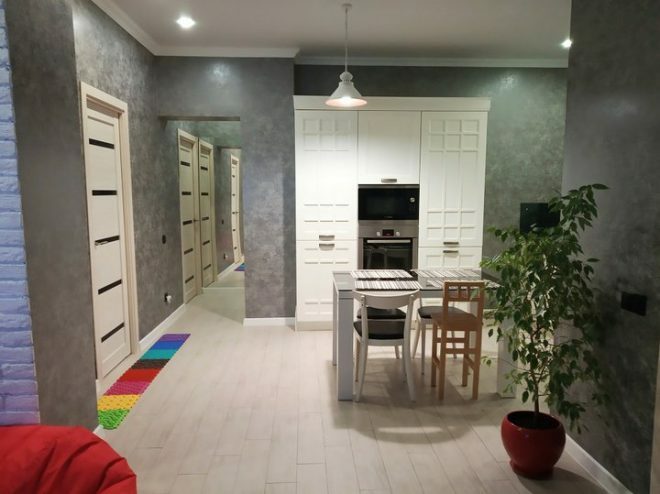
White was not chosen by chance. This is an ideal option, which, in combination with dark colored walls, looks very dignified. Caring for white surfaces is absolutely not intimidating, high-quality materials allow you to maintain order without difficulty, even in such a complex room as a kitchen.
At first glance, our kitchen project may seem like one of the favorite trendy options on the White Kitchen theme, but it is not. Even the proportions of the room, which were obtained from three separate rooms, differ from the standard ones. The layout turned out to be rather complicated, taking into account the non-standard arrangement of doors and windows, the presence of protrusions. Therefore, I had to smash my head over the choice of furniture.
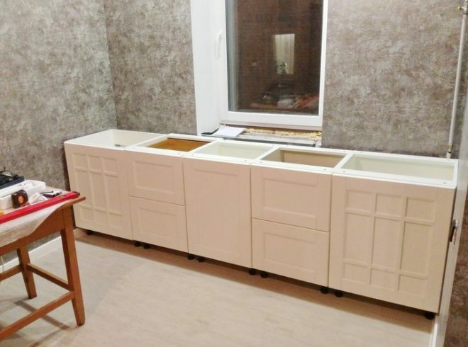
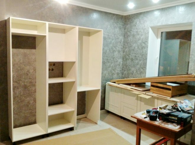
We got it so that the kitchen area looks detached, despite the combination of premises. Any amount of furniture could be placed in this area, but we did not order corner models. Free-standing parts of one headset look harmonious due to the unity of color and design. For many, this composition may seem very controversial, but for us this option is convenient. Although, perhaps, a model with an island would have looked more appropriate.
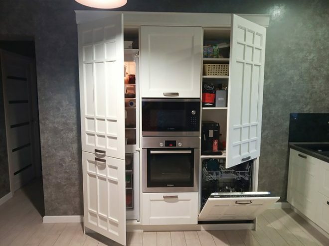
During the furniture assembly process, we installed all the built-in appliances. It turned out to be a great solution to hide household gadgets in a headset. As a result, the microwave, oven and refrigerator are perfectly hidden from prying eyes. This is an important point considering that the kitchen is combined with the living room. The pencil case contained a coffee machine, there was also room for storing cups.
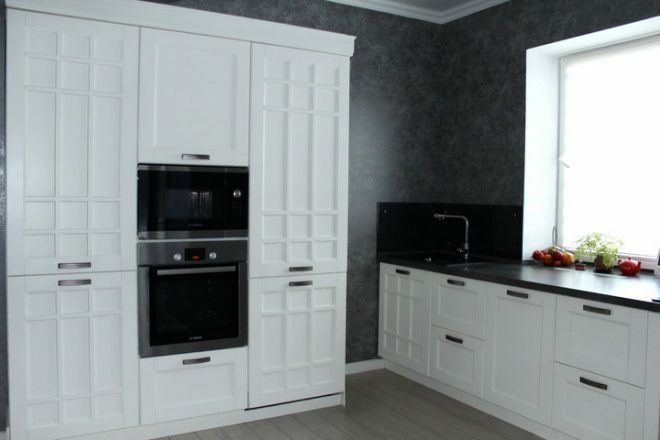
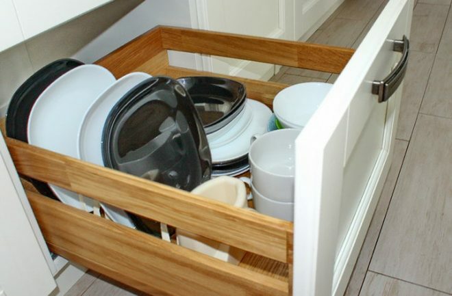
The dishwasher has made it possible to abandon the classic dish drainer; clean items are stored in a pull-out oak drawer. Hinged modular lockers, which visually make the space heavier, were not required either.
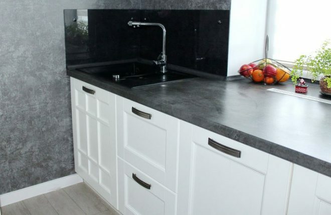
The work surface in front of the window is another good solution in my opinion. There is always a lot of light here. The sink was installed in the left corner, and the hob was placed to the right of the sink. The convenient location allows you to cook in comfort. The anthracite washbasin matches the postforming gray mother-of-pearl top. The mixer was chosen so that it was possible to connect a water filter.
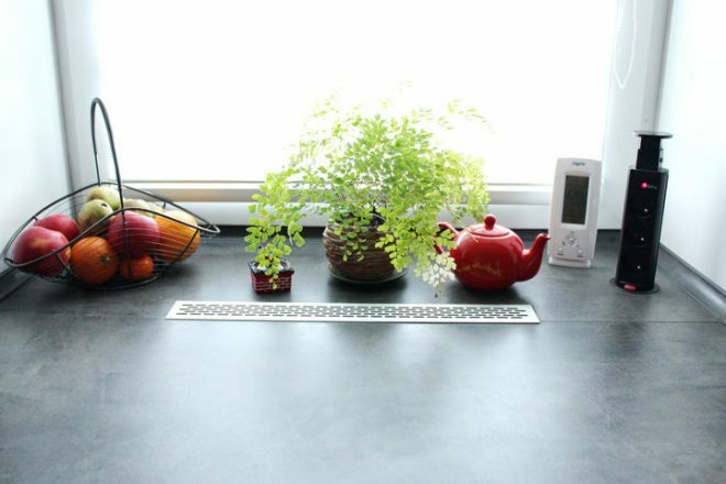
The working area is 1.5 meters long, the ideal size to create an ergonomic and comfortable working space. The table top has a smooth transition to the window sill, under which heating radiators are installed. The circulation of warm air is regulated by means of a special grill.
The wall next to the work surface is covered with a glass panel. For skinning, we chose a gray glass with a thickness of 8 mm, all measurements were taken independently. This is the most suitable material for decorating a work apron, easy to clean, looks very stylish.
I didn't want to cut the glass, so we made the sockets built into the windowsill. A practical, convenient and inexpensive option, we use a tee to work with a blender and a food processor, and connect a multicooker here.
The hob with a hood is located on the right side, the black glass surfaces perfectly support the chosen style and do not stand out from the general concept of the room.
We also bought a built-in refrigerator, I really didn’t want to get away from the idea of “hiding” the equipment. Although at first I was worried that there was not so much space in the built-in model, and the prices differed enormously from stand-alone devices. As a result, we chose an inexpensive option from a domestic manufacturer.
There is no No Frost system, this significantly reduced the cost of the product, compared to imported counterparts, the price was almost twice as low. But we had to defrost the refrigerator only once in three years of use, so I don’t regret the choice. It is convenient to use it.
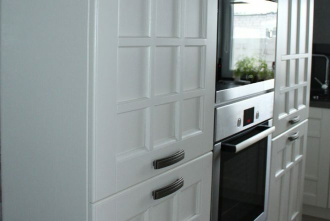
A pencil case is a great way to hide equipment. We also put a dishwasher here. The project provided for a water supply to this place and access to free sockets in advance. I didn't have to redo anything, the dishwasher is convenient to use. Previously, they wanted to put the car under the window, but abandoned this idea.
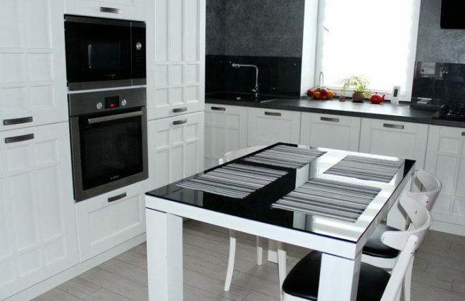
The dining group so far consists of an old table, which we brought from the previous apartment, and chairs. They had to be refurbished a bit, the seats were re-tightened and painted white. They look very laconic, perfectly supporting the design of the kitchen. So far we are not going to change anything, but in the future we dream of purchasing a beautiful table and chairs made of natural oak.
Since our kitchen is combined with the living room, they did not hang a separate TV in this room. The screen installed in the living room is perfectly visible from any corner of the kitchen.

About 350 thousand rubles were spent on the arrangement of the kitchen, of which 220 thousand are for a set, 108 thousand for kitchen devices. It seems that it is expensive, but our goal was not to save money. We chose quality and durability as well as functionality and convenience. Initially, it was clear that cheap does not mean good.
I like the result of our work, and the appearance of the kitchen, and the colors, and its ergonomics. We use this room with the whole family, we have two little children. Therefore, it was important for me that it was easy to maintain order, and cleaning took a minimum of time. To do this, it was necessary to think over everything to the smallest detail.
We are not experienced designers, perhaps more interesting ideas can be realized in such an area. But I think we did great!
average rating 0 / 5. Number of ratings: 0
No ratings yet. Be the first to rate.

