The fashion for different stylistic solutions used in the design of the kitchen space is constantly changing. But the classics are relevant at all times. In a relatively small room, the interior is very well implemented with corner layout in country style. Wood furniture with solid wood facades is always in demand. It looks very organic. The floor is lined with linoleum in the color of the kitchen, the apron is tiled with light tiles.
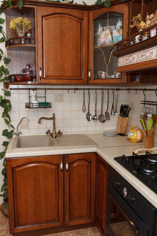
The classic trend in the interior design of this kitchen can be traced very clearly. But there are some space disadvantages, rather related to the convenience of using the kitchen. This is due to the fact that the layout is not particularly successful. The sink is located on the edge. The sink is large, with a dish drainer and takes up a lot of space.
As a result, the working surface has shrunk. The corner is practically not filled, it is extremely inconvenient to use this part of the table. Reduces the possibility of creating a comfortable working area and the unsuccessful position of the hood. They did not transfer it, and the hob had to be installed in the center.
Attention! Earned on our website kitchen designer. You can familiarize yourself with it and design your dream kitchen for free! May also come in handy wardrobes designer.
Photo source - rebenok.by
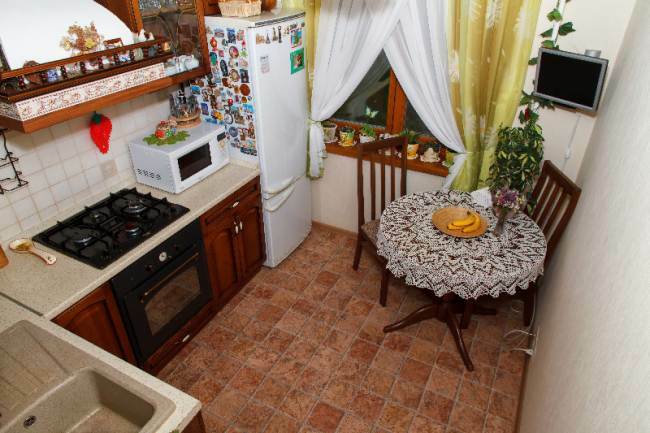
The kitchen room can be called a classic corner in an apartment. The idea to decorate it in this style came to the head of the owner of the apartment, he was also engaged in bringing it to life. Despite its small area, this nook is popular. Here the family celebrates holidays and spends a lot of time on weekdays. Therefore, it was important to get a homely, cozy and warm atmosphere.
The design was based on the concept of creating a calm and comfortable space, for this, whenever possible, only natural materials and natural tones were used. On the way to the dream, I had to reconsider some desires and bring them to reality. The main reason for this was the small area, it does not exceed 7 square meters in a standard panel house.
The time frame for repairs was also set quite long, this is due to the limited finances and payments on loans. Since all the premises of the apartment were being renovated at the same time, they had to save on everything. In addition, shortly before the renovation, a large white refrigerator was purchased, which could not be replaced. But a compromise was found.
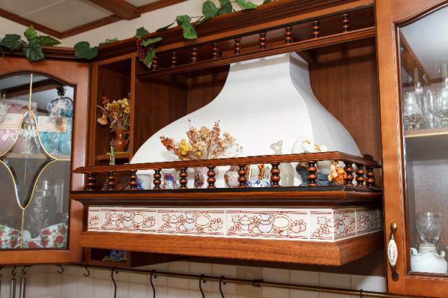
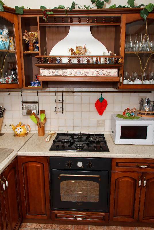
The main highlight of the new interior is an elegant hood, created by hand in the best traditions of Russian national decor.
Since the family did not turn to specialists at the kitchen planning stage, the hood turned out to be quite large and takes up a lot of space. It is more expedient to install more compact structures in a small room. This would save space for the top cabinets and increase storage space.
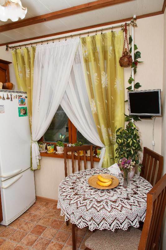
The country style was supported by the installation of a wooden window frame. In search of creative research, it was decided to create a kitchen set project on their own, and take into account the location of the hood. Elements for the organization of ventilation were ordered at the same time.
It was not possible to position the sink by the window, as it was originally intended, it was installed in the cabinet of a small part of the headset on the edge.
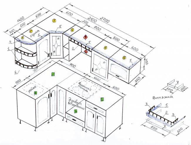
The cabinet fronts are made of solid wood, painted brown. Countertops in beige tones look interesting and harmonious.
Work apron and light beige walls. The family refused the door, the entrance is decorated in the form of a drywall arch.
A bit of history
There were some curiosities, the designer proposed to make the handles on the upper cabinets adjacent for symmetry and beauty. But in reality, this arrangement turned out to be very inconvenient and made it difficult to use the doors. Therefore, the door for the drying cabinet had to be redone, which led to additional waiting.
But now both the owner of the kitchen and the designer know that it is not necessary to arrange the doors of adjacent cabinets in such a way that they open towards each other if one of these cabinets is corner.
Technics
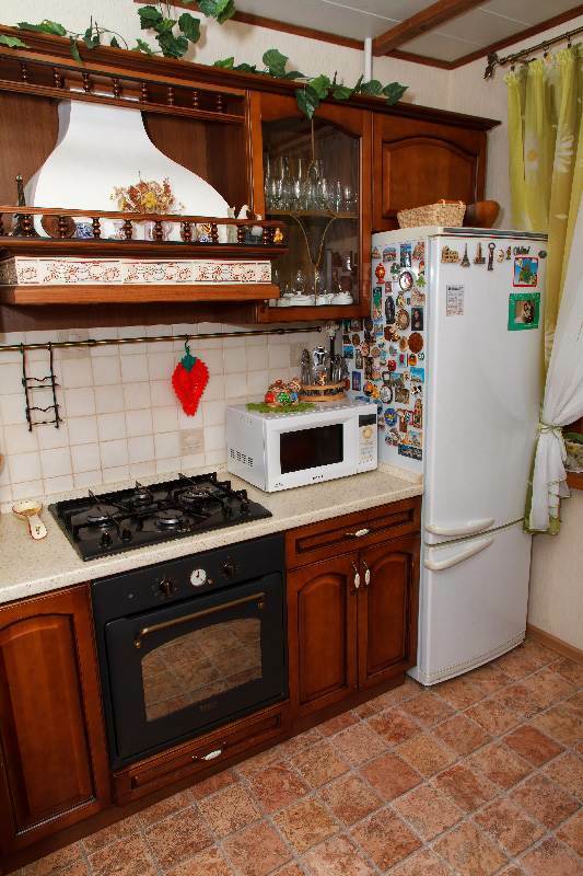
A brand-name was purchased for the new kitchen gas hob and an electric oven, both built-in. An old LCD monitor, which is used as a TV screen, has been successfully placed in the room. Even in his student years, the owner used it to write a dissertation.
A large two-compartment refrigerator from Atlant is located in the corner. A small kitchen requires a competent approach to using the area, and it would be better to buy a built-in refrigerator. But this unit was purchased in advance. So that it does not stand out against the background of the rest of the furniture and appliances, one of the walls was covered with magnets.
These design elements are a whole story. They were brought from trips, each individually magnet raises pleasant memories and gives positive emotions.
Nearby is a retro-style microwave. It fits perfectly into the prevailing interior, matching in color with the refrigerator, handles on the headset and railing. Although it is also planned to change.
Rustic country style and natural materials were not chosen by chance. It is known that only natural materials are able to age beautifully, remaining practically unchanged. And in any case, the equipment will have to be changed sooner or later, but while the old units are working, it makes no sense to acquire new devices.
In the future, it is planned to purchase other kitchen appliances, additional sockets have been created for it next to the working area.
Ceiling
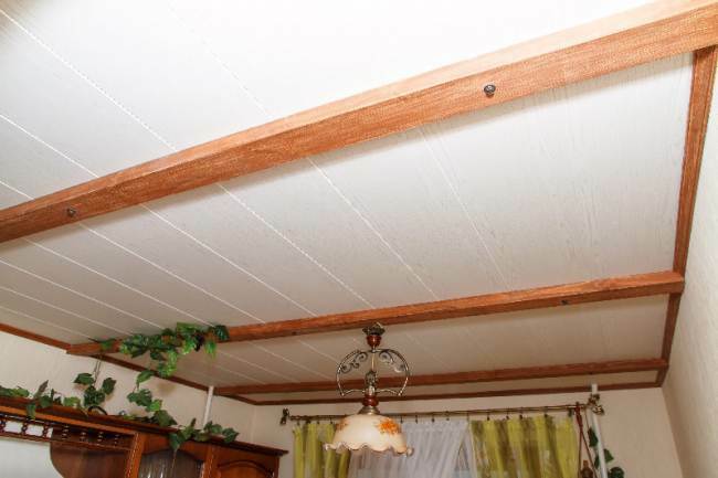
The surface of the ceiling was sheathed with MDF panels and decorated with artificially aged beams, this design perfectly supports the rustic style. Fears that MDF would not last long in a kitchen were not confirmed. A good ventilation hood prevents grease from accumulating on walls and ceilings.
Floor
The floor is covered with linoleum, the color and texture resembles a tile. The surface is very soft, it is very pleasant to walk on it even with bare feet. There is a small child in the house, and such a covering will save him from stuffing extra bumps. The dishes will not be damaged in case of awkward handling.
Moreover, the floor remains warm without the organization of special heating, which also made it possible to save money. This is especially true given the increase in the cost of electricity. The only choice in favor of a lighter color would visually make the space lighter and more airy.
Dinner Zone
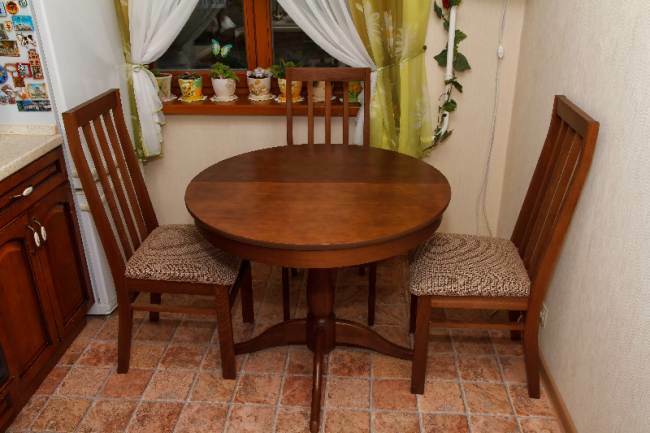
Lunch group represented by an elegant round Flamingo table, 90 cm in diameter. If desired, it can be expanded. But even when folded, it can accommodate six people, when companies gather, 8 people can easily sit behind it.
The table was taken "for growth", the family is young, it is planned that new members will appear. Two chairs go to the table, which are usually carried out to another room, since an active baby loves to be boss at the stove or sink. To do this, he quite easily climbs onto a chair.
Decor and small details
Kitchen décor is an integral part of the design that makes it individual and lively. Elements are added gradually, while forming a single and unique image inherent in this particular room. On the cornice by the window, an earthen jar is successfully attached, which attracts attention.
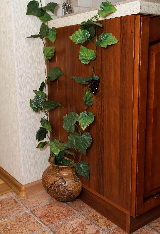
A vine branch partially hides the pipe from the central heating. She decorated a baguette located on the top of the kitchen set. The artificial vine is placed in an elegant pot next to the sink. Its use made it possible to brighten up the side wall of the cabinet, making it textured and interesting.
Home comfort allows you to create bouquets of dried flowers and pots with bright violets, which are placed on the windowsill. The overall country-style design is supported by accents such as a flower-shaped lamp above the dining area and a bronze cornice. Attached to the wall next to the work surface roof rails. A stand for spices and kitchen stuff hang on them.
Of course, this room cannot be called completely ideal, the design has its advantages and disadvantages. While one of the walls of the kitchen is still empty, in the near future the homeowners will start decorating it.
It is planned to install illumination of the working area, the best option will be to carry the LED strip under the hinged cabinets. The general lighting of the kitchen, which is represented by one chandelier, is clearly not enough. It would not hurt to arrange separate lighting for the dining group.
For now, a young family prioritizes economy, not striving for perfection. Therefore, the fact that the project is not fully completed does not bother anyone. But the owners do not give up their dreams of an ideal kitchen, and in the distant future they hope to purchase a new home, with a large kitchen space, in order to realize their desires and creative ideas to the fullest.
average rating 0 / 5. Number of ratings: 0
No ratings yet. Be the first to rate.


