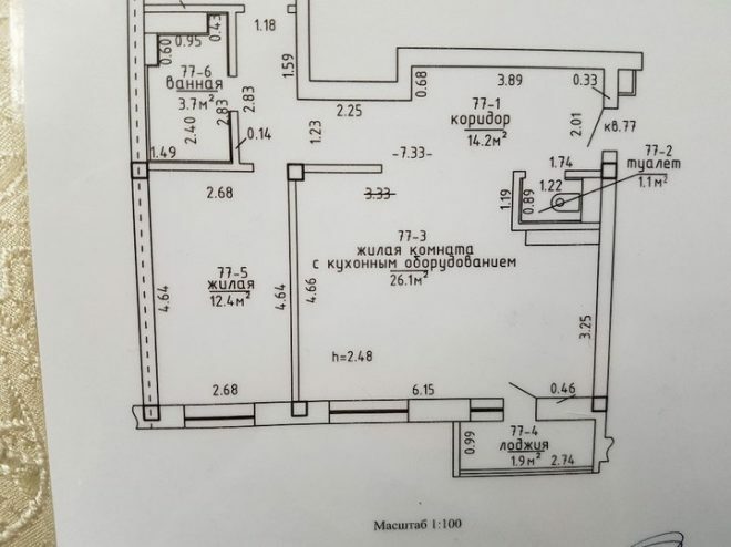
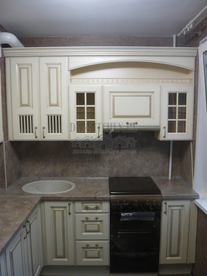
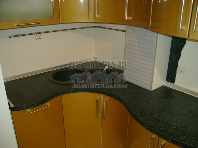
Kitchen design with an area of more than 10 square meters, U-shaped layout, looks very organic. White furniture with MDF facades fits perfectly into the overall concept of the classic interior style. Painted ceiling, tiled floor and work apron in light colors, light white curtains maintain a pleasant atmosphere of comfort.
Photo source - tut.by

Attention! Earned on our website kitchen designer. You can familiarize yourself with it and design your dream kitchen for free! May also come in handy wardrobes designer.
The interior in white tones, strict lines, the absence of unnecessary details is an ideal option for decorating a kitchen in a new building, allowing you to get a stylish and ergonomic space. The comfortable kitchen unit provides plenty of storage space for dishes, food and modern kitchen appliances.


There are non-standard features of the layout of the premises, which had to be reckoned with during the arrangement of the premises. This is a window opening with access to the balcony and a long box for ventilation. They made me think about how to arrange the main functional elements and fill the existing niche in the corner of the room.

The U-shaped layout was not chosen by chance. This is the most convenient option for arranging a kitchen, which allows you to place a work and dining area in a limited area in order to make the most of the available space. The owners of the apartment wanted to get around the habit of receiving guests in the living room, which was so common in Soviet times.

The kitchen project was created by the owners on their own, then a master was found who agreed to bring the idea to life.

All work that could be done independently, taking into account the skills and capabilities of the apartment owners, were done on their own. Professionals were involved in complex rough work, leveling walls, decorating surfaces with tiles, installing kitchen units.

The apron is lined with white Chinese tiles, which made it possible to obtain a seamless surface. On the floor are tiles of Spanish production, with a surface imitating natural wood. It goes well with the pattern of the headset countertops. The surface of the ceiling is quite straight, which made it possible to do without the use of complex structures. It was just leveled and painted.

The electrical wiring, installation of sockets and switches, water supply throughout the apartment were done independently. On our own, we covered the walls with wallpaper for painting. This is an excellent choice to save money on repairs in the future. Renovating the walls is easy, just freshen up the paint.

The height of the wall cabinets does not reach the ceiling. This is due to the fact that the hostess is short, and it is inconvenient for her to use high shelves. Even to reach the top level, she has to use a stepladder.
The U-shaped layout made it possible to provide a large work surface, as well as to successfully place the ventilation box in the upper drawers of the headset, invisibly to prying eyes. The small "tail" of the letter P does not interfere with the passage to the refrigerator at all.
There is enough space left to organize dining area. This group is made up of a fairly large white table and chairs of a similar color. If desired, this table can comfortably accommodate more than 10 people; warm companies can gather for gatherings right in the kitchen.

The facades of the headset are made of white matte MDF, the fittings are of high quality, door closers and tandemboxes from the BLUM company are installed.

The material of the table top is postforming. A branded sink made of artificial stone, a convenient mixer with a high spout and a hose is installed.

The facades are homogeneous, which made it possible to create an integral free space. Austere lines, equal-sized top and bottom drawers maintain a sense of order and unity.

The space was expanded by combining several lockers under one door. For example, a dish drainer is combined with additional shelves for storing kitchen utensils. The identical handles on all drawers, located strictly horizontally, look harmoniously. At the same time, the fittings on the kitchen set are combined with the handles on the refrigerator and oven.

When choosing household appliances, not only technical requirements were taken into account, but also colors. The devices were not supposed to stand out strongly against the general background, so the choice was made on the Polish technique in the style of minimalism. The products of this manufacturer have high quality characteristics and have ample opportunities.

Powerful induction cooker and an oven allow you to quickly prepare your favorite meals. The white refrigerator is conveniently located in the corner by the window; a high-quality refrigerator ensures the safety of food for a long time. The microwave oven with a white glass door fits perfectly into the open shelf. The hood is built-in, a TV was hung on the wall under the ventilation shaft.

Almost all the shelves of the headset are closed, this ensures the maintenance of order inside. An exception was made for a place for a microwave oven and an open shelf next to the TV, in order for the facades to look more harmonious. The dishwasher is conveniently located near the sink in the closet.

The lighting is zonal, the light is made separately over the working and dining areas. Additionally, the cooking area is illuminated LED backlightbuilt-in at the bottom edge of the wall cabinets and extractor hood. Photo frames have been hung over the dining table for now, but in the future, perhaps this place will be taken by a sconce.

When choosing a design, everything was done to make the kitchen look neutral. This makes it possible, if desired, to add individual details or change accents. At the moment, the red seats on the chairs and the lettering in the frames are the bright décor.

In general, it took a lot of money to equip the kitchen from scratch, since the renovation began with rough work. But it turned out to be a cozy room conducive to a pleasant pastime.

average rating 0 / 5. Number of ratings: 0
No ratings yet. Be the first to rate.


