Our apartment is located in an ordinary panel building. The interior is as simple as possible. But dreams of a more modern design haunted, and my husband and I decided it was time to renovate. Monitoring prices for finishing materials and work showed that it is worthwhile to start arranging the kitchen, and then all other premises.
Photo source - realty.tut.by
Attention! Earned on our website kitchen designer. You can familiarize yourself with it and design your dream kitchen for free! May also come in handy wardrobes designer.
They didn’t turn to a professional designer, we decided to do everything ourselves. And then the question arose of how to create a stylish and modern interior, the same for all rooms. It is easier to arrange one room, but connecting all the rooms together in style turned out to be quite difficult, the brain was just boiling.
The second important point, which we have reached empirically, is that repairing a panel house in a standard apartment is a difficult task. It is easier to turn around in a large apartment or in your own cottage, there is simply a sorely lack of space. Solving the issue by simply moving the walls, gaining extra square meters, or making a kitchen combined with the living room, in our case, did not work.
I had to apply all my knowledge, imagination in order to realize something new, interesting, practical on the existing 8 m2. Since there is no other place to live anyway, there is no point in complaining. We chose the classic path - we studied fashion magazines and Internet pages on design and interiors, watched a lot of videos on youtube.
Of course, we did not find a ready-made solution, but some ideas were implemented. The tips on how to visually increase the area of the kitchen helped a lot, since it is still impossible to physically expand it. And the first thing we did was choose the main color - white. We bought light tiles in Minsk, since at that time it was no longer produced, we bought up all the leftovers.
To take into account the opinions of all family members regarding the arrangement of the kitchen, we wrote down our desires on paper. I really wanted to get a dishwasher, my husband wanted a sofa in the kitchen, and my daughter dreamed of a TV with Internet. As a result, all wishes were taken into account and implemented.
We decided to make budget repairs, so we immediately abandoned the built-in equipment. Not only does it cost half as much, it would require ordering a large facade, which is also not cheap. A familiar furniture designer suggested simpler and more economical solutions.
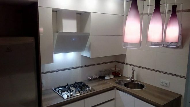
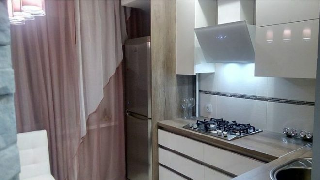
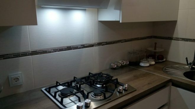
The apartment has gas, so we bought a gas hob by ordering it online. The location of the burners is convenient and familiar, we have used a similar device before. There is a small hotplate against the wall, designed specifically for a coffee maker. It's good that the spray doesn't hit the wall.
The main large hotplate, which I cook on most of the time, is slightly moved forward. It is convenient, nothing burns or remains on the stove. If food falls, it can be quickly removed from the surface. The bowl-shaped burner prevents spilled liquid from spreading and falling onto the table.
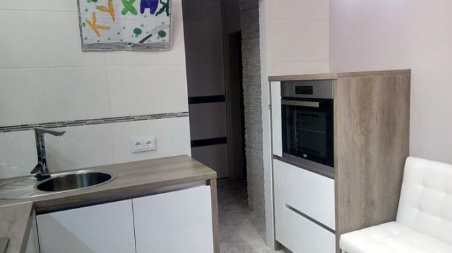
Traditionally, the oven is located under the hob. But this is inconvenient for me. I cook often, and I don't want to bend over for trays all the time. Yes, and nothing can be arranged from below, so we moved the oven to a box on the opposite wall, placing it at the level of the countertop. It turned out very convenient and practical.
The difficulty was the choice of facades. Since we decided that the kitchen should be white, the furniture was ordered in a matching color. But there were many shades of white, and most of them threatened to turn the room into a hospital ward. At first it was upsetting, but then we found the optimal muted white color from one furniture manufacturer, which looks very harmonious.
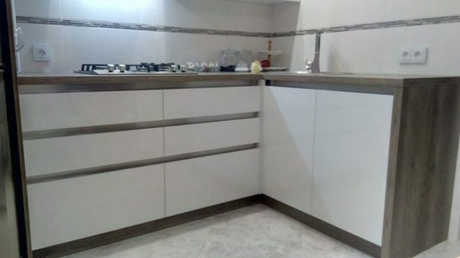
We ordered a complete set from a Belarusian manufacturer with a countertop, fittings and all the work. The floors were covered with inexpensive Russian-made tiles. When arranging lighting, they decided not to save money, and purchased high-quality expensive sockets. The mixer and the sink are in the same style.
We tried to order all kitchen appliances on the Internet. It turned out to be cheaper. The assortment is large, you can choose suitable household appliances at the best prices of the appropriate quality. They took a good, powerful hood. The only drawback is that it makes a noticeable noise.
The curtains are still old, they were made to order for us a few years ago. A stretch ceiling with a chandelier above the dining table is in harmony with the painted walls. The refrigerator is still old, but in the summer we are planning to purchase a new unit with a glass front. The sofa was bought in Minsk, we chose a transformer that fits perfectly into the free corner. It is convenient to lay it out, and an additional sleeping place appears in the kitchen.
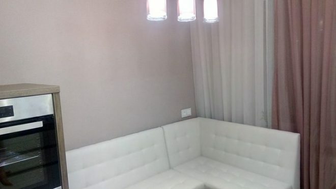
The TV has not been purchased yet, and my husband and daughter have created a TV model from cardboard so far. The 32 "was a bit big, but the 29" is just right. As soon as a suitable model appears in the home appliance store, we will immediately buy it.
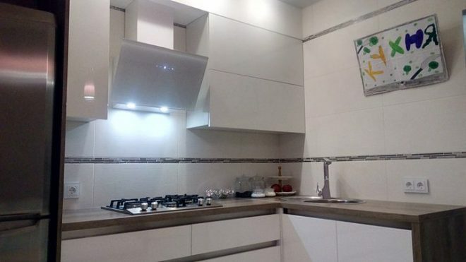
The classic dining table had to be abandoned. The area is small, and it will be impossible to accommodate behind it. Therefore, the husband put the countertop on the bar leg, and an interesting version of the table turned out.
The surface is made of façade material that can be easily scratched off by heating. The Italian material was relatively inexpensive, resulting in a great cover.
The estimate of our repair was almost 200 thousand rubles. The headset device cost 80 thousand, about 50 thousand rubles were spent on kitchen appliances. The cost, in my opinion, is quite acceptable.
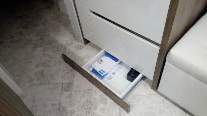
Natural light is slightly lacking, perhaps we will abandon the classic curtains in favor of roller blinds, but for now we have left everything as it is. Compact facades and transformer furniture saved space. Our kitchen is stylish, functional, convenient and comfortable. All this is due to the fact that we tried to think through everything to the smallest detail.
average rating 0 / 5. Number of ratings: 0
No ratings yet. Be the first to rate.


