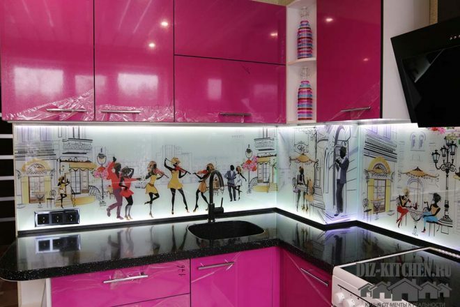
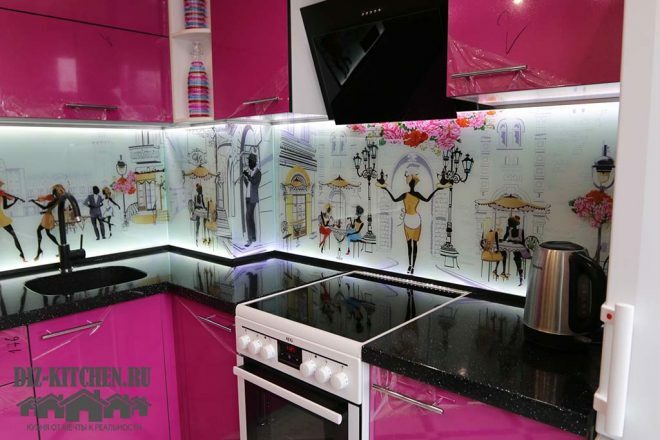
Bright, colorful, French - these words can describe my new cuisine. I always wanted to make it effective, so that the first reaction was - "Wow!" And so it happened. I turned to a designer and with the help of a specialist for 205 thousand. rubles gained an impressive result.
Wenge furniture
G. Murmansk
More about the companyFuchsia magenta is the result of mixing red and blue. The color is unusually cheerful and looks different from different angles. Where the sun's rays fall on it, the facade appears more pink. And without lighting it is a little darker.
Attention! Earned on our website kitchen designer. You can familiarize yourself with it and design your dream kitchen for free! May also come in handy wardrobes designer.
I have already tried the effect of color on myself - a bad mood disappears somewhere irretrievably. When there is autumn slush outside the window, the house is always bright colors.
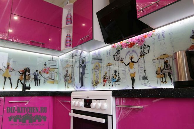
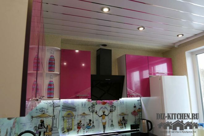
Photos of the kitchen were taken immediately after installation. It remains only to remove the protective film and connect the hood. The windows face south, there is plenty of light. Therefore, we limited ourselves to spotlights in a slatted ceiling.
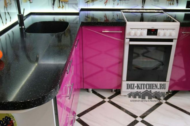
Floor - tiles of white squares with black frames.
There is another additional corner in the kitchen.
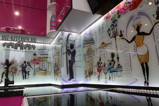
The designer managed to beat it, and now we have furniture, open shelves and a table top there. And before, with standard wardrobes, the place was empty.
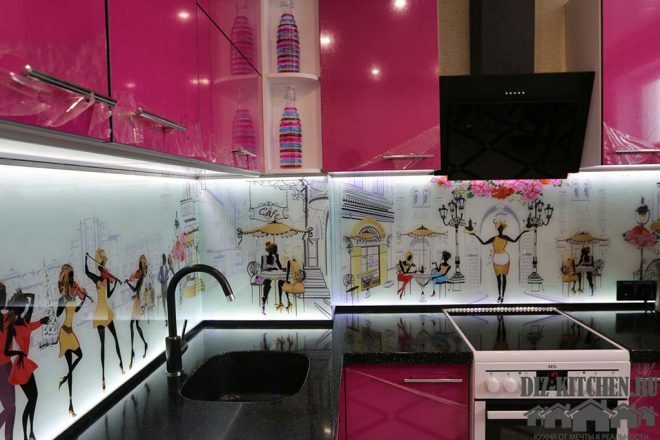
There are 3 main colors in the interior: white (skinny, refrigerator, oven), black (stone countertop, hood) and fuchsia (facades).
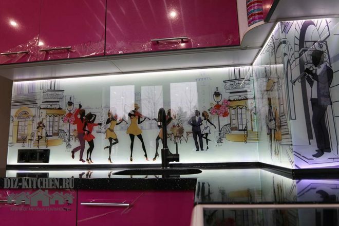
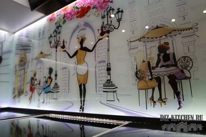
The drawing on the apron skillfully connects them together.
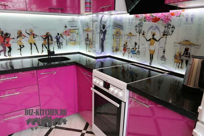
We managed to successfully fit the refrigerator and gas stove into the color scheme.
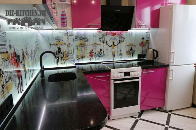
Plastic cabinet facades.
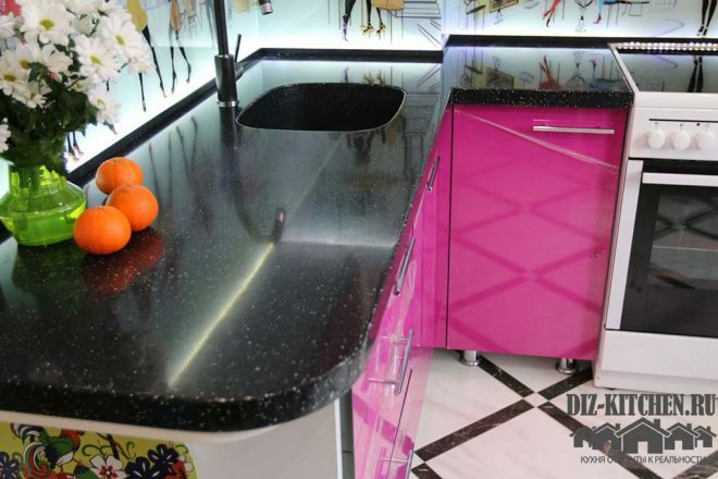
We ordered them according to individual sizes. Thus, it turned out to make one more additional cabinet above the refrigerator. And the black range hood fits perfectly to the cabinets.
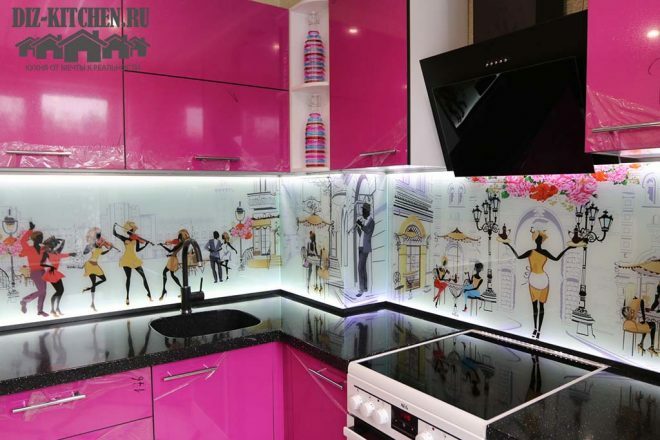
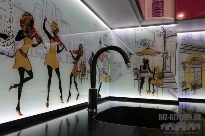
Glass apron with illumination from the inside.
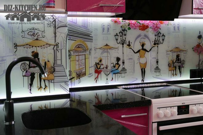
Thanks to her, the drawing acquires depth and sharpness. I deliberately chose the image to make the kitchen look like a French cafe.
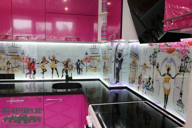
The festive color of the facades echoes the same cheerful images on the skin. And all this creates a wonderful atmosphere in the kitchen.
The triple socket was built into the wall. It is black and almost blends in with the countertop. To do this, I had to make a cutout in the skin.
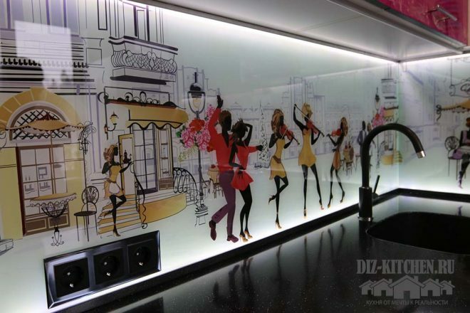
Stone countertop, made of artificial black quartz.
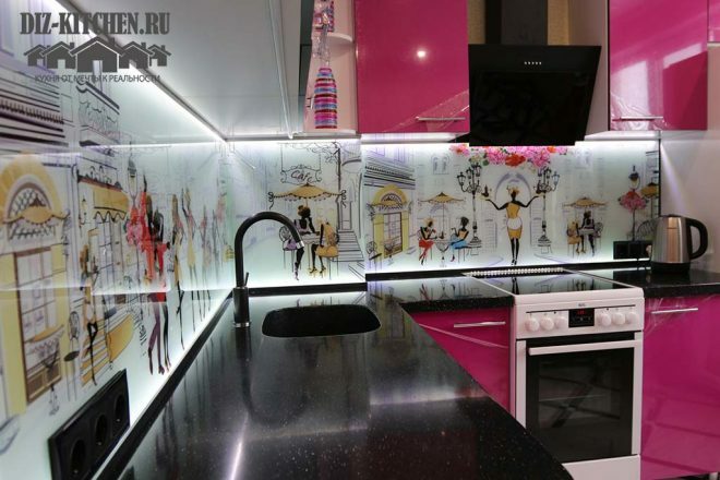
It is polished to a high gloss and reflects artificial lighting in the evening and sunlight during the day.
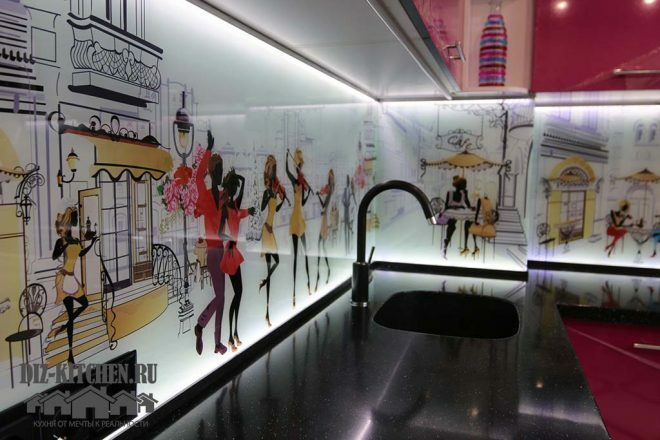
There is also a backlight behind the hob, near the wall. In this way, the effect of depth is achieved. The light on the top and bottom edges of the skin gives the image volume.
The sink is cut right into the worktop. I doubted about the black tap, but I liked the result - against the background of the apron, it does not look like a foreign body at all.
The kitchen has an area of only 6 square meters. I wanted to get a bright kitchen, but the lighting and the white glass apron completed another task along the way - the room now seems larger than during the previous renovation. And this is another indisputable advantage of my new kitchen!
average rating 0 / 5. Number of ratings: 0
No ratings yet. Be the first to rate.
