The area of the room is 10 squares. It is located in a three-room apartment. Ceiling height - 2.5 meters.
Photo source - Tut.by

Attention! Earned on our website kitchen designer. You can familiarize yourself with it and design your dream kitchen for free! May also come in handy wardrobes designer.

The living room was originally combined with the kitchen. The owners liked this option. It was decided to emphasize this even more. The furniture layout is incredibly successful. It smoothly moves from zone to zone. Textures and materials go together very well. I wanted to create an unusual space in which White.

Hinged double doors were installed prior to the commissioning of the house. They were removed. The opening on the side of the living room was framed with polyurethane moldings. It is planned to install sliding doors from the kitchen side. But it has not yet been decided how they should look.
The renovation was done from scratch three years ago. The owners did a lot on their own.

Ceramic tiles have been chosen for the floor in the kitchen, corridor and living room. These are products of a well-known European manufacturer. The tile successfully imitates the texture of natural unpainted boards of sufficient width. The skirting board is made of MDF.
The ceiling was originally plastered. Then a matte white paint was applied to it.
There are two levels of lighting. In the center is a white chandelier. Spot spots are built into the box, which is made of plasterboard. The latter is needed in order to hide the ventilation pipe.
For the walls, paintable wallpaper was chosen. The owners covered them with high-quality paint, to which color was added.
For windows selected Roman curtain. It is made of Belarusian fabric.

For the kitchen backsplash, tiles from a well-known European manufacturer were selected. Its format is convenient 60 * 30 cm. The owners really like the apron. There are practically no seams, so it is incredibly easy to clean.
The pipe and gas meter are hidden in a pencil case that stands by the window.

The hostess really enjoys cooking. That is why a large hood was chosen. Its width was 90 cm.
The original plan was to purchase a dishwasher with a width of 60 cm. But difficulties arose during the manufacture of the headset. It was difficult to integrate it into the column below the oven. That is why a dishwasher was purchased which was 45 cm wide. Its manufacturer is a well-known company that has managed to recommend itself well.

The sink is located in the corner. This option is incredibly convenient. Moreover, she is completely invisible from the living room. Artificial granite was chosen for the manufacture of the sink. The mixer is of excellent quality.

It was decided not to install a built-in refrigerator. The thing is that he is incapable. The owners bought Atlant. Bribed the cost. The inside does not smell of plastic at all.

There is also a quality oven and hob. All equipment is of excellent quality.
An elegant white door leads into the corridor.
The kitchen is very stylish. White facades are made of MDF panels. The body is made of chipboard. The fittings are from a well-known European manufacturer. Handles and plinth in a pleasant satin color. The table top is made under natural wood. She looks just great.

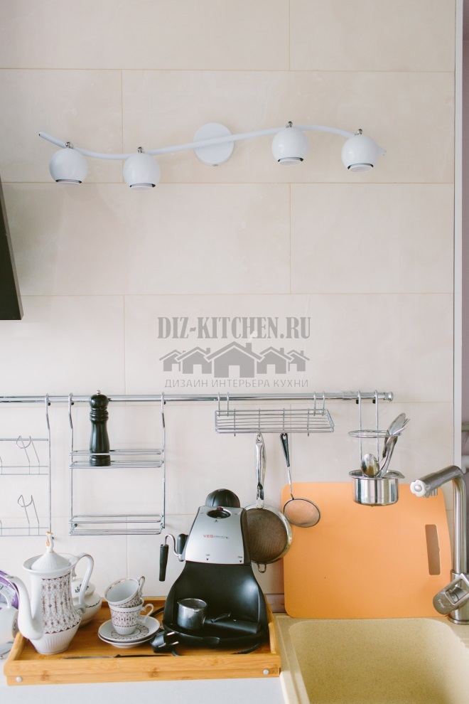
The window sill was made of fiberboard. It was replaced by a wooden one. It has been increased to 25 cm. this made it possible to place a coffee maker and a kettle.
The large dining table was made in 1957. For 50 years he lay on the mezzanine of his grandmother. In this kitchen, he miraculously found a second life. This piece of furniture has been repainted in the color of the headset. Glass is provided on top.
The table is complemented by chairs, the base of which is chrome-plated. They are made in China. There are 4 of them in total.

The owners wanted to make a bright, almost southern decor. It is very rarely light in this room. The thing is that the windows face north-west. For the decoration of the windows, a roman blind with a magnificent pattern was chosen. An unusual clock made in the form of the sun is also provided. The details are rich in turquoise.

The furniture arrangement is perfectly planned. We managed to save the triangle stove - sink, refrigerator. The hosts are in the kitchen for several hours a day.
The kitchen furniture is incredibly laconic. She is even slightly ascetic. I wanted to create a completely traditional image. Used classic materials. These are wood and tiles. This design is modern and trendy. Appliances in the kitchen are luxurious black. She creates impressive contrasts. Immediately reminiscent of the style modern.
Different lighting options make it possible to adjust the light in different ways. Manages to create a relaxing or work environment. The room is not devoid of accents. We managed to create coziness and true peace.
What does it mean to arrange furniture according to feng shui?
The stove (the main element of the kitchen) should not be in the corner
33.08%
Refusal from mirrors and height differences
12.78%
Harmony of balance, soothing shades, purity
33.08%
Put the refrigerator next to the TV)))
21.05%
Voted: 133
average rating 0 / 5. Number of ratings: 0
No ratings yet. Be the first to rate.


