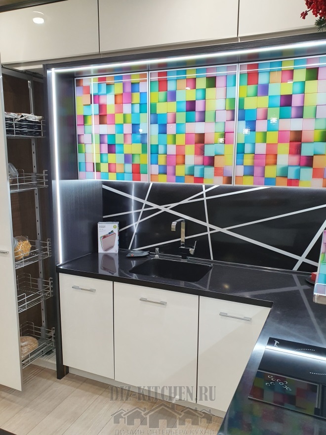
Salad kitchen in the interior, the photo of which does not always convey all the beauty of this color, has become popular not so long ago. It is necessary to see it live and then it is simply impossible not to fall in love with such furniture. Today, the light green color kitchen is on the wave of popularity, it is very cheerful and bright, ideally fits into modern design.
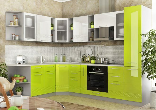
Benefits of green when creating a kitchen interior
He has many epithets: perky, positive, memorable and extraordinary. In addition, the color is associated with garden herbs, healthy foods and can even reduce appetite. In general, there are plenty of arguments for the kitchen to sparkle with bright green colors.
Attention! Earned on our website kitchen designer. You can familiarize yourself with it and design your dream kitchen for free! May also come in handy wardrobes designer.
Surprisingly, light green is very practical. Scratches and stains on such furniture are not conspicuous. This shade is also versatile. If used on the shadow side of a room, it will become lighter. And when the sun's rays hit the surface, it will sparkle with brighter colors. Using light green as a background wall design, you can highlight, emphasize and display in a winning light almost any kitchen furniture.
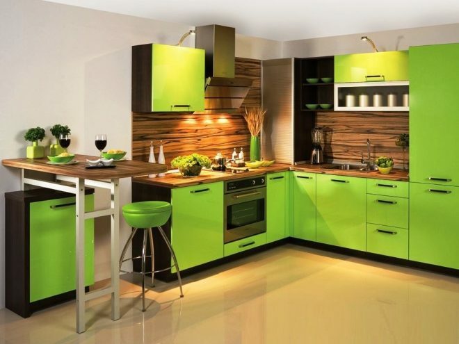
Secrets of choosing a green shade
- You should adhere to the rule - the brighter color scheme you use, the less catchy shades it should be supplemented. Then the composition will not be annoying.
- If you have a light green kitchen in the interior, then the rest of the setting should be neutral and muted. The brighter the set, the quieter the walls.
- Provence, Eco and Art Nouveau are the preferred styles. Provence is not complete without floral motifs and lush vegetation, and the light green color in the interior will come in handy. Shades of fresh greenery will decorate the ethno-interior, and there will always be a light, sophisticated and unobtrusive atmosphere in it.
- It is not necessary to tint all walls in green, you can select one (accent wall). Nowadays, wallpapers are popular in which the pattern on one side is combined (or contrasts) with the other three. And this design always wins in comparison with the classic one, and the boring design of several neutral colors is transformed.
- If you decide to paint the walls greenish, then it should be muted, and other colors warmer. The combination is the opposite - light walls and a light green kitchen (or apron area) are no less attractive. And if you make additional lighting of furniture or skinned, then your rich green will be magnificent not only during the day, but also at dusk and in the evening.
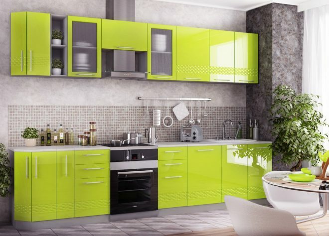
The best options for combining green in the kitchen
Your task is to determine the main shade, choose the right additional shade for it, use them in the required dosage, and also select the rest of the accessories.
Today the assortment of green kitchen sets is quite large. There is plenty to choose from, the main thing is additional colors in warm shades. It is they who are friends with light green.
You can dilute the interior with textile accessories (tablecloths, curtains, chair covers). Dishes to match the furniture or walls will complement the original kitchen design.
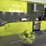
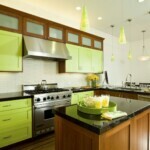
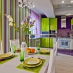
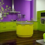
White
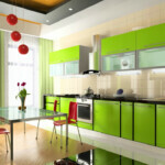
The best shade of a headset in tandem with greenish walls is white. This combination will visually expand the space and create a feeling of freshness in the kitchen. Therefore, for a small room, this range is best suited.
If you have white-light green furniture, then the surfaces can be matte, mirrored, made of colored glass or with chrome elements. This design will ideally fit into a high-tech or modern kitchen.
A light floor, white furniture and a bright kitchen apron, complemented by other green elements, look good.

Brown
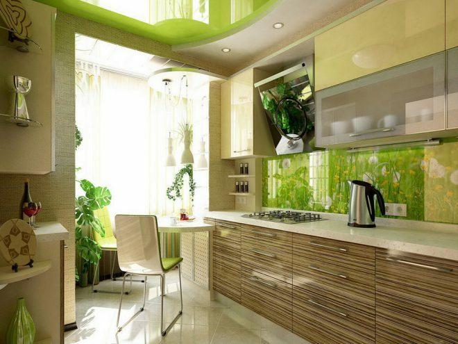
It is more difficult to fit light green into a classic interior. For wooden facades, which are often brown, pastel green is perfect. This is especially true for light and honey shades of wood. But the darker colors (wenge) will act in contrast, creating a dynamic interior.
If you add a third complementary color, then it is better that it is white or sand. And of course, wood furnishings or furniture look best in a retro setting.
Black
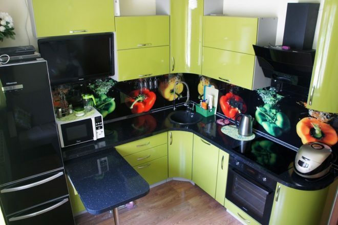
Black and light green cuisine is a very effective accent in minimalism. In addition, now there are a lot of kitchen appliances that are black, and in this case, you will get a clear two-tone interior without any unnecessary color blotches. Just remember that going over black will be depressing.
Sometimes black and white details are used for a more expressive effect.
Yellow
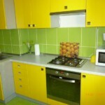
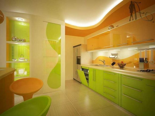
See how the yellow-green kitchen will sparkle with colors in the photo. This is one of the most striking and unusual tandems. In such a house it will always be joyful and sunny, and sad thoughts will never arise. The two-tone furniture, which echoes this related palette, creates an unusually luscious atmosphere in the kitchen. It is very good to use them in a dimly lit room or in which the sun's rays do not peep - the room will seem warmer than it actually is.
Orange
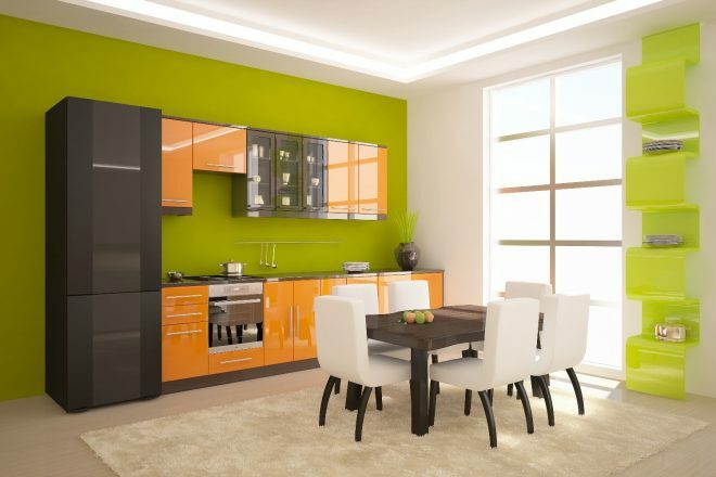
If you choose to go with terracotta or orange, stick to the strict 50:50 ratio. Otherwise, the dominant bright color scheme will draw all the attention to itself. And the third additional shade would be inappropriate.
Flashy and eye-catching colors are suitable for futurism, kitsch, hi-tech and art deco. If you need a bold and extraordinary picture, then using orange and light green, you will get it.
But there is also a nuance - by yourself combining two such energetic colors in the interior, you risk turning the kitchen into a parody of a nightclub or getting cognitive dissonance. Remember that the more colorful the colors, the more they suppress neutrals.
Grey
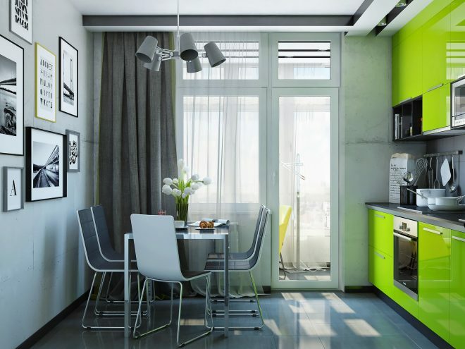
This tandem for design tending to naturalness (romanticism, provence, modern). It is quite difficult to fit a gray-light green kitchen into the interior, since you will need impeccable knowledge of all the nuances of the color palette and their correct dosage.
Against the background of gray walls, the greenish set looks good, the main thing is to choose the right shades. The rules of balancing will help you - the brighter the greens, the lighter the gray should be, and vice versa.
Beige
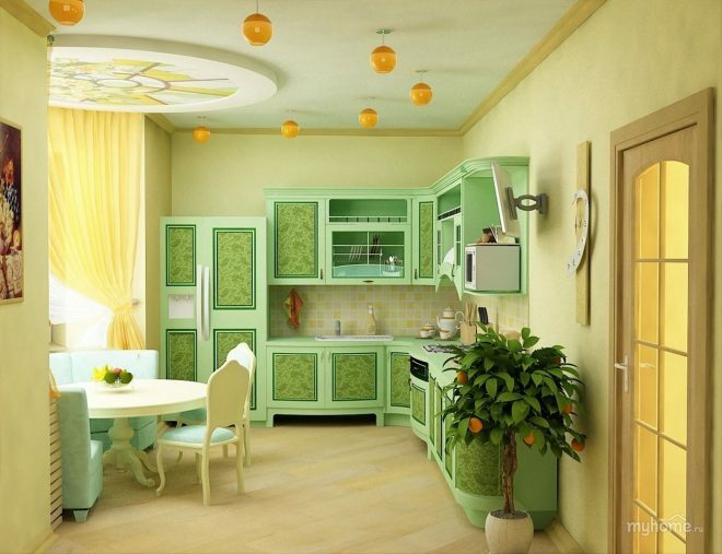
Creamy, creamy, milky notes - it all looks great in a room with hints of fresh greenery. Warm light tones, especially the ivory floor, will well set off a plain light green cuisine. Furniture forms are clearly visible on beige, especially glossy overflows on surfaces.
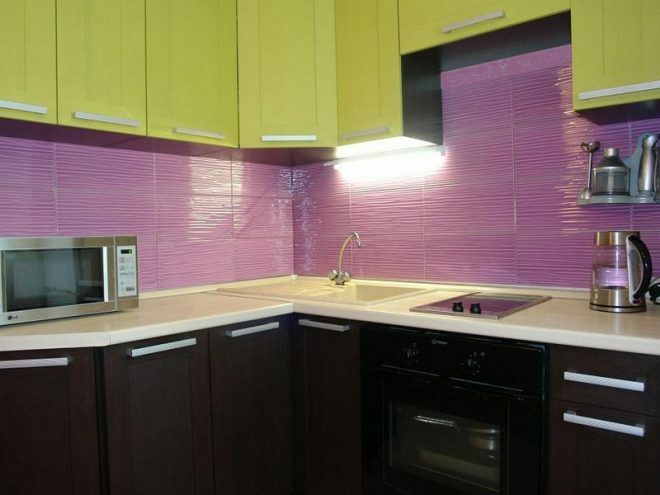
Violet
This combination is considered not very successful, especially when using dark shades. Overpowering purple will create unsettling feelings, and the interior itself will become gloomy, gloomy and tedious. Therefore, no matter how you love rich orange or purple, it is better to entrust the design to a specialist.
But pastel shades of fuchsia, lavender, lilac, light or dark pink are allowed, but with caution.
Where to use color correctly
- A light green kitchen set has one indisputable advantage - the type of surface is not at all important to it. Metal, gloss, glass or matte facades - everything is perfectly combined and each texture reveals shades of color in its own way.
- The main rule when using greenish is not to allow an overabundance of it. Therefore, you either have a light green kitchen on a neutral background, or bright green walls, and furniture in additional shades.
- Most often, the light green color in the interior of the kitchen is found on the facades, then there are the walls, the apron area, textiles, the ceiling and additional accessories. But on the floor it is quite rare, and green floor coverings are not common on sale.
- If you have a juicy and bright accessory, then in most cases there should be one such accent. Otherwise, you will get a motley and ridiculous oversaturated interior, cutting the eye.
average rating 0 / 5. Number of ratings: 0
No ratings yet. Be the first to rate.

