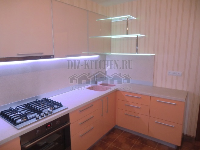
Powdery shades are incredibly popular these days. Not less than salmon))) When I saw this cuisine, others ceased to exist for me. Very delicate and beautiful, the furniture immediately attracts attention. The set really has a calming effect, and in combination with pastel pink wallpaper and a light apron, it looks incredibly stylish.
The kitchen is made in the company "Stelnn",
vk.com/id239206381
G. Nizhny Novgorod
Attention! Earned on our website kitchen designer. You can familiarize yourself with it and design your dream kitchen for free! May also come in handy wardrobes designer.
And such a romantic beauty is not very expensive (250 thousand. rubles), since the facades are plastic. Modern plastic lasts a long time - it does not fade from sunlight, does not flake off, it is easy to care for it. Gloss itself is reflective, additional lighting adds even more coziness, and the kitchen shines and sparkles.
The corner set is the most ergonomic and functional kitchen that uses every centimeter of space 100%. The short edge of the headset is decorated with a multi-level step, consisting of glass shelves, an apron and a longer row of lower facades.
The lower tier is darker, salmon-colored. It is darker than the top powdery modules. Both shades are soft, saturated and deep, but more noticeable in comparison with the walls. Wallpaper with expressionless stripes that accentuate the darker facades.
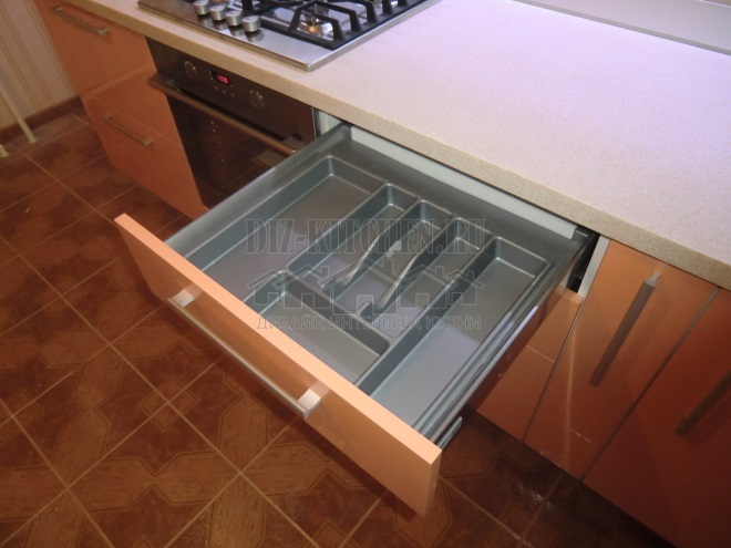
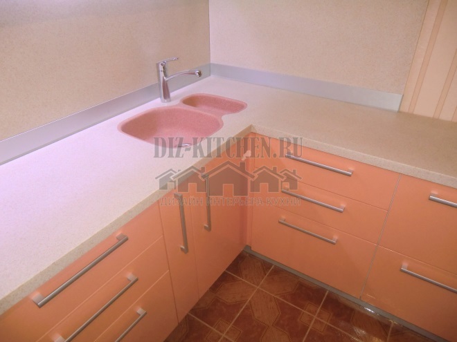
Liquid stone countertop with a light pastel pink sink. It matches the apron.
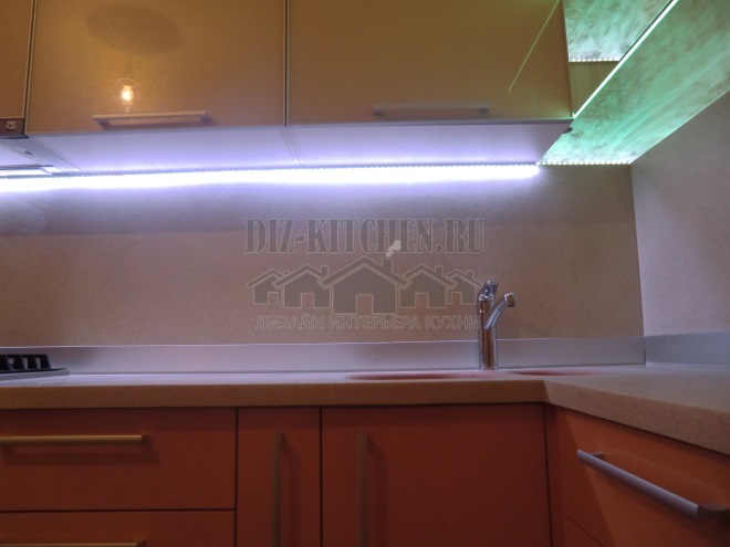
The kitchen is already light, and with the help of illumination, it becomes even brighter, more voluminous and more spacious. The backlighting added creativity to the interior, emphasizing the items on the glass shelves.
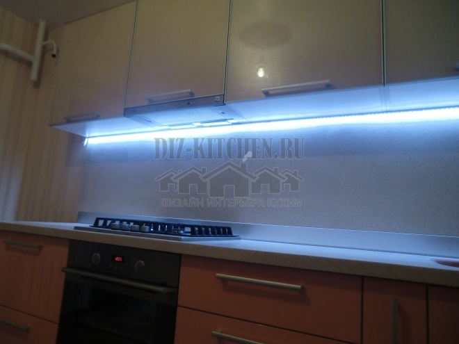
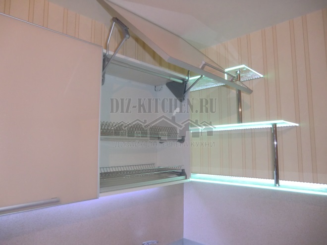
Our kitchen has a lot of additional lighting - under the lower tier of the fronts and built into 8 mm glass shelves.

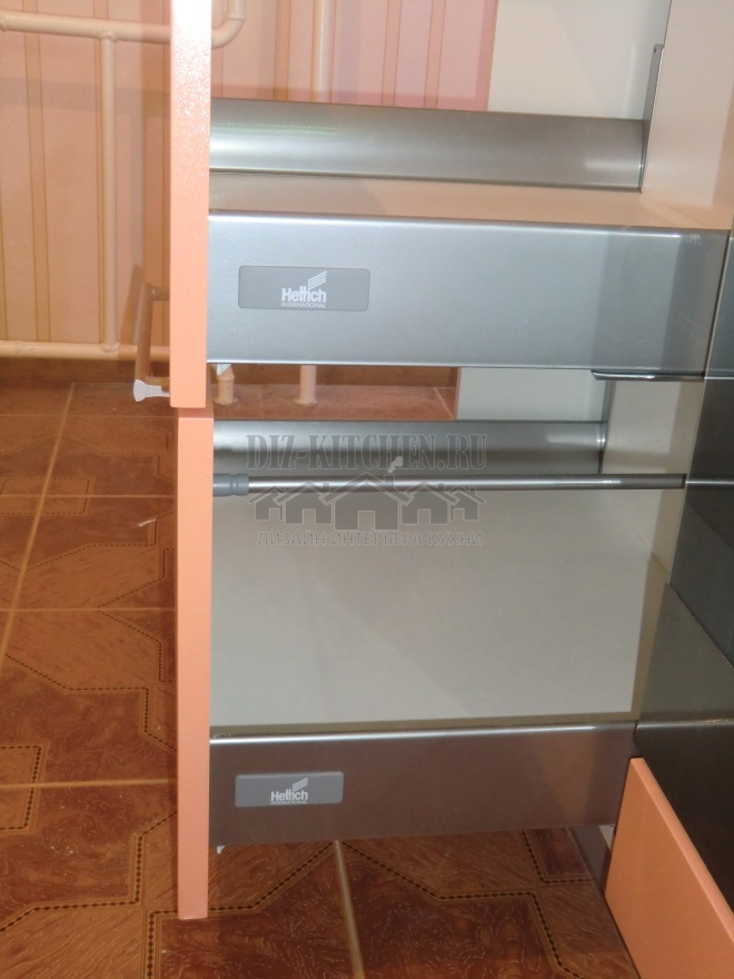
All Hettich fittings (guides, hinges, drawer systems), which makes the furniture comfortable and functional. Bunk drying is the most convenient.
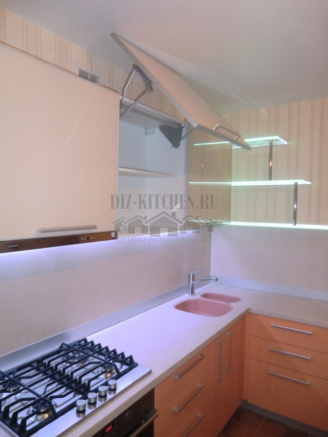
My kitchen is feminine and romantic, light and airy. She managed to choose the right color balance, to place accents and color zones.
