When I bought an apartment, the question of buying a kitchen set arose first and foremost. The dwelling is located in the old fund, some "antediluvian" furniture was already there, but I did not waste time on putting it in order. Therefore, I just ordered a new one - exactly the one that fits perfectly into the interior. Since I live alone, I am rarely at home, the most important requirements for the design of the kitchen were the materials for the wall and ceiling cladding and, of course, the kitchen furniture itself. First of all, it had to be functional, easy to clean and not clutter up the space. The idea was realized primarily due to the U-shaped layout, the arrangement of cabinets along the walls.
The kitchen is made in the company "Mebel Concept",
instagram.com/mebel_concept
G. Rostov-on-Don
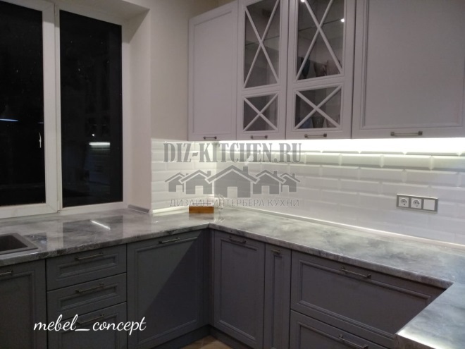
I opted for a classic headset with a high section for household appliances. I chose the U-shape for a reason. Despite the fact that there is enough space in the kitchen, it is very convenient to move around it - the designer arranged everything ergonomically, having successfully worked on the customer's comfort.
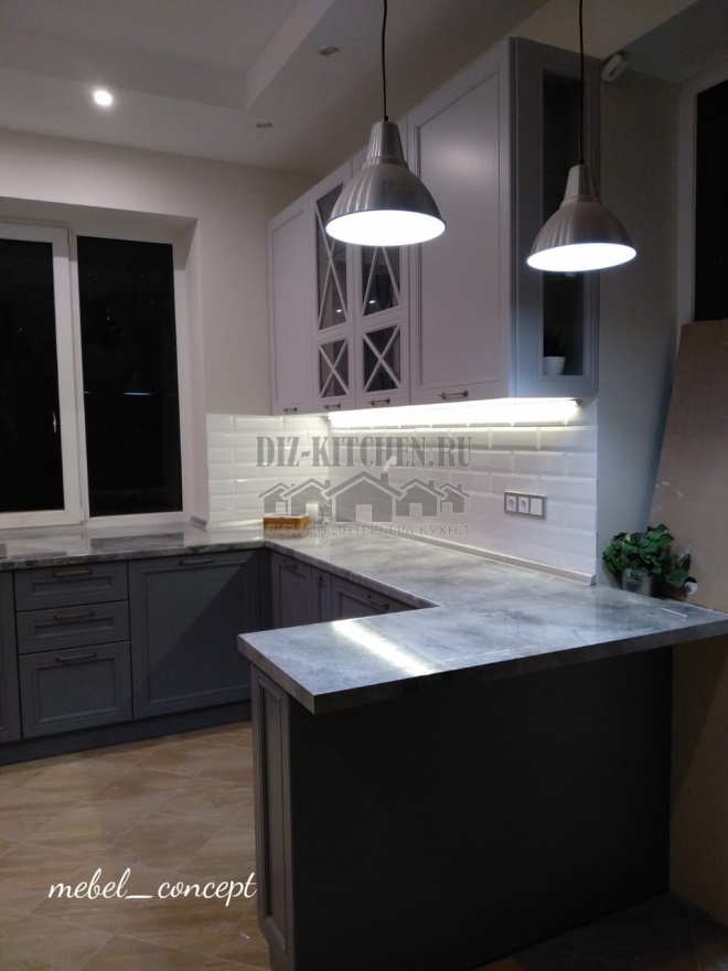
All top cabinets (Egger chipboard with Sayerlack coating) are white, which visually adds volume and height to the room. The lower sections are gray-blue. Under the plinth there are scilm kitchen supports.
Attention! Earned on our website kitchen designer. You can familiarize yourself with it and design your dream kitchen for free! May also come in handy wardrobes designer.
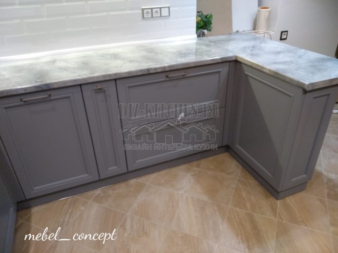
Interesting and designer design of swing doors in the form of a "French window" made of polished glass of the M1 brand. And the kitchen no longer resembles a bachelor's "den", but has become cozier and more comfortable. The glossy tile backsplash recalls the current loft style - rough natural brick painted white. 
There is a large enough window in the room, so the window sill was made wider, and under it was the continuation of the headset. Union premium plastic tabletop looks like a solid monolith. In addition, an additional work surface appeared, where the designer placed the sink. The apron on this side is decorated in the same way, in the form of white painted bricks.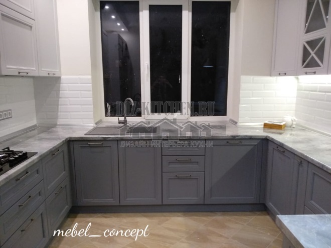
There are household appliances in a large high pencil case - a refrigerator, a microwave oven and an oven. This wardrobe is a contrasting element that emphasizes the white color of the fronts and unites the upper and lower sections. 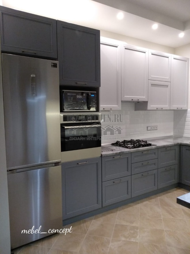
I have been living in an apartment for the third month now, and I fully enjoy the comfort every time I go into the kitchen. Everything is thought out to the smallest detail, ergonomic and functional. Spacious drawers with the best Blum and Hafele fittings, Vibo mesh filling, Camar awning system allow you to use your kitchen utensils as conveniently as possible.

Of course, I also approached the choice of materials for repair so that they would be combined with the future kitchen set: white brick apron, sand-colored porcelain stoneware on the floor and spot lighting. Thus, my kitchen now represents a single and harmonious, and most importantly, comfortable ensemble.
average rating 0 / 5. Number of ratings: 0
No ratings yet. Be the first to rate.


