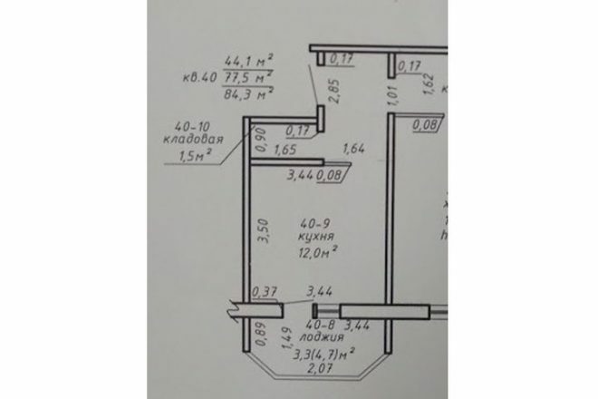
An area of 12 square meters for a kitchen is a lot. In our three-room apartment, we completed the renovation a little over two years ago, the work took a very long time. This is mainly due to the fact that in order to save money, we did most of the repairs ourselves. To be honest, we would have delayed it even more, but had to move quickly because of our daughter's health problems.
Photo source - realty.tut.by
Attention! Earned on our website kitchen designer. You can familiarize yourself with it and design your dream kitchen for free! May also come in handy wardrobes designer.
Searching for an idea
At first, the kitchen seemed to me just gorgeous, after the small room where we lived before. The history of our renovation began, like many others, with a drawing. We spent a lot of time deciding on the interior of the future apartment, looking for options in magazines and the Internet, watching thematic programs and spying on ideas from friends.
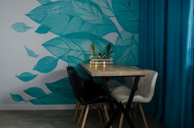
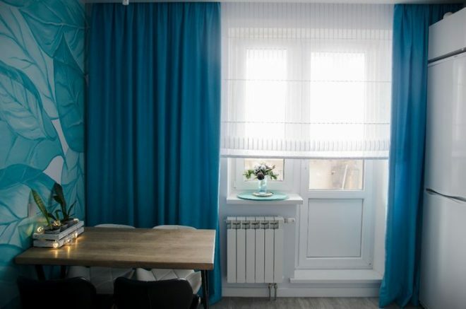
One day, the gaze settled on a project with painted walls, which depicted large leaves. And at that moment I realized - this is exactly what we are looking for!
Implementation of the plan
Not one day was spent trying to find the optimal color for the project - clean, light. We settled on a gray shade, which should have looked perfect against a white sheet under different lighting options. But during the implementation of the idea, it became clear that this color still looks like a gray-blue, and we resigned ourselves.
Gorgeous turquoise leaves on the wall were painted by my husband's sister, we are very grateful to her for that. It turned out beautifully, stylishly and brightly. Against this background, there was no question of choosing bright colors for the facades of the headset. Therefore, we settled on white furniture. Strange as it sounds, this is the best option for pig housewives. White color is practical and easy to clean, like it or not, but the dirt is visible well, and you have to clean it up regularly.
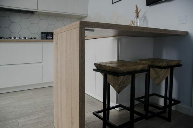
I am not a fan of constantly cleaning up, so we installed integrated handles on the facades. You don't have to constantly clean small parts. Despite the relatively small area, our family was not going to refuse from the bar counter. We constantly use it as an additional workspace and for a quick morning meal.
We really like this kitchen set for its beauty and ease of use; we purchased it at a Grodno factory. The upper tier of cabinets is equipped with folding lifts, and the swing doors of the lower facades are equipped with door closers. Drawers and tandemboxes available.
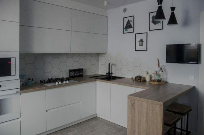
Black accents were done with household appliances. We received the sink as a gift in the salon; we bought only a mixer of a similar company that was the same in style. The oven and hob from the Hephaestus company were purchased via the Internet.
We did not spend money on branded items, the stove consists entirely of high-quality components and is equipped with a timer. The oven has touch controls, grill and convection functions, everything we need. And the price for that is quite acceptable.
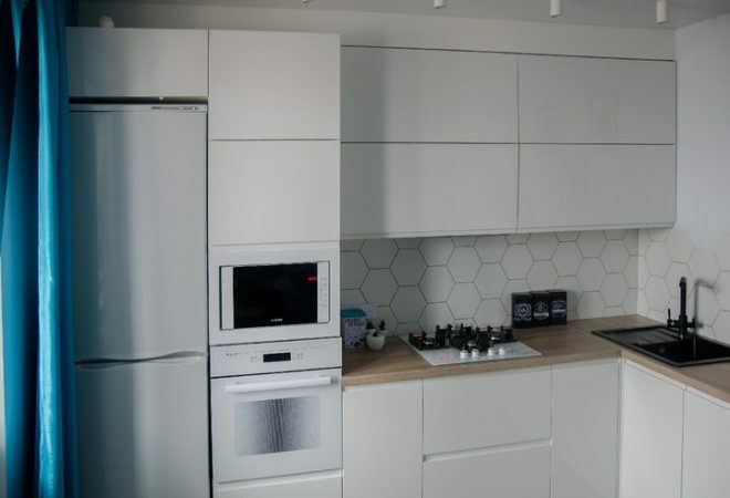
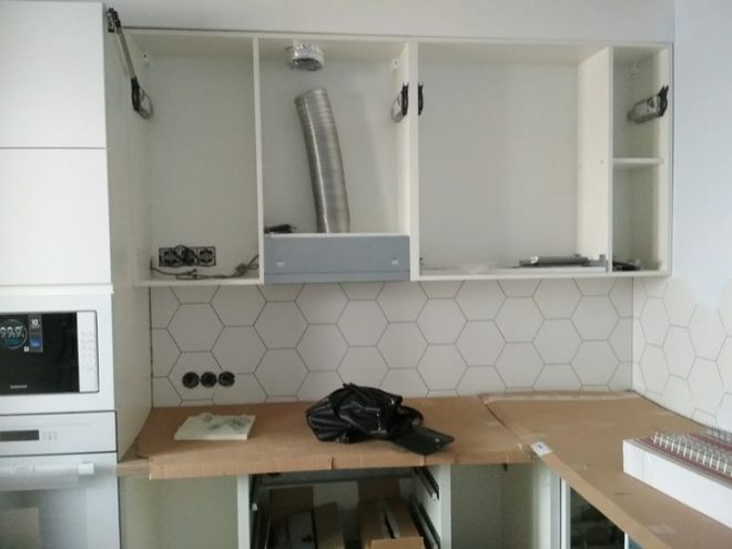
Along with the built-in appliances, we also purchased a built-in hood, which makes it easier to clean the kitchen. It is hidden in a cabinet, and dust and soot do not accumulate on the surface. We got the dishwasher for the action, and the refrigerator moved with us from the old apartment.
There was a slight hitch when buying bar stools. We have a small rack height. It is located at the level of the countertops, so it turned out to be problematic to choose the chairs according to the height. The adjustable products were all on chrome-plated legs, and they did not fit into the interior in any way, and the classic chairs were too high.
Therefore, I had to make them according to an independently developed sketch, the husband and father-in-law "welded" the base, and I painted them black. The spouse carved the seats from ash, it turned out original and stylish. We created the dining table in the same way. It's good when men have golden hands.
The husband constantly makes something for the kitchen - trays, drawers, boards. All these do-it-yourself little things create a unique atmosphere of warmth and comfort in the room.
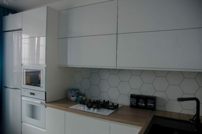
Of course, our renovation cannot be called completely perfect. We made several mistakes, firstly, choosing the color of the furniture only on the basis of practicality. We didn’t think that the variety of white would look a little out of place, and we didn’t quite accurately select the technique in terms of shades. But over time, they got used to it and began to find their charm in this.
A curious moment came out with chairs, my husband said to take two chairs, try to see if they would be comfortable. When we went to buy the rest, it turned out that there were no more white items. So in our kitchen there were different colored chairs, black and white.
When the tiles were purchased in the showroom, they looked dazzling white against the background of other products. But after the work apron was laid out for her, a beige shade suddenly appeared. Apparently it depends on the lighting. But they just picked up the ideal option on the floor, no dirt is visible on the tiles.
I was convinced that it was necessary to finish everything at once. Otherwise, everything temporary will remain constant, like our lonely light bulb above the table. We never found the lamp. But these little things do not spoil the overall impression of the kitchen!
The total estimate was more than 300 thousand rubles. The most expensive was the kitchen set, we spent almost 140 thousand rubles on it. Household appliances cost about 110 thousand rubles. The kitchen turned out to be cozy and homely, full of peace and romance. Unusual things give her personality and charm. This is the perfect place to do business and receive guests.
average rating 0 / 5. Number of ratings: 0
No ratings yet. Be the first to rate.


