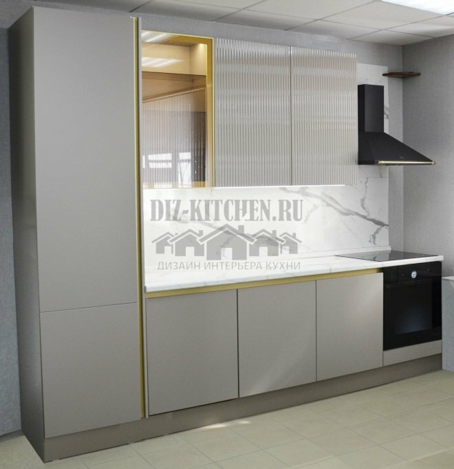
This kitchen is quite unusual, but that's why we chose it. It is simple, but at the same time elegant and harmonious. There is a lot of contrast in the design, but not flashy and bright, but perfectly complementing each other. This opposition is different - soft and unobtrusive, without rough transitions. Thanks to this, the kitchen turned out to be cozy, smooth and elegant.
Made by company Kitchens,
ritskuhni.ru
G. Kirov
Attention! Earned on our site kitchen constructor. You can get acquainted with it and design the kitchen of your dreams for free! Also may be useful wardrobe designer.
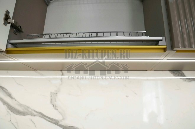
In a compact three-meter kitchen, everything is thought out: there is a place for household appliances, a fairly large work surface, on the side there is a spacious utility cabinet-pencil case for the entire height of the headset. In the top row there was even a place for a dish dryer.
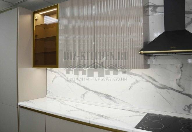
Near the wall we have a black module: a hob, above it is a dome hood. The black matte finish of the hood is the opposite of the shiny glass of the oven and hob.
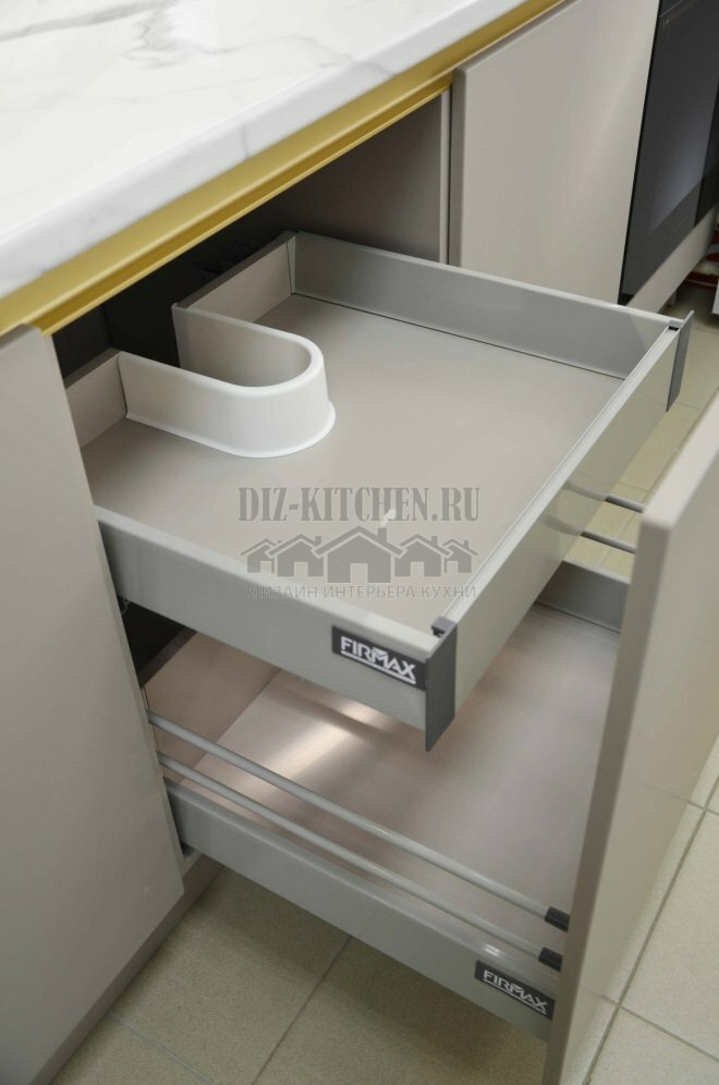
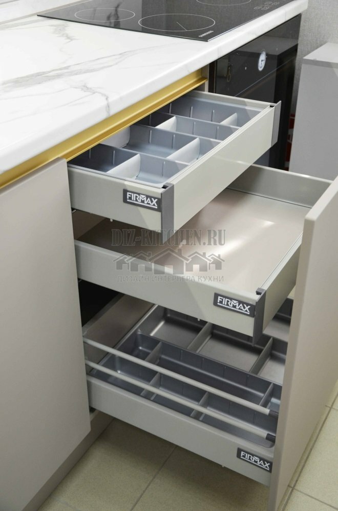
Firmax fittings are installed in the cabinets of the lower tier, innovative storage systems look modern, clearly distributing all kitchen utensils.
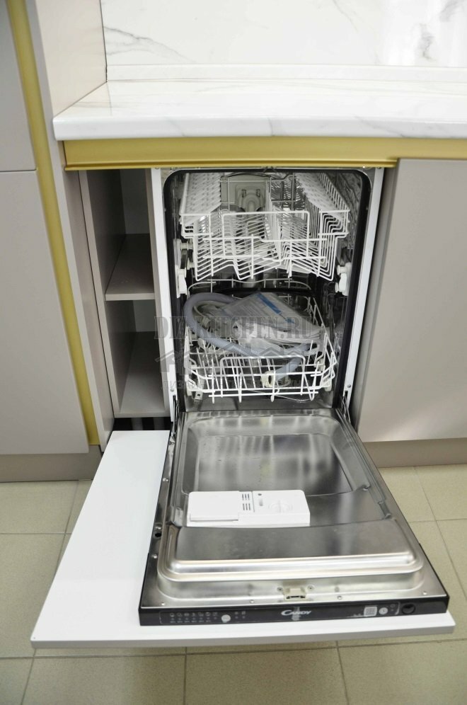
Built-in dishwasher nearby.
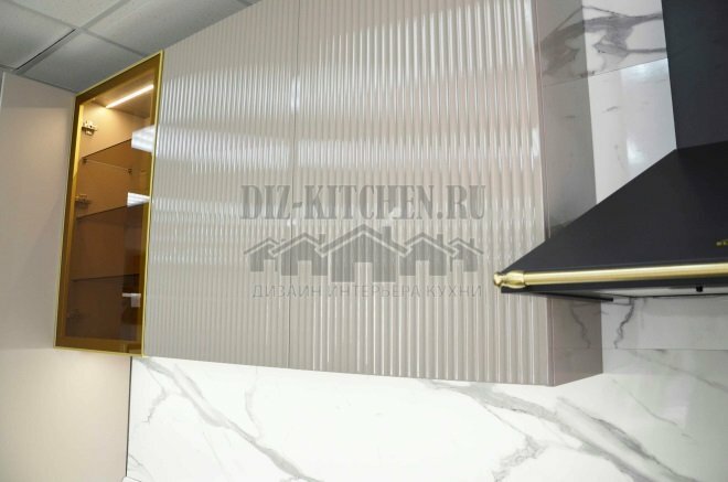
Two types of facades made of MDF coated with enamel are used in the set: Nika - smooth, even and matte. They prevail in the headset. They were complemented by Marin surfaces in the top row - corrugated, with a glossy finish. These are companion facades, they made the appearance of the kitchen more interesting.
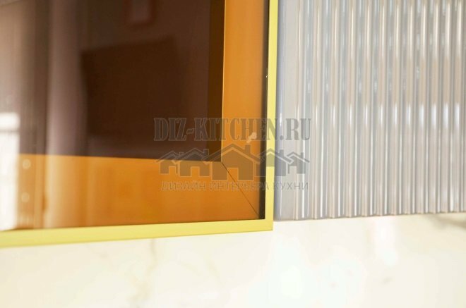
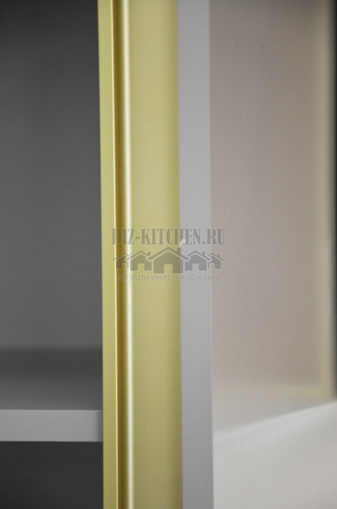
A single section of tinted glass in a golden aluminum profile highlighted the stylish gray furniture, being a bright accent throughout the interior, bright and radiant. The brilliance of glass and light was necessary for the gray-black scale.
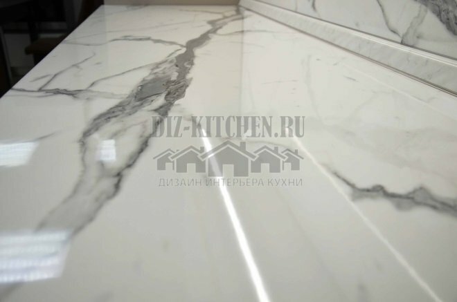
The tabletop and backsplash are made of the same material and color, with a plastic coating. White marble, even in the form of imitation, looks noble and expensive; it well enlivened and set off even light gray facades.
There are no handles in our kitchen. All cabinets open using the Gola profile built into the cabinet.
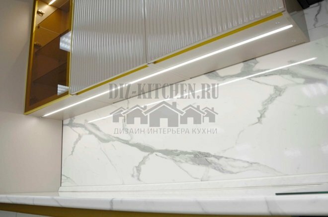
It is very convenient to use, besides, a smooth row of facades is best suited for a minimalist interior, it looks very stylish. The profile is painted in the color of the aluminum frame on the facade with glass.
Our laconic kitchen turned out to be cozy and delicate, but at the same time it has depth and volume.
Average score / 5. Number of ratings:
There are no ratings yet. Rate first.


