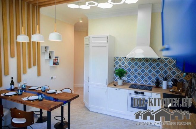
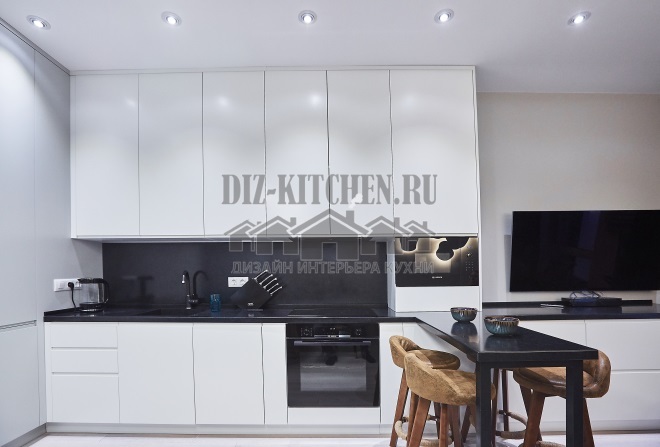
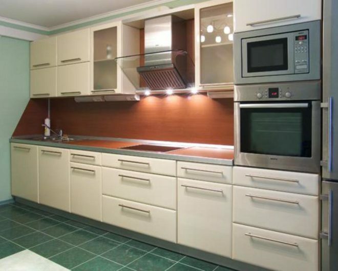
We have a standard kitchen, small. Only a compact straight furniture set 3 meters long fit there. We chose a modern direction (due to the small dimensions of the room), but in the design we adhered to classic techniques that always work without a hitch.
Made by company House furniture,
vk.com/domovayamebel_dz
G. Dzerzhinsk
Attention! Earned on our site kitchen constructor. You can get acquainted with it and design the kitchen of your dreams for free! Also may be useful wardrobe designer.
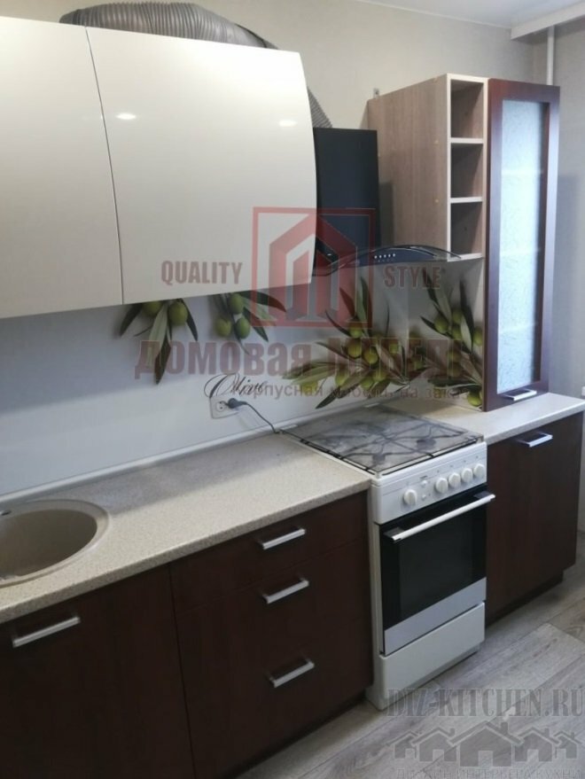
Light top - dark bottom are the best option in a modern interior in a small room. In our case, the design is a bright glossy top, juicy greens in the center and a more neutral bottom. And the combination of colors no longer seems boring and simple.
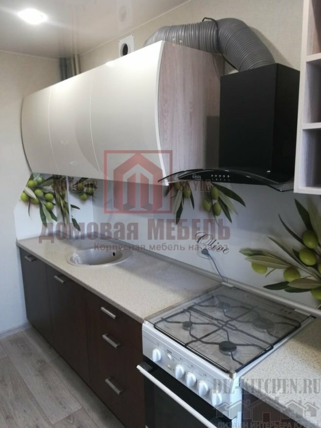
To enhance the contrast, gloss was used on the upper panels. The upper part, as it were, dissolves against the background of light walls, the furniture looks lighter and weightless.
They made the upper facades curved, which gave the cabinets originality. They do not hang as much over the countertop, but have become more spacious.
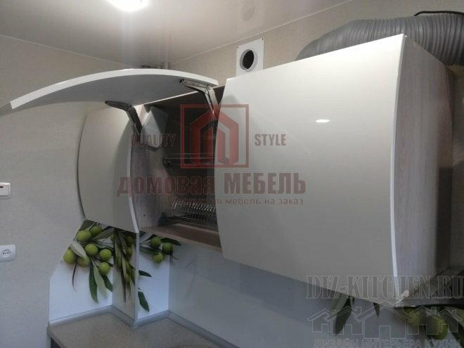
We tried to fit everything you need and we succeeded, there is even a place for a work surface. The solid furniture facades were well enlivened by an open wooden shelf and a glass pencil case near the window, along the entire length of the upper cabinets and an apron.

The furniture case is made of laminated chipboard Uvadrev (light wood color). The upper facades are made of MDF, with white glossy enamel on top. Below - plastic with imitation of wood.
The tabletop is moisture resistant, 38 mm thick, TM Cedar. It is completely white, and the light, upper part of the kitchen begins with it. Then comes a white wall panel with an image of an olive branch.

An oval light sink made of artificial stone (premium production) in color perfectly matched the plastic countertop with imitation of fine stone chips.
Green added bright colors to a calm color scheme. But since there is not much green, it remained only a bright accent, emphasizing the companion colors (white and brown).

The fittings inside the cabinets are guides with a closer from the McMurty company. Lifts are installed in the upper cabinets, making it easy to open fairly heavy sections.
Average score / 5. Number of ratings:
There are no ratings yet. Rate first.
