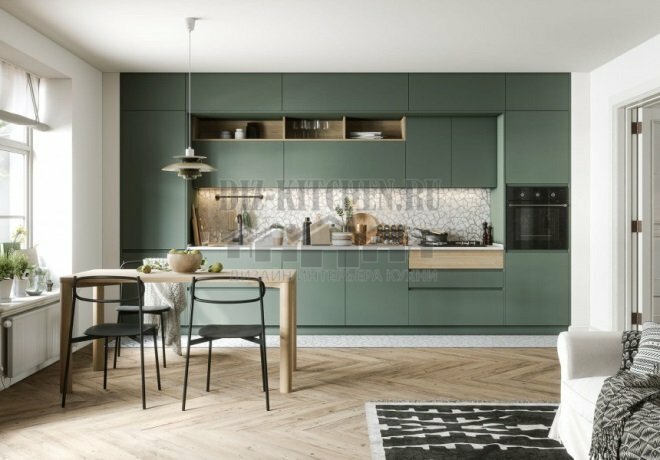
If you choose a kitchen of noble and not the most common shades, then you probably won’t find more beautiful than olive. A clearly visible pattern of natural ash wood, accentuated by enamel, looks interesting, solemn and expensive.
Made by company GeosIdeal,
mos-gi.ru
G. Moscow
Attention! Earned on our site kitchen constructor. You can get acquainted with it and design the kitchen of your dreams for free! Also may be useful wardrobe designer.
The whole atmosphere is calming, it is pleasant to be here. The green facades refreshed the interior well, and the muted tones became an excellent base for the green. Olive tone - basic, brown - accent. To prevent the green from looking too simple from afar, it was complemented by a white tone and light wood.
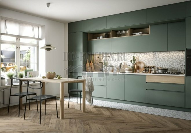
The kitchen is combined with the living room, it occupies a smaller part of the room. But the almost four-meter headset turned out to be quite functional and roomy, it has everything you need.
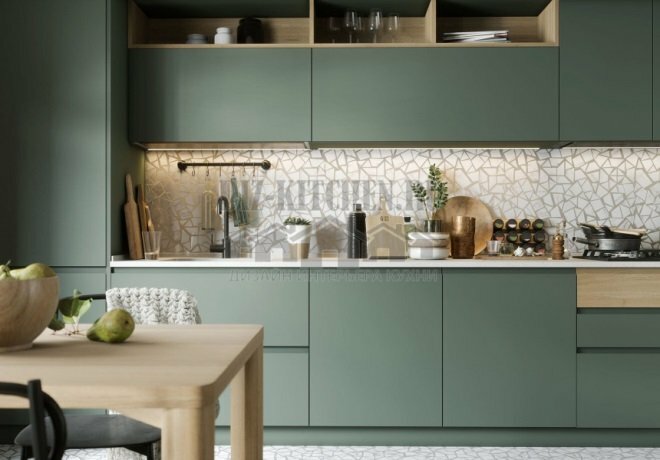
The direct furniture layout is made in a modern minimalist style, there is not a single protruding part and bright decor, only the contrast of textures, colors and materials. Each detail is the opposite of the neighboring element. Competently selected and located shelves, sidewalls and an apron are interesting solutions, capturing all eyes.

The furniture sections are strictly symmetrical - they begin and end with high canisters up to the ceiling. One has a built-in refrigerator, the other has an oven and microwave.

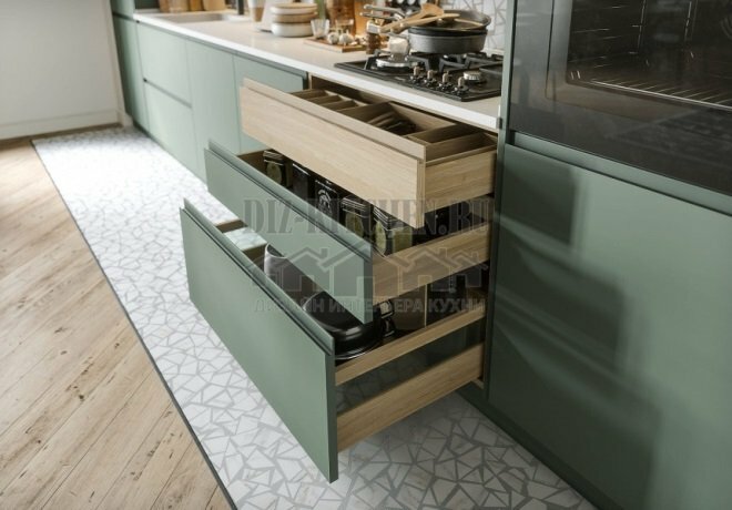
The J-profile has completely replaced the traditional overhead handle. It is located at the end of the facades and turned out to be the most appropriate for a modern minimalist interior.
The white apron comes in the form of a chaotic tiled mosaic, as if created from fragments. This decision is a noticeable contrast to the strict olive facades.
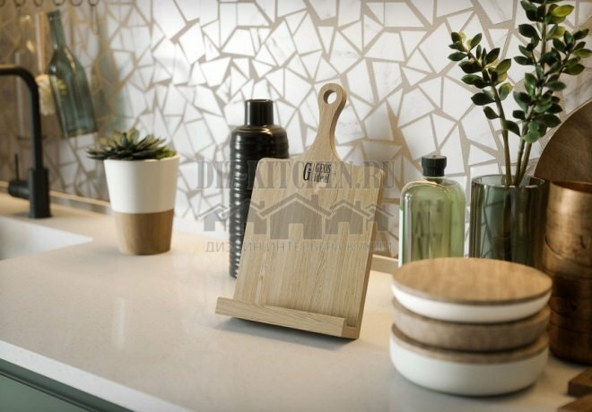
A similar tile is laid out on the floor next to the headset. She separated the kitchen area from the rest of the room.

The apron is also interesting because the transitions between the tiles and gray cement are more clearly visible up close, and the farther you go, the more the overall picture merges.

The light center created a visual volume. The muted olive is dark enough, but the furniture didn't make the room smaller, thanks in large part to the light center, wooden sides, and shelves.

Open shelves (Lime color) have become an interesting element of decor in themselves. Warm wooden notes were needed for the cold green of the facades and neutral white.
What does feng shui furniture arrangement mean?
The stove (the main element of the kitchen) should not be in the corner
34.12%
Refusal of mirrors and height differences
12.94%
Harmony of balance, soothing shades, purity
33.53%
Put the refrigerator next to the TV)))
19.41%
Voted: 170
Average score / 5. Number of ratings:
There are no ratings yet. Rate first.


