Our young family bought an apartment quite recently. The question of repairing the secondary housing stock in the house was not even raised, it had to be done unambiguously and as quickly as possible. My husband and I wanted a bright and incredible cuisine and this is exactly what we got. To do this, we ordered radius furniture, which is so popular lately, and installed lighting under the countertop and in the upper cabinets.
Wenge furniture
G. Murmansk
More about the company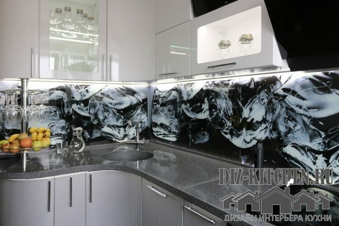
Radial furniture allows you to use the entire space of the room, which is important for a 7-meter kitchen. And we also thought about the child and cabinets without sharp corners for the kid will be very useful. Smooth lines of facades and showcases make the kitchen unique and so different from the usual corner ones. In terms of aesthetics, it is much more beautiful. True, curved facades under the order are much more expensive - 290 thousand. rubles. But it was worth it!
Attention! Earned on our website
kitchen designer. You can familiarize yourself with it and design your dream kitchen for free! May also come in handy wardrobes designer.
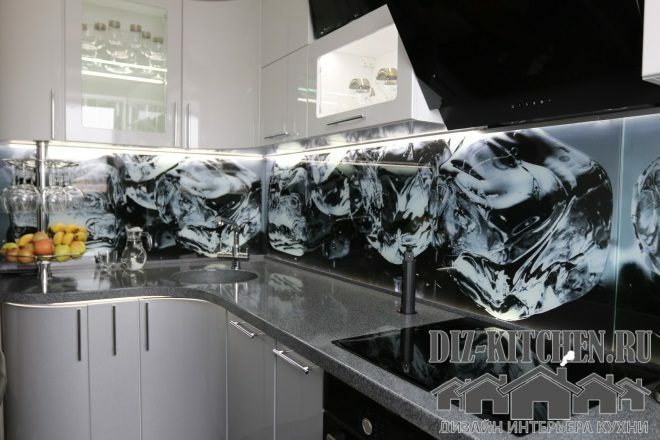
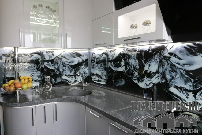
The cabinet fronts are made of MDF. They are strong, moisture resistant and can be shaped into any shape. Covering - PVC film, ideally adjoining curved facades. We chose 2 colors - white and dark silver. The surfaces are glossy, because there should be a lot of light and shine in such a kitchen.
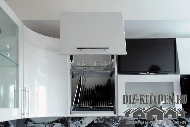
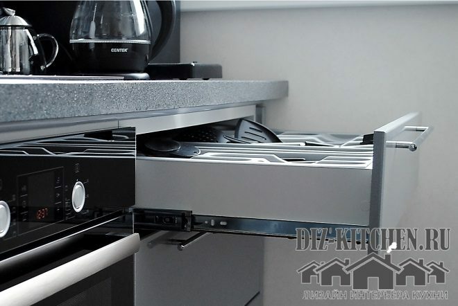
The bottom drawers are equipped with a built-in self-closing mechanism (from BLUMATIC). Therefore, all boxes work smoothly and quietly, and jamming of the mechanism is excluded.
Showcases of the upper cabinets are illuminated. Glassware looks especially gorgeous in them, the glare from which plays in the rays of light.
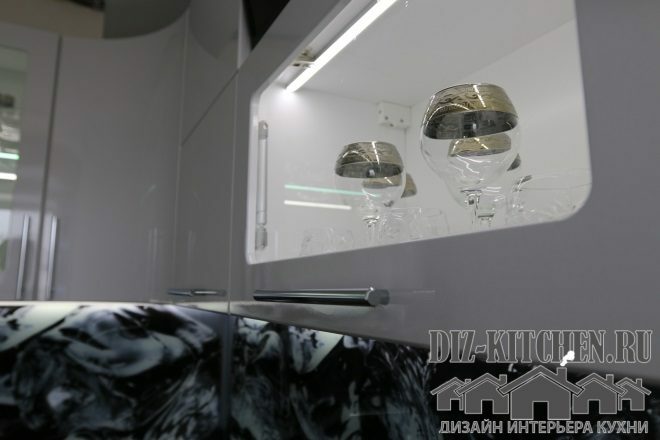
The LED strip on the glass shelf and behind the door additionally creates an effect of depth and the kitchen looks even larger.
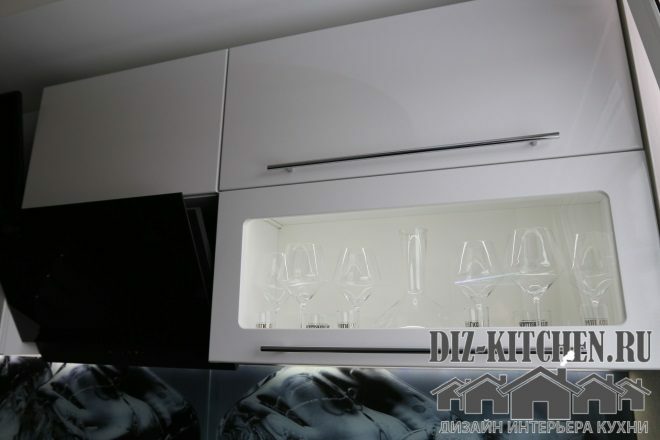
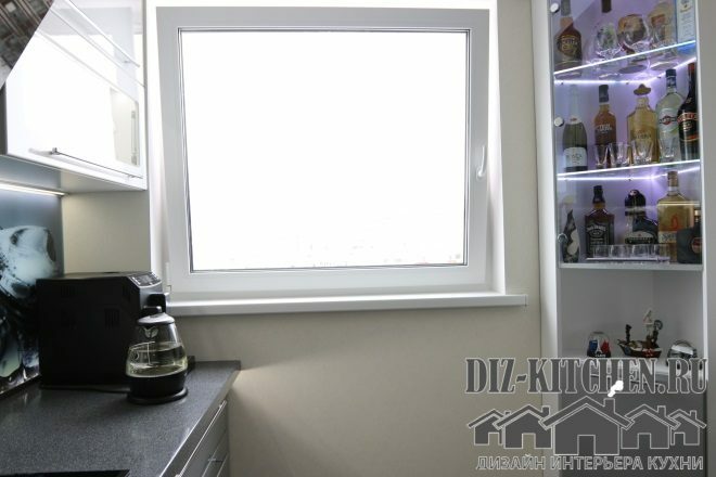
The main lighting in the room is from the backlight. Otherwise, the display cabinet would not look so advantageous. There is also additional lighting under the countertop and on the opposite wall, in the glass bar. Expensive alcohol in neon rays immediately attracts attention.
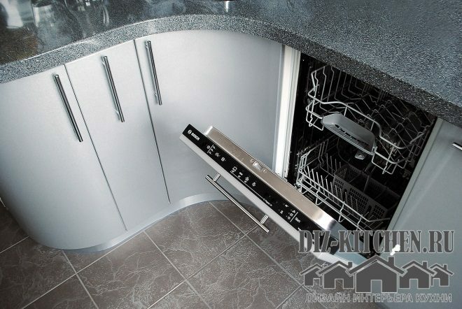
It was possible to place a built-in dishwasher in the lower tier. Its control panel is located on the upper end of the door.
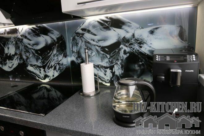
All our household appliances are black (hob, TV, oven) and they fit perfectly into the design of the kitchen. And we even bought a coffee maker and a kettle based on these considerations.
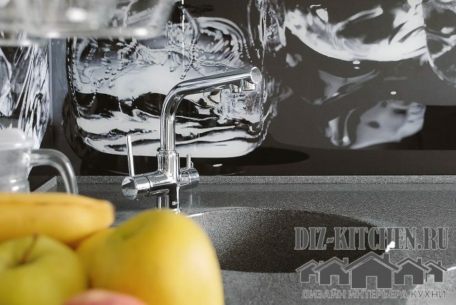
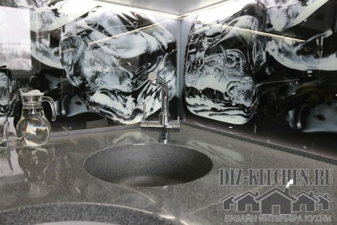
We ordered an integrated sink in a stone countertop. The junction is practically invisible.
The glossy surface of the stone countertop perfectly reflects light at a certain angle. And this texture adds space to the kitchen.
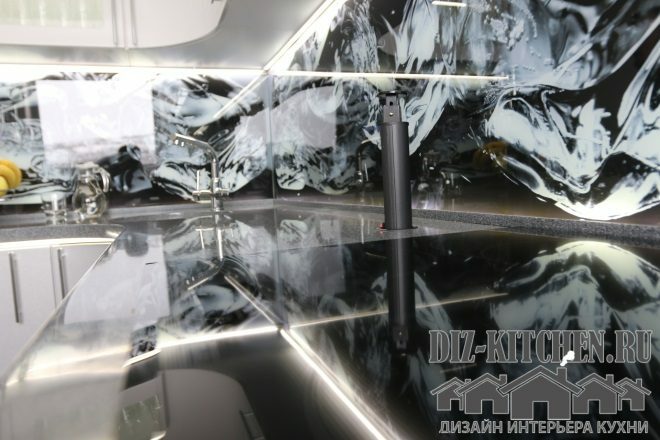
Photo printing was used for skinning. In a bright kitchen, the drawing should be colorful and eye-catching. The realistic image and a small layer of air between the drawing and the glass created an optical illusion of movement and the apron became the central element of the interior.
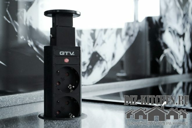
We have built-in sockets, from the GTV company. Such a seemingly trifle as an outlet makes the whole kitchen more orderly and ergonomic. When folded, it practically merges with the table top, without interfering with the use of the entire surface.
Our kitchen turned out to be extraordinary and beautiful, as we wanted. Friends called her a discobar. I really like this name - not every housewife has her own personal nightclub in the public domain, but I have one!
average rating 0 / 5. Number of ratings: 0
No ratings yet. Be the first to rate.


