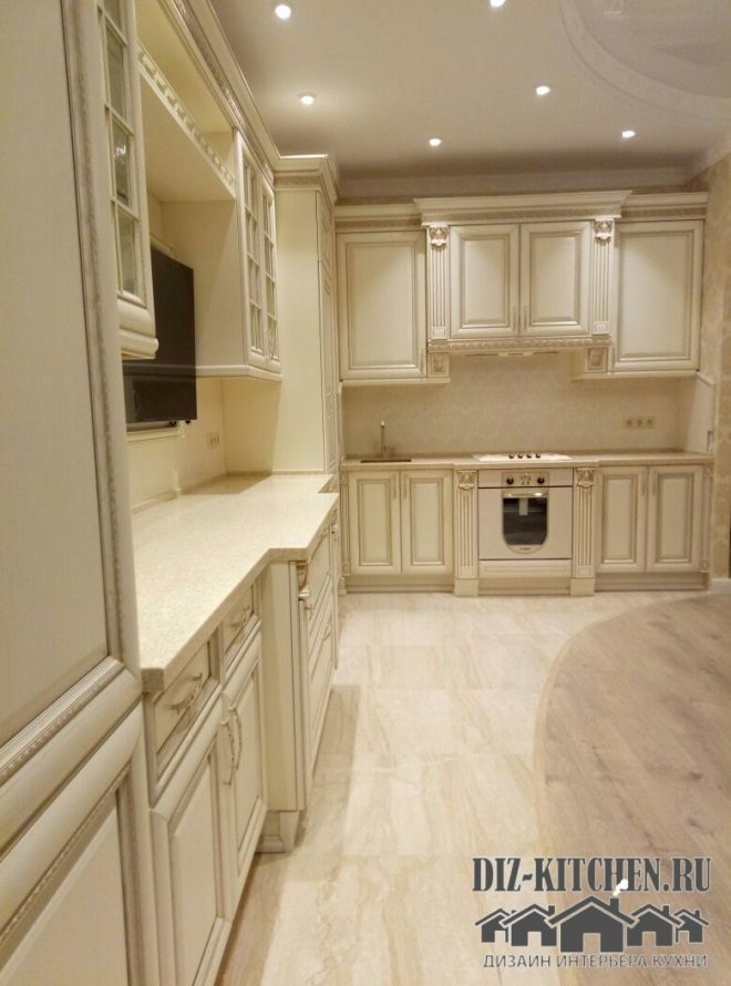
Of all the headsets, white is the most stunning and solemn. Majestic, discreet, neat, light, airy and very beautiful - it's all about my kitchen. For people who value stability and consistency, light classic furniture suits in the best way.
PTC "CLASSIC"
G. Moscow
More about the company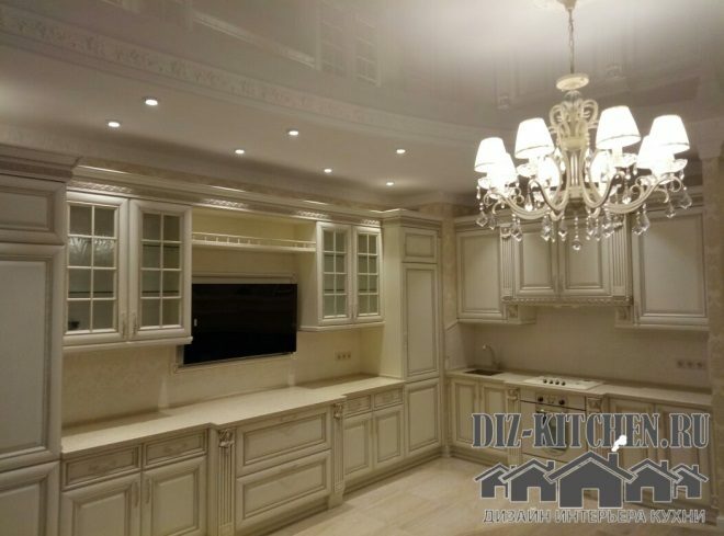
And needless to say that white furniture is hard to maintain, since all the stains are visible on the surface. In cleaning, it is no different from any other bright kitchen. And now, always give preference to only dark typefaces? In addition, today it is not the color that is important, but the texture of the material and its quality. There are no synthetics or plastic in our kitchen, only natural wood and glass. And that's why the interior looks so exquisite.
Attention! Earned on our website kitchen designer. You can familiarize yourself with it and design your dream kitchen for free! May also come in handy wardrobes designer.
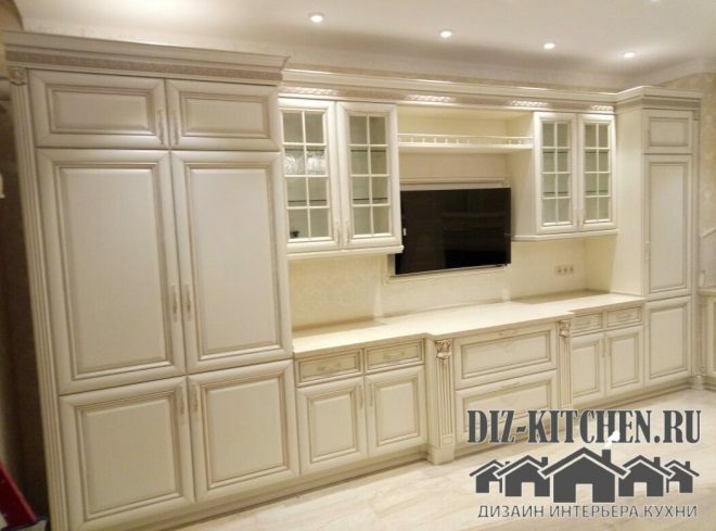
We live in a townhouse, the ceilings are high, there is plenty of free space. The only drawback is that the kitchen windows face the north side and there is not enough sunlight, especially in winter. With the help of the white interior, we have solved this issue as well. Also white expanded the space. And now the room visually looks larger and higher than before the renovation.

We chose a shade so that the room did not in any way resemble a cold hospital room. The Alieri ash massif is very warm. Its finish is open-pored lacatto and champagne patina. The wood is painted quite a bit, the texture is only slightly emphasized.
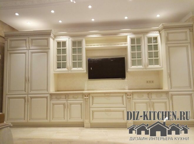
Decor elements in the form of plaster moldings look solemn and expensive. The combination of white and gold is always sophisticated, win-win and, pardon the tautology, a classic version. But our headset is not pretentious. Gold elements do not overload the interior with color. They only echo the pattern on the wallpaper, moldings, ornaments and decorations on the plaster panels.
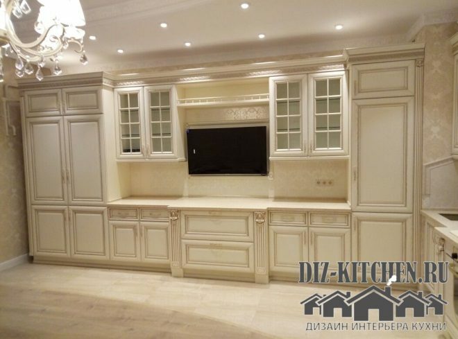
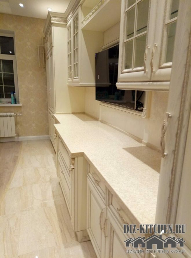
The furniture occupies two walls, forming a kind of portals. One is around the TV, the other is near the hob.
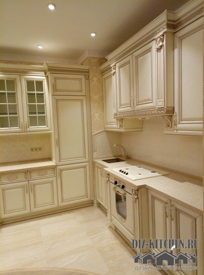
The upper tier of cabinets is glass showcases and closed cabinets. Bottom - blank facades. The solid wood is made in Italy and has a thickness of 26 mm. Porcelain dishes will look great in open cabinets. Decorations on the furniture include stylized columns, a relief ornament (frieze), cornices and handles made of aged brass. All accents are very skillfully placed and the furniture does not look pompous.
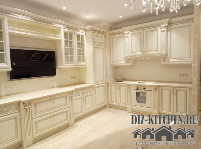
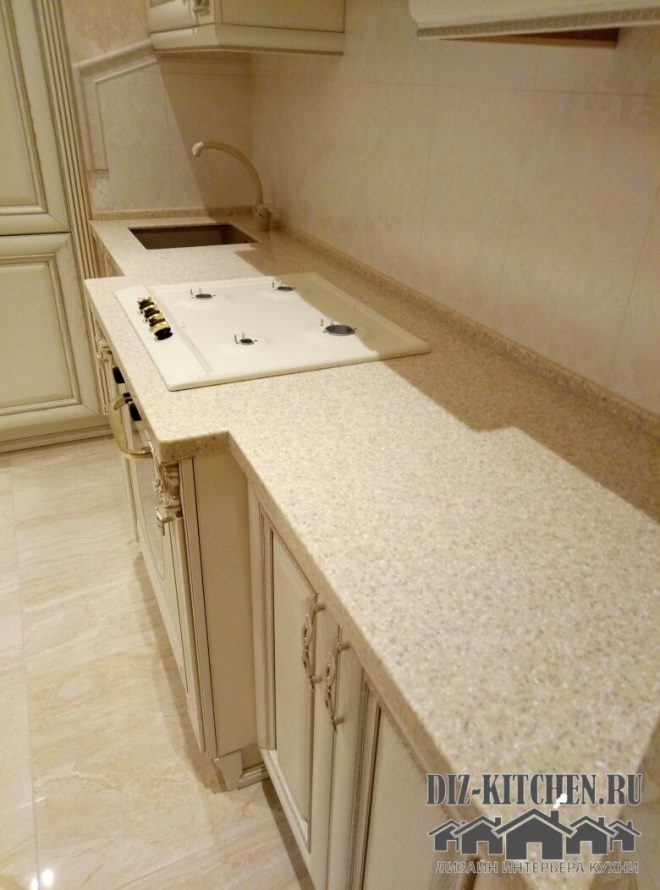
The issue of protecting the working areas (there are two of them) was solved simply - the same wallpaper as in the entire kitchen was covered with tempered glass. The wallpaper is discreet, with a classic ornament. Such an apron does not distract attention, but only complements the overall picture.
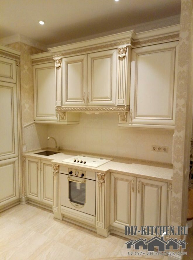
It is impossible to find an oven in a classic style on sale. Therefore, we used an overlay on a glass door, installing two columns on the sides. We specifically bought the oven a little larger than the countertop. Thus, the oven has become the centerpiece of the entire set. I have never met such a solution, but it turned out to be very unusual and cool.
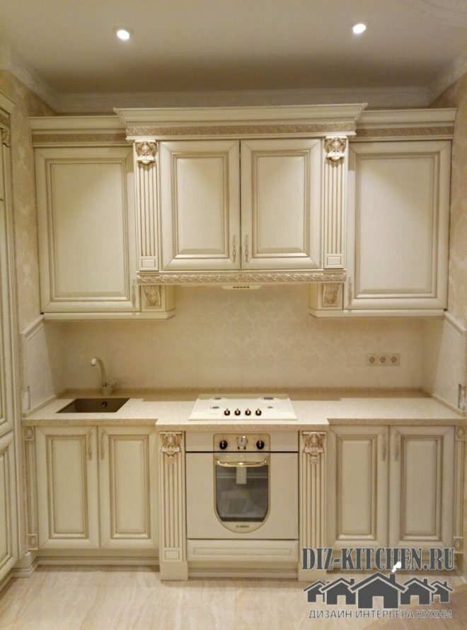
But the ivory-colored hob was found on the Internet pretty quickly. And she turned out to be perfect)))
Ceiling - two-level, stretch white matte at the edges and glossy in the center, with spotlights in the working area. In the middle of the room there is a traditional classic chandelier with forging elements. Its openwork brings even more space and festivity to the room. And depending on the purpose of your stay in the kitchen (cooking or receiving guests), you can change the type of lighting and atmosphere.

The parquet board on the floor is in two colors, echoing the ceiling. Light acts as a background in the general color scheme, supporting the interior.
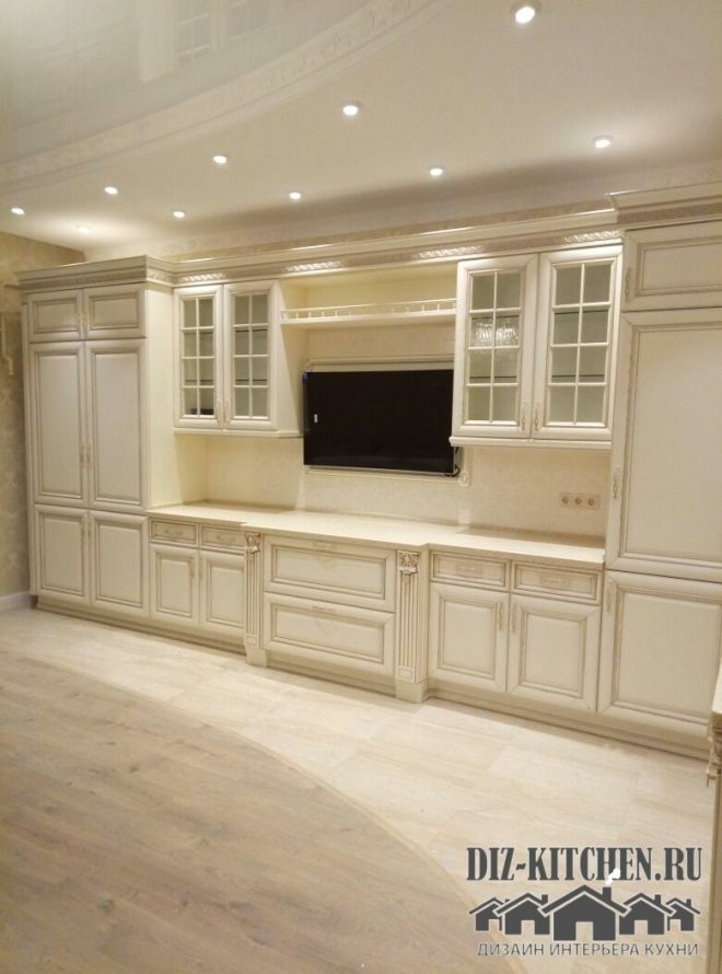
The middle of the room is darker. With this technique, the work area was visually separated from the recreation area (where the sofa and dining table will stand).
The refrigerator was removed behind a blank door. He was clearly a foreign body in such a room. And so - we covered modern technology with antique elements, preserving the integrity of the picture.
The table top complements the monochrome interior. It matches the color of the entire kitchen and is made of quartzite. This artificial stone has a perfectly flat surface (unlike natural), hygienic and easy to use.
There is always a festive atmosphere in my kitchen. It is enough to put an ordinary bouquet of flowers and the room immediately changes its mood. But family traditions and established rituals, I am sure, will not change in our house for a very long time.
What does it mean to arrange furniture according to feng shui?
The stove (the main element of the kitchen) should not be in the corner
33.08%
Refusal from mirrors and height differences
12.78%
Harmony of balance, soothing shades, purity
33.08%
Put the refrigerator next to the TV)))
21.05%
Voted: 133
average rating 0 / 5. Number of ratings: 0
No ratings yet. Be the first to rate.
