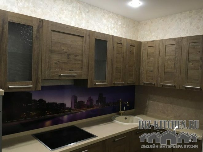
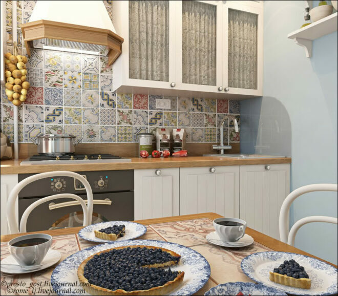
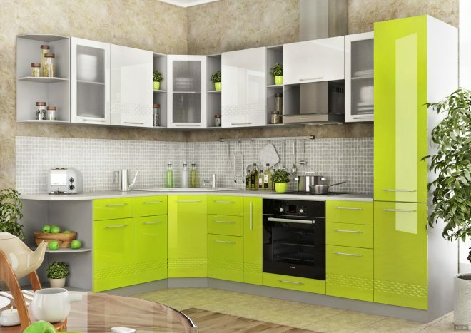
The peculiarity of our kitchen is that all surfaces are made from the same materials and in the same manner. And from this the interior looks incredibly stylish and organic. And thanks to the color, a modern and extraordinary interpretation of the classic kitchen has turned out, which can be safely called neoclassic.
Furniture factory "Optimum PROF"
G. Balashikha
More about the company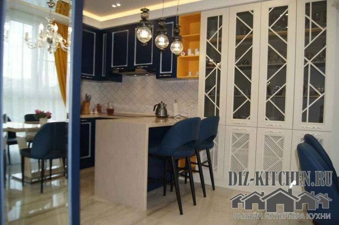
Indigo navy blue kitchens are not often found in modern interiors. Perhaps due to the fact that this is a cold color scheme, and the kitchen, like the kingdom of fire, gravitates more towards warm shades. And modern apartments are more likely to favor small and medium-sized areas than large ones.
Attention! Earned on our website kitchen designer. You can familiarize yourself with it and design your dream kitchen for free! May also come in handy wardrobes designer.
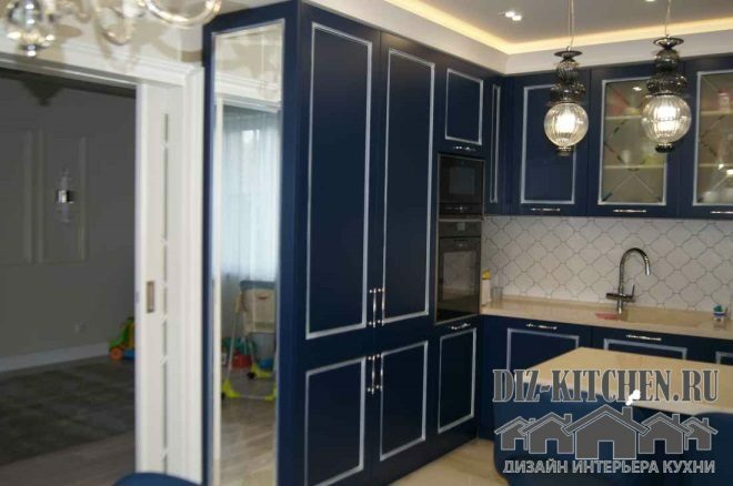
We have a spacious room, lots of natural light, so we allowed ourselves this cool shade. It does not make the kitchen smaller, but in combination with white it has an elegant, fresh and airy interior. In addition, white successfully neutralizes the property of blue to make it heavier and narrow the space.
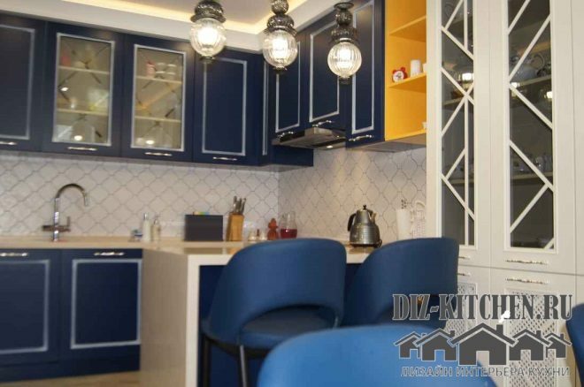
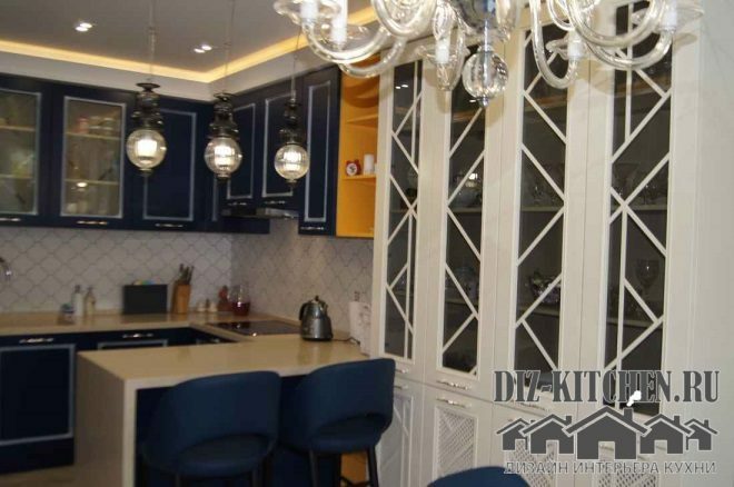
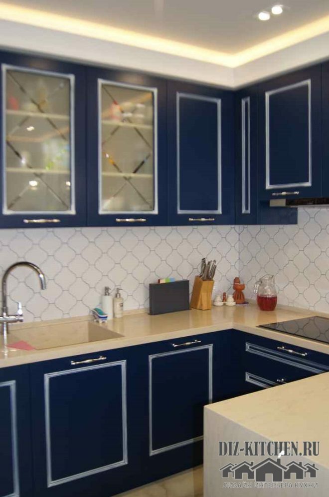
Set with MDF facades (model no. 8) covered with matte enamel with patina (artificial aging effect). The matte finish is solid and noble in itself. The classic framed façade has an overlaid contrasting silver frame that gives the surfaces an elegant and solemn look.
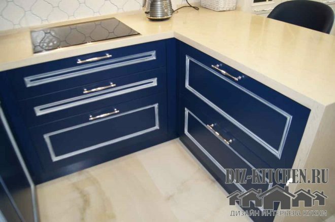
U-shaped set, ending with a peninsula and a bar in one person. Its height is slightly higher than the dining table, so our family members always have a choice - where they are located today.
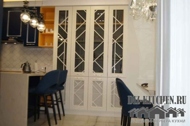
There are several lamps in the kitchen. These are single shades over the working area, and a luxurious chandelier over the dining table. They are combined both with each other and with the interior as a whole.
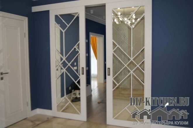
The room is quite spacious. But in order to make it seem even larger, they used a mirror on the side of the tall cabinet. First, the sliding glass door reflected in it is duplicated, as it were, once again. And secondly, the mirror creates a kind of perspective and increases the amount of artificial lighting in the evening.
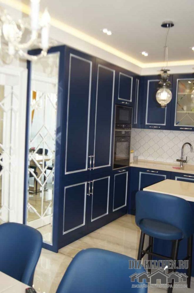
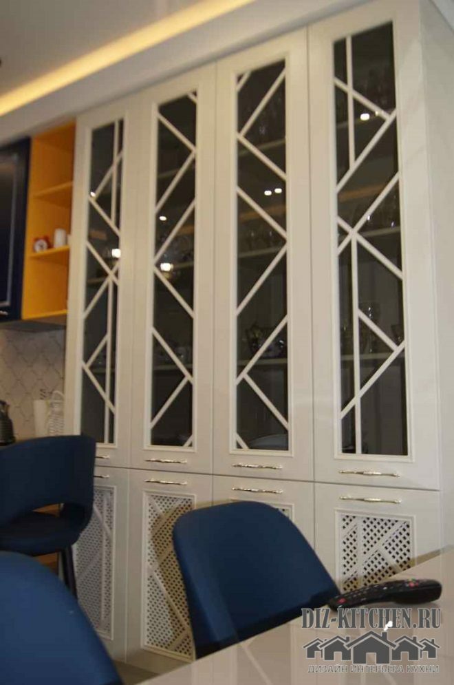
Blue tends to make the interior heavier, so there are many open showcases and glass in the headset. The glass in the showcases is matte, with a diamond-shaped pattern, the same as on the apron, sliding doors and sideboard.
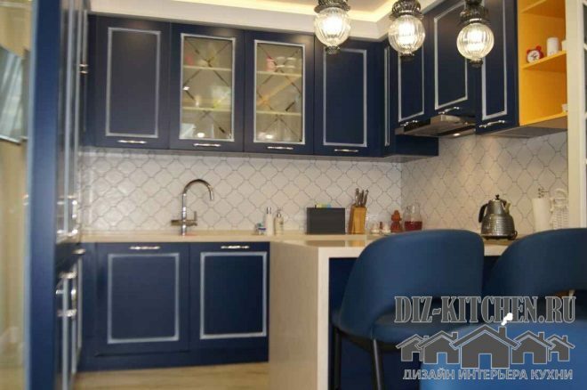
The table top is made of artificial stone. It is light sand in color, echoing with the floor, stained glass cabinet and sliding doors.
The largest module of the headset is a 4-winged white cupboard. This modern sideboard, in addition to its functional component, has managed to become a real highlight of the interior. And, together with the sliding doors, attracts all eyes. Its upper tier is transparent glass doors, the lower tier is covered with lattice panels.
Sliding doors are stylistically similar to the sideboard. They have a mirror with the same pattern as in the whole kitchen. The doors continue the line of the entire kitchen ensemble.
Such an interior simply calls for calmness. It has been tested on myself - no matter how excited you enter the kitchen, you will soon tune in to a calm mood.
