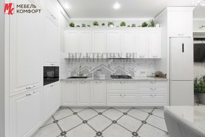
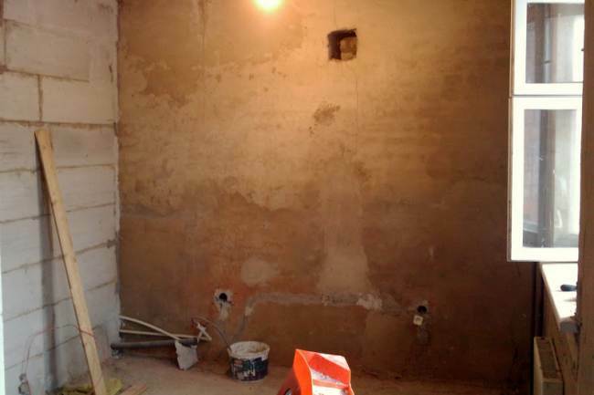
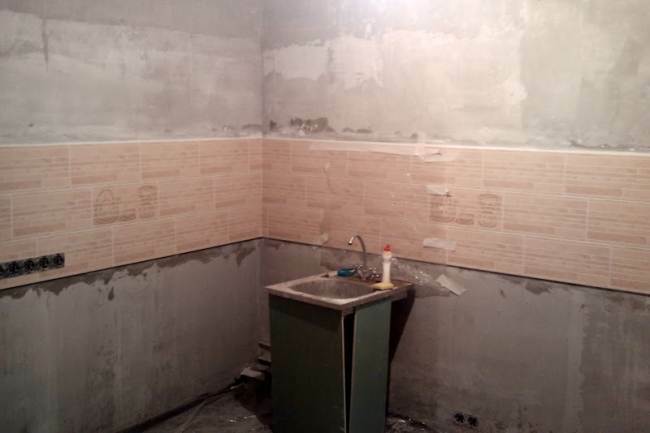
As a kitchen space in a new building, as it was announced, without finishing, in reality there was nothing at all. The walls dividing the premises of the apartment were lined with aerated concrete blocks, and those that separate the residents from the neighbors and the streets were made of bricks. On the one hand, the absence of a plaster layer made me happy, this made it possible to assess the evenness and quality of the masonry.
Photo source - ideas.vdolevke.ru
Attention! Earned on our website kitchen designer. You can familiarize yourself with it and design your dream kitchen for free! May also come in handy wardrobes designer.
Having dismantled the incomprehensible, crooked communication bends, it remains plaster the walls. For the one that should have a stove, they took an oven clay mixture. This requirement applies more to private houses with wooden bulkheads, but I don’t want to use material rich in chemical composition-improving additives in the apartment either.
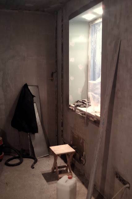
The rest of the walls were treated with the same solution. The expense turned out to be low, and no final alignment was needed. The next step was to apply the primer, which took about 6 hours to apply and dry. Before the start of finishing work, the sockets were moved to the floor, and the switches were moved to a height of 90 cm from the floor, which meets not only the requirements of European-quality repair, but also common sense.
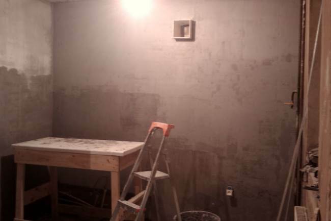
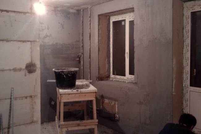
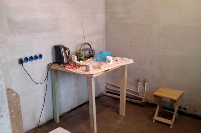
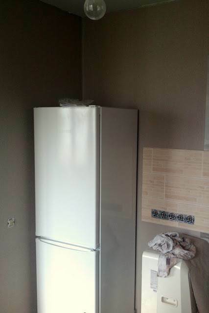
From the very beginning, the design of the kitchen was planned in the tones of wenge wood and beige. The tone of the walls should be in harmony with both shades, so that the interior paint of cocoa with milk came in handy. After drying, it turned out that in daylight it has a grayish tint.
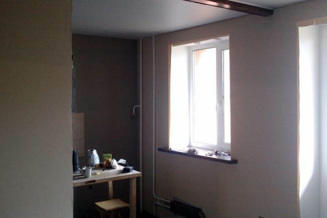
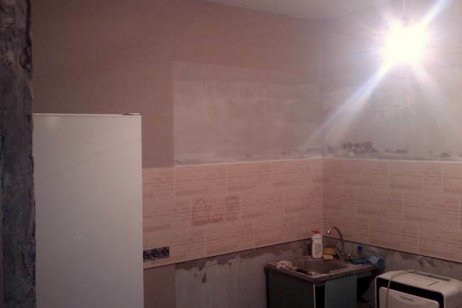
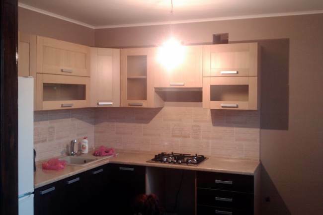
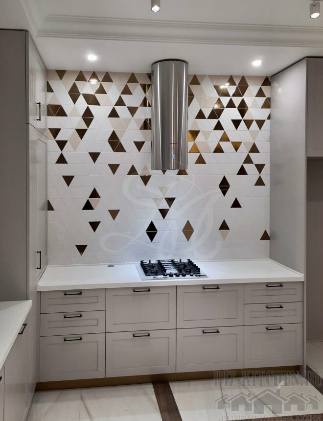
To correct this oversight, tiles under a natural layer of polished shale rock helped. Smooth tiles with smooth color transitions softened the color of the walls. An apron is made of it. It will protect the wall from grease splashing from the stove, soap drops at the sink, and it will also become an organic connecting element between the dark facades of the lower tier of the headset and hanging cabinets with light-colored facades wood.
When choosing furniture, it turned out that it is almost impossible to find a set made of natural wood in the retail network, yes and custom-made workshops predominantly work with extruded laminates.
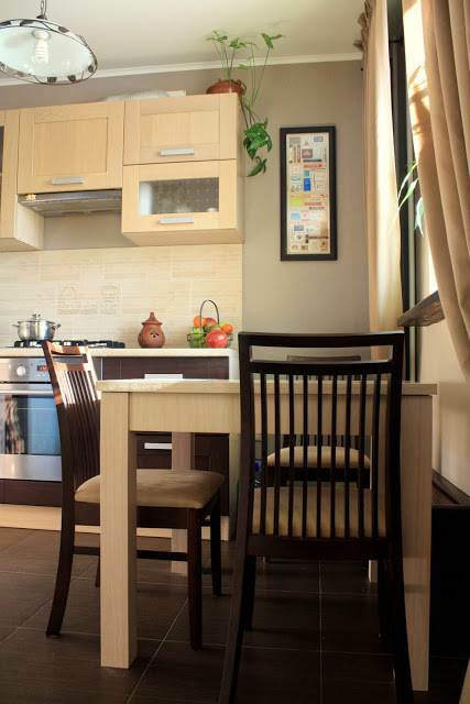
Craftsmen claim that natural wood has an extremely high weight when using such furniture in a room where the temperature and humidity of the air are constantly changing, it will quickly lose its attractiveness in appearance - it is deformed, will change color. The idea to use natural wood in kitchen decor has disappeared.
Remained options for the laminated surface of the facades or covered with dense thermal film. Reviews of inexpensive furniture sets, attracting sonorous names, textured designs and a low price seemed disappointing.
And the Edelweiss set with the doors of the lower cabinets, made in the color of dark chocolate, was so great for our idea; for the upper ones, the manufacturer offered white facades with a hint of heavy cream. In the rays of artificial lighting, this set seemed like a dream until they began to carefully examine the joints of the film with the main material. Even on the new doors, the thick film peeled off in places. I had to believe the reviews that even with a slight increase in temperature from the oven heating next door, this material in the places of exfoliation will shrink and bulge.
A more profitable purchase, despite the higher cost, seemed to be a set in which the facades were clad with natural veneer. Here it is - a dream come true for lightweight wooden furniture!
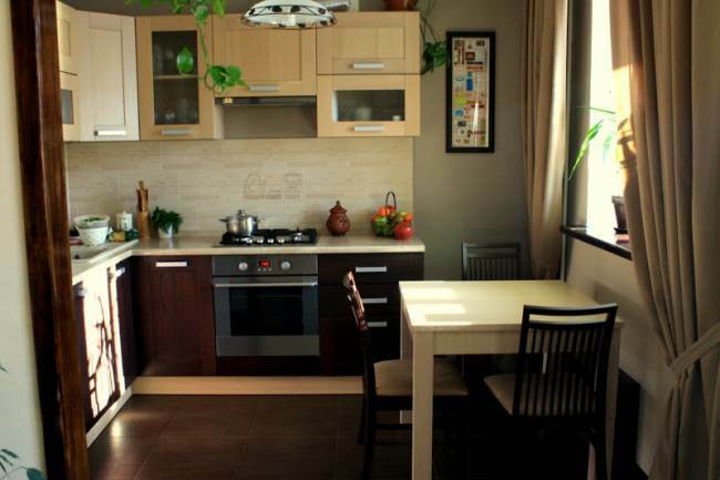
The facades were made of the same budget material, the difference in color is explained by the color scheme in the varnish with which the veneer is covered. The peculiarity of varnish, which is easily absorbed into wood fibers, is that the textured pattern shines through the paintwork. This effect was needed and should have been achieved.
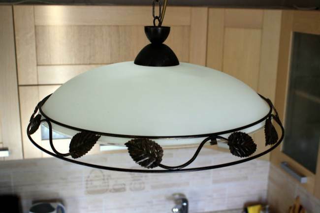
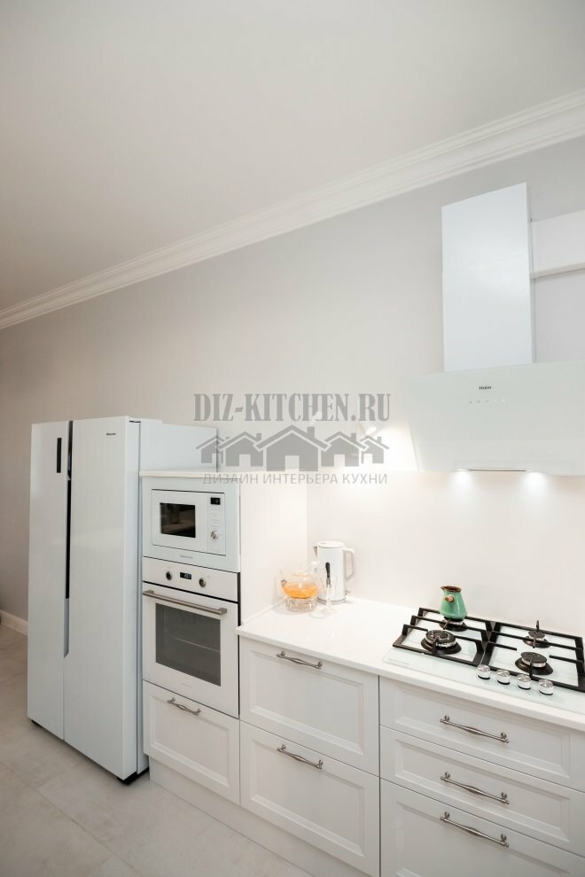
The front panel of the gas stove turned out to be a dissonance in the ensemble. The fittings alone were not enough to justify the silver color. The plafond with a pronounced shine and metal ornament along the lower edge helped.
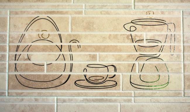
Apron size matched the size of the custom headset. In general photographs, the main element is not very clearly visible, which became the reason for choosing this particular tile for the kitchen. A schematic, laconic image of a kettle, a cup and a decanter was found above the gas stove hob.
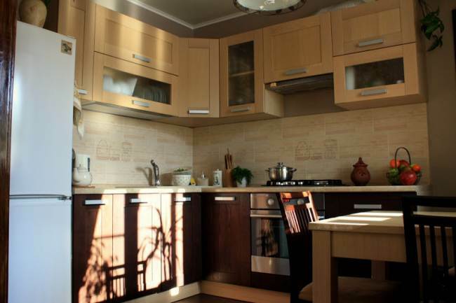
It is difficult to find chairs, door frames, window sill, ideally matching in color. It's easier to make these details in harmony with the interior yourself. The wooden frames of the old chairs are sanded, completely cleaned of the old varnish, impregnated with linseed oil and covered with two layers of varnish with the Wenge color scheme. The window sill is made of a thick 5-centimeter board using a jigsaw, processed with an electric plane, sanded with an emery wheel using a grinder. Painted - covered with 3 layers of varnish with a roller with a short-piled synthetic fur coat. The materials for the door frame were also prepared.
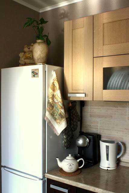
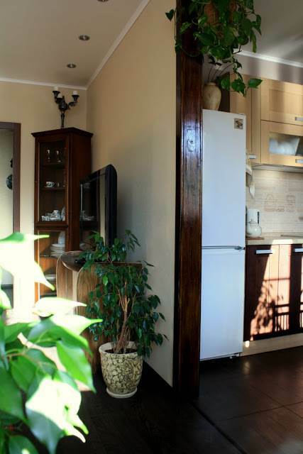
White refrigerator is a large interior detail, the color of which must be justified. Its side wall, adjacent to a part of a composite corner tabletop, is decorated with potholders and towels. They hang on decorative magnetic hooks, and white, cream, brown tones dominate in the decor of fabric kitchen accessories.
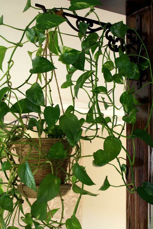
At the top of the refrigerator, the beige flowerpots were also not accidental. Style is created from carefully selected details. Excessive details, for example, bright magnets from all over the world, can break the harmony created with such difficulty.
average rating 0 / 5. Number of ratings: 0
No ratings yet. Be the first to rate.
