Russia, Moscow region, Moscow+79041000555

 It takes ~ 2 minutes to read
The interior consists not only of furniture and any accessories (read also about its choice here). Ceilings, floors, walls (considered here) are also directly related to the decor. You will especially have to think carefully about the decor of the walls in the bathroom and in the kitchen, since there you can’t paste the wallpaper and you won’t do much with the walls.
Many materials will not pass the test associated with temperature extremes. It's good that there is a great alternative to wallpaper - this is tile. You can’t even imagine how she is able to transform the room: to make it not just beautiful, but individual, designer.
Let's find out what needs to be done so that it is combined with a kitchen set, does not fall off and delights you every day.
The basis of the apron for the kitchen
We are talking about tiles, but it is worth mentioning, after all, other materials that can be used.
- Glass - a serious competitor, excellent qualities, but installation requires experience, is expensive.

- Mirror - This is a one-piece panel that is very demanding to care for. If you love order and are ready to spend 15-30 minutes every day, wiping it from grease and dirt, this option is right for you. On the other hand, if the room is small, the mirror will increase the space.

- Mosaic - without a doubt, this is a creative and bright choice of material. But this option is time consuming and long. Over the years, grease and dirt can clog between mosaics. To avoid this, you need to buy a more expensive grout.

- MDF + plastic - it will pleasantly surprise you with its price, good appearance, you can make a beautiful design. Moisture resistance at a low level, inferior to tile in durability.

- Chipboard + plastic - easy to install and easy to clean, otherwise this option is not profitable to buy, because it will deteriorate quickly, and you will have to purchase chipboard or more expensive and high-quality material again. Good options can come out of it.

- Polycarbonate - it will help you a lot if you need to hide the wallpaper (they said how to choose them here), as this material is transparent. There are cons: if dirt gets between it and the wallpaper, it will be noticeable. Over time, it loses transparency, looks cheap.

- Fake diamond - one of the most high-quality and durable options. The high price is justified, there is a restoration function: if an artificial stone is scratched, it can be increased, and it will become as good as new.

- Metal - the metallic color is considered cold and uncomfortable, but if you combine metal and dark brown harmoniously, the eye will not tear off.

- Tile - we will discuss an apron in this execution. This material is in the middle between the glass (described here), artificial stone, particleboard and MDF. Installation will cost inexpensively, if installed by yourself. In this case, do not take it under the mosaic. You have to prepare the wall well, otherwise it will look ugly, and it will not last long. Ceramics will last you 15–20 years, and therefore, choosing, think: “But will she bother me tomorrow?” Easy to wash.

Varieties of tiles
- Tile (ceramics) - the composition includes clay rocks, sand, quartz and mica.
- Clinker - considered durable, used to simulate natural stone.
- Porcelain tile - has low porosity, is suitable for rooms with a large load. It can imitate granite, marble, brick, stone and even leather.
- Concrete - more suitable for sidewalks.

Photographic tile is a new technological type of decor. This opportunity allows you to come up with your own design, which no one has. High-quality and bright photo printing, it is possible to choose a finished photo tile. According to its properties, it does not differ from ceramic. Ideas for photo printing can be found in the shooter bank. It presents numerous photographs and pictures for printing.

How to choose ceramic tile for an apron? Selection tips
I want to follow the fashion, make a stylish decor, so that no one else has this. Many have such thoughts, let's go through the basic rules when choosing.
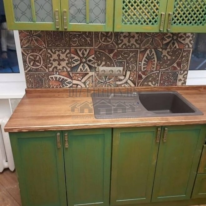
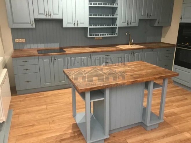
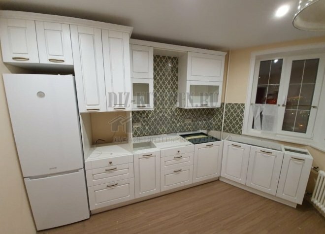
The first thing to consider is the color, it must coincide with the kitchen set or harmoniously combine with it. Great example in this photo:

In the right colors, he will act positively on you psychologically.
Functions
- Hides a bare wall.
- Creates a certain atmosphere, complementing the decor of the entire room.
Various color schemes of a beautiful kitchen apron made of tiles (photo)
- Red - Do you want dynamics, energy and positive emotions? Then choose a white tile and red kitchen. Of the minuses - quickly tired, causes aggression, too intrusive.

- Yellow (more details) - Awakens appetite, fills with energy. It will be the highlight of your kitchen.

- Blue - cold and calm, which at the same time calms and invigorates.

- White - beneficial effect on all family members, calms and pacifies. Practical properties include the fact that it visually expands the space. Minus - causes a hospital feeling, so it is better to combine it with others.

- The black - associated with style, fashion. It produces a positive effect, but you should not rush into a choice. In the store and in the picture - this is one thing, but to contemplate black kitchen every day is different. It can suppress and agitate aggression. If you combine, for example, white with blackIt will be very stylish.

- Pink - very bright, playful. Gives unreality in large quantities. Soon tired, start to annoy.

- Orange - will warm you every morning. An orange tile or a large orange on the entire wall will arouse appetite, but such a bright color can also soon get bored.

- Violet (read also this post) - a very deep color, mysterious, in combination with gold, silver or black, looks original and unobtrusive.

- Green (more details here) - enters the league of bright colors. It can be twofold: give energy and oppress, so you do not need to make the kitchen and apron only in green, it is better to add a softer shade, for example, gray. Good for the kitchen and olive shade.

- Gray - symbolizes wisdom, calm, but he is dull and boring. It is necessary to dilute the color with bright shades, you can experiment with red, purple, green, and lay the apron with a photo tile.

- Brown - cozy and calm, you can combine with many colors, both bright and calm.

Design tips
Here are some little secrets to keep everything perfect:
- To design an apron, do not buy porous non-ceramic materials. In the pores, accumulation of grease and dirt is possible; washing will not be easy.
- The most versatile color in the interior - white, but preferably in combination with brighter shades, for example, yellow, green, red.
- A catchy apron should always be perfectly clean, otherwise the whole look will be irreparably damaged.
- If the budget is small, but you want to buy expensive material, then there is the opportunity to save on installation work and make an apron for the kitchen with your own hands.
- Ceramic tiles are perfect for this.
With great interest I always read your comments to my articles. If you have any questions, feel free to ask them, leave, you are welcome, Your feedback in the form below. Your opinion is very important to me. Thanks to your criticism and thanks, I can make this blog more useful and interesting.
I would be very grateful if you rate this post and share it with your friends. This is easy to do by clicking on the social media buttons above. Do not forget the article you like Add to bookmarks and subscribe to new blog posts on social networks.


