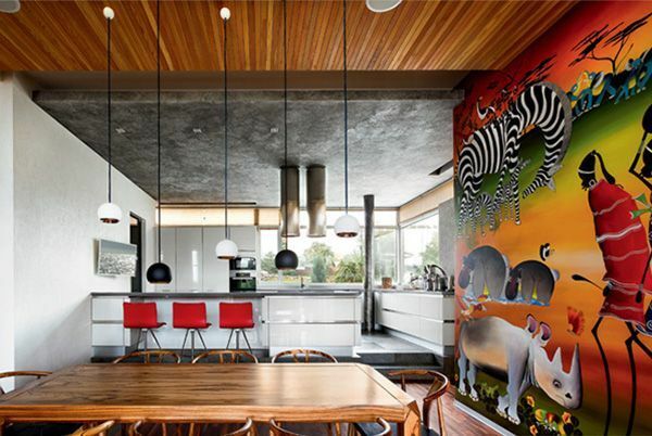
Wallpaper for the kitchen is an inexpensive opportunity to complement the interior. Given their variety, it is not so easy to choose. Let's take a look at the features of the most popular coatings and which ones are better to choose. Since the selection criteria for the kitchen are different, in contrast to the bedroom and living room. Of course, if you want a new renovation to last for a long time.
Wallpaper for the kitchen
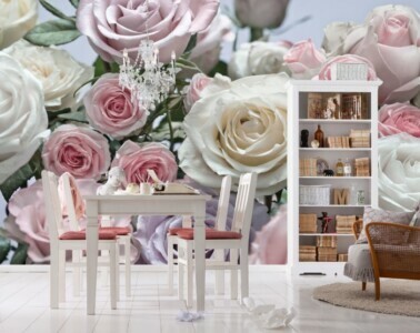
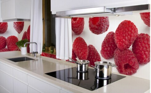
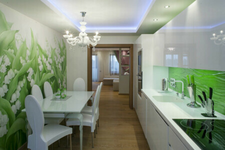
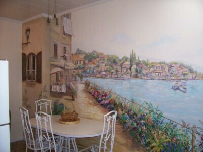
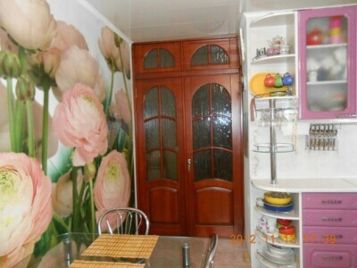
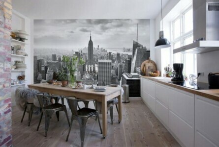
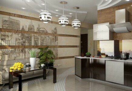
Wall murals in the kitchen are distinguished by a bright and original pattern. A well-chosen option and an exclusive creation of a photographer or artist will harmoniously complement the interior. To maximize the advantages of such wallpapers, they can be covered with special frames. But the latter must be made of a material that is resistant to moisture.
Attention! Earned on our website kitchen designer. You can familiarize yourself with it and design your dream kitchen for free! May also come in handy wardrobes designer.
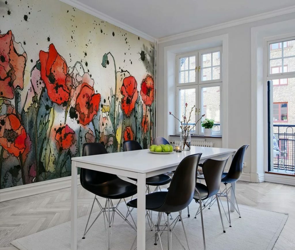
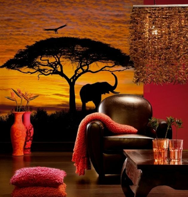
You can originally complement the kitchen by combining several types of photo wallpaper. This work will take more time than gluing one type. But as a result, you can get an excellent kitchen design with photo wallpaper: for example, a unique ornament in ethnic style.
Photo wallpaper in the interior allows you to radically change the room:
- visually enlarge a small room;
- make the room more comfortable, austere or playful;
- carry out zoning.
Wall murals attract attention and become one of the main elements of the kitchen. Therefore, they need to be very carefully selected in order to improve the appearance of the room, and not just stick a ridiculous poster.
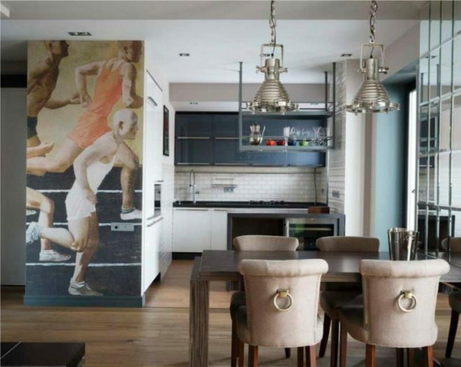
As you can see from the photo of the interior, Alexander Daineko's painting "Running" became a bright addition to the room. The latter is of a practical nature and a minimum of originality of the idea. But wall murals added a sense of movement to the kitchen and changed the style.
Wallpaper for painting
In order not to rip off the wallpaper every year, but literally in a few hours to change their color, the designers came up with canvases for painting, on which any color is applied. Such a covering can be made from non-woven, fiberglass or vinyl. They have proven themselves well in styles such as Provence, Art Nouveau. And eating in a “comfortable” color environment is much more pleasant.
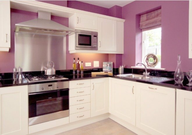
A significant advantage is that there is no need to level the walls. Such a coating is much thicker than most other analogs and will hide small irregularities without problems.
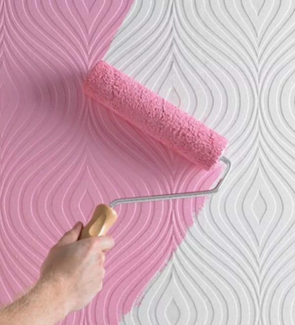
Smooth paintable wallpaper is made of non-woven or fiberglass. The most common are canvases that imitate the look of plaster. Also, coatings with original geometric patterns and multicolored ornaments do not lose their relevance.
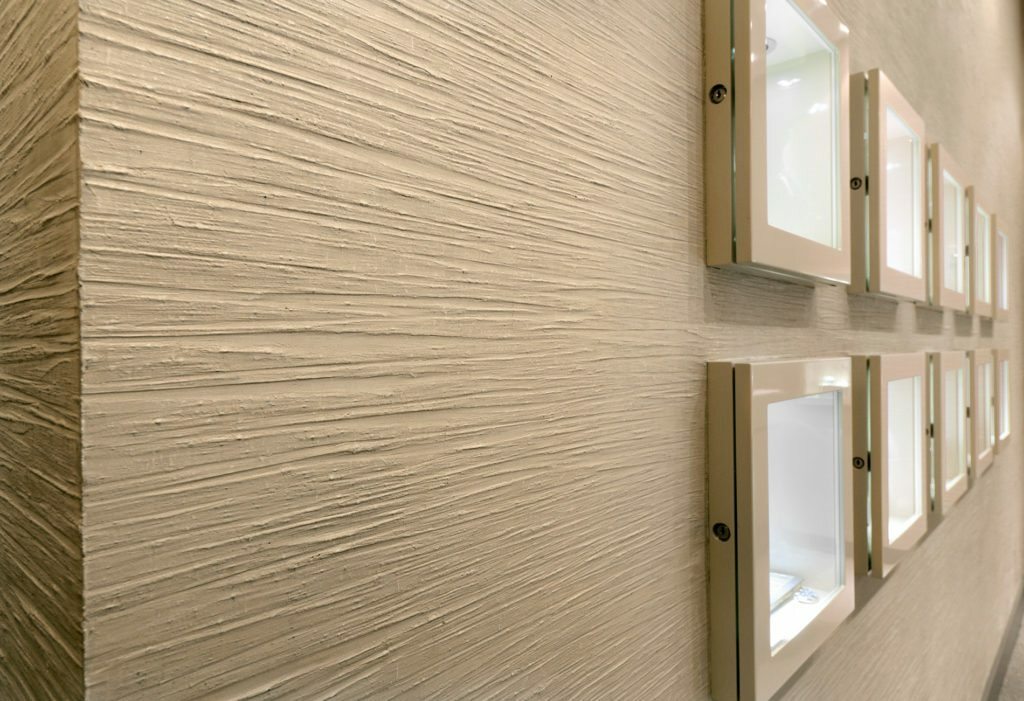
The lion's share of such coatings are white. Others are delicate pastel shades.
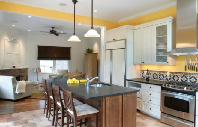
Liquid
In addition to the aesthetic effect, liquid wallpaper in the kitchen has an equally important purpose - to hide irregularities and other imperfections in the room. A significant advantage of such a coating is the absence of seams. This not only has a positive effect on the appearance of the kitchen, but also helps to keep the room warm and reduce street noise. A viscous structure is a guarantee of the absence of cracks and other similar negative surprises. Considering also their resistance to sudden changes in temperature, they will fit into the interior for a long time.
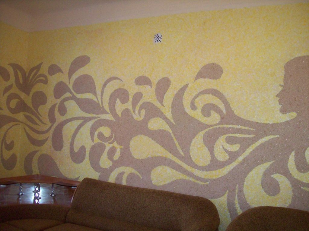
To prevent liquid wallpaper from absorbing the kitchen aroma, not getting wet from steam and serving for more than one year, you need to apply latex or acrylic varnish on them. For reliability, you can immediately 2 layers. Then the dirt can be wiped off with a regular piece of cloth soaked in water.
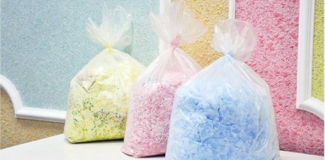
Combined
Correctly combined wallpaper in the kitchen follows the basic design principles. Use materials of the same quality and thickness. If the numerical indicator of the latter is significantly different, an ugly tubercle will appear.
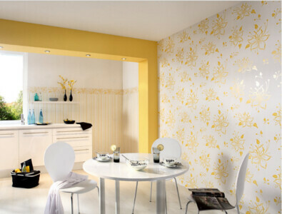
Color is one of the most important issues when choosing. One option can harmoniously complement another or contrast. The combination of a monochromatic coating with colored patterns looks interesting.
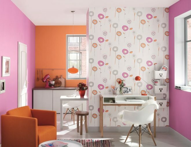
It is easier to harmoniously match stripes and checks, geometric and abstract patterns both with each other and with other options. Consider the color and style of furniture and other interior items. It is worth remembering that the bright color and shades of the walls of the covering are well combined with the light tones of the interior.
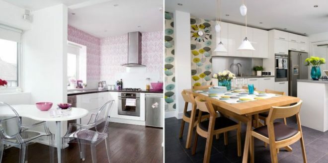
Vertical combining
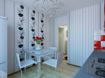
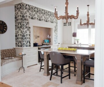
You can see in the photo in the interior that the vertical combination of wallpaper allows you to visually expand the walls and raise the ceiling. The color of the coating can be either monochromatic or contrasting. The second option helps to balance the length and width of the room.
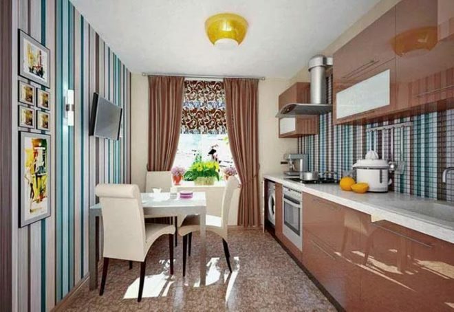
In 2018-2019, asymmetry is popular. You can also glue wallpaper of different colors and shades one by one. In this case, the coatings have different lengths. If you decide to opt for a contrasting combination, then a good wallpaper design should be based on classic color combinations:
- black and white;
- blue and yellow;
- yellow and blue;
- green and yellow.
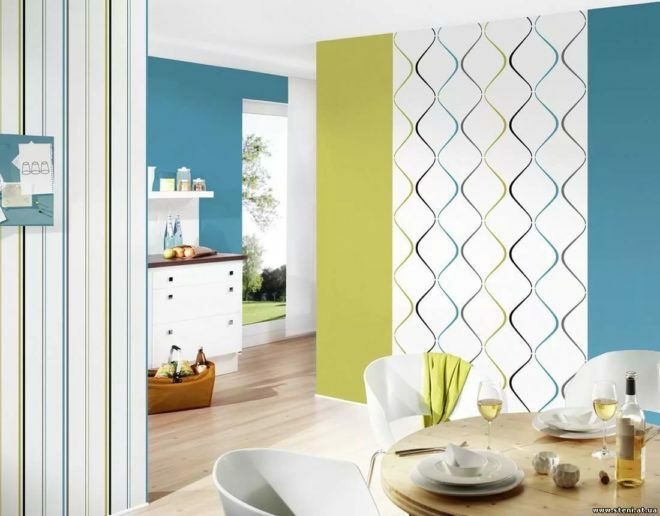
White blends harmoniously with any other tone or image. It is bold to match black with red, or purple, red with gold.

Horizontal combination
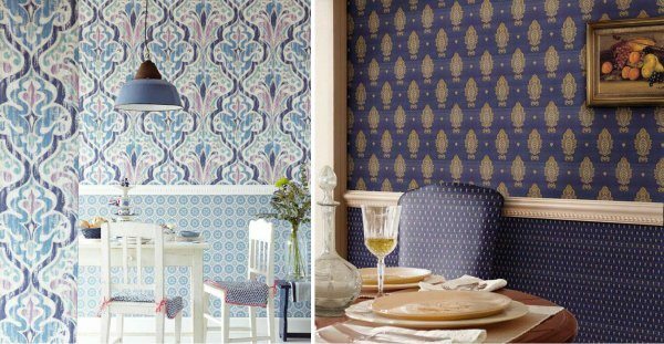
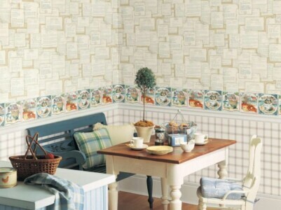
With this combination, the upper part of the kitchen walls is pasted over with some wallpaper, for example, paper (made from cellulose) is perfect, and the lower one with others, for example, vinyl. If the lower part of the wall is covered with tiles, decorative plaster or wood paneling, it will be advisable to use a horizontal combination.
Designers recommend allocating 1/3 of the walls to the lower wallpaper in the kitchen interior, and 2/3 to the upper ones. And if the room has high ceilings, then vice versa. This ratio is well perceived visually. You can also position the border between the wallpaper at the height of the window sill.
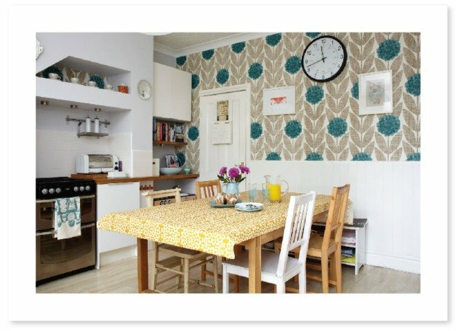
When combined horizontally, plain wallpaper will look better from above, and bright coatings with drawings - from below. Coverings with small patterns should be adjacent to the floor, and large ones to the ceiling.
Unlike vertical combination, with horizontal one you can take wallpaper that differ significantly in thickness and quality. The border between such a coating will help to hide a decorative element: a wooden plank or border.
When combining horizontally, special attention should be paid to the bottom coverings. They must be resistant to damage, quickly and easily washed.
Accent wall
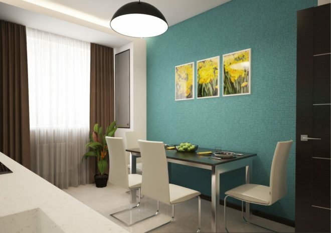
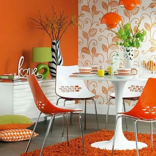
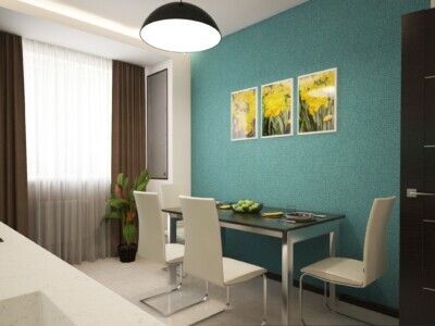
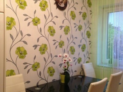
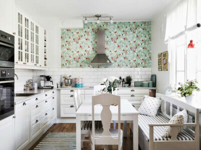
To pay attention to the wall, you need to stick wallpaper on it that has a pattern or contrasts with another wall. Such a design move is a highlight of the interior, which gives it boldness and originality. It is imperative that the color scheme of the accent wall be combined with elements from the opposite part of the room. If not, our wall will become nothing more than a bright spot in the room. Therefore, try to make furniture and textiles emphasize the benefits of wallpaper.
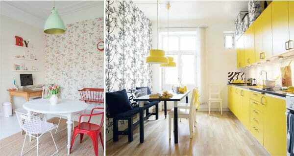
By deliberately focusing on the wall, you can emphasize other elements of the kitchen. For example, add brightness to inconspicuous niches and columns. Then the disadvantages of the layout can be turned into its advantages.
Brick Wallpaper
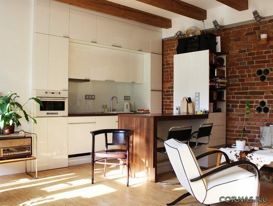
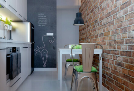
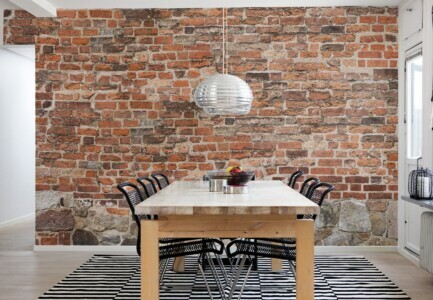
This wallpaper faithfully imitates brickwork. You can choose different colors: from pastel light tones to bright reds and strict dark ones. The cover can be glued to a variety of bends or overhangs for added realism. There is also paintable brick wallpaper. The image of bricks fill the room with an atmosphere of reliability and safety. This is a good opportunity to visually separate the kitchen, for which they are used in most cases. It is worth gluing the walls around the perimeter of the kitchen if it matches the loft or Gothic style.
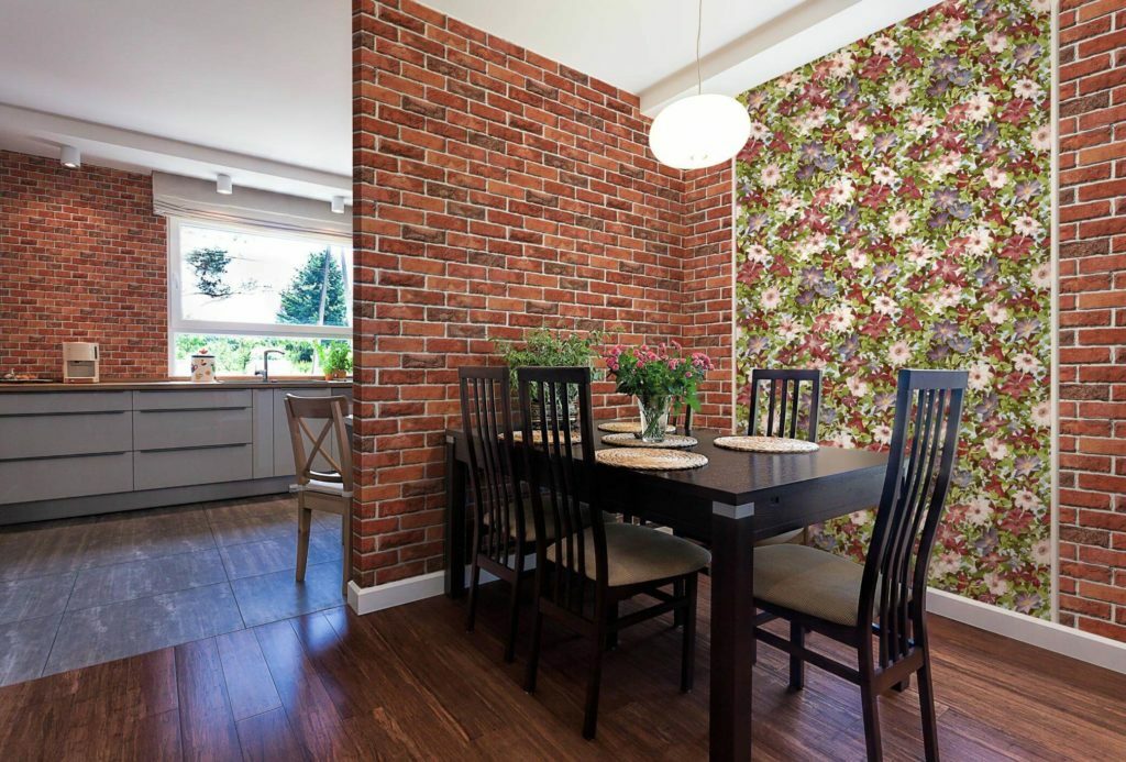
The color scheme should be chosen depending on the size. The less - the lighter the "bricks" should be. If the wall is well lit, use an imitation texture. So brick wallpaper in the interior will have a more realistic look. If little light falls on the wall, you need to take smooth "bricks".
Scandinavian wallpaper
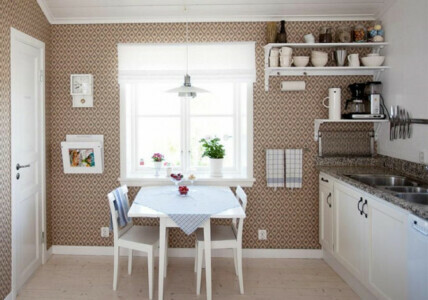
The Scandinavian style is matched with pastel colors, practical furniture and aged textiles. The main rule is the simpler the better.
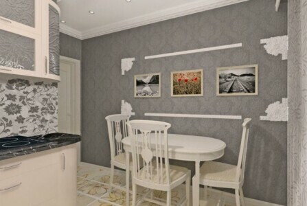
Accordingly, wallpaper for a Scandinavian kitchen should be white or gray. If the kitchen is large in size, you can focus on the wall (more details), which is located opposite the door. For this, wallpaper with a pattern, shades of dark or bright colors are well suited. As the latter, red or green wallpaper.
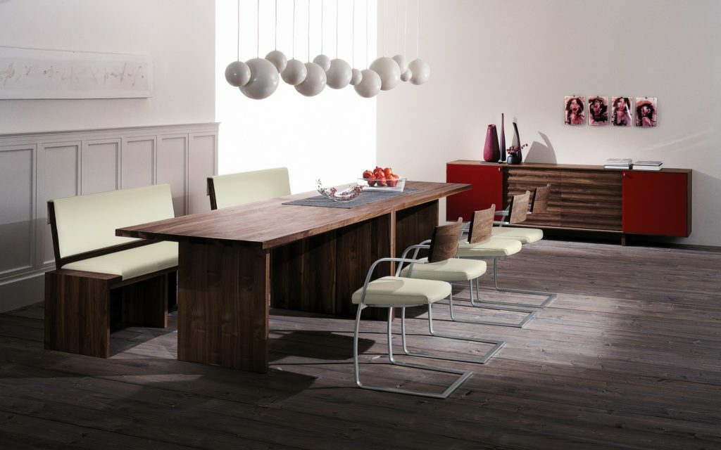
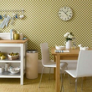
The Scandinavian style is in keeping with the spirit of minimalism. Therefore, a large number of different accessories will look out of place. To make the wall more interesting, a picture or a clock will be enough. To add brightness, it can be supplemented with liquid wallpaper with warm colors such as (you can find out more by clicking on the link):
- yellow;
- green;
- pink;
- Orange;
- blue;
- light green.
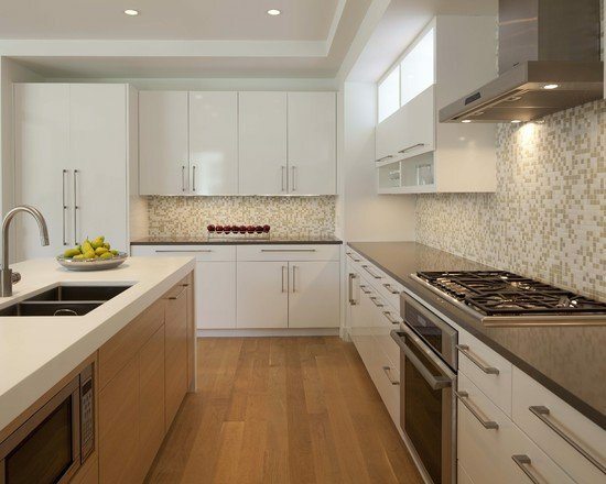
Scandinavian-style wallpaper helps to create a light and cozy kitchen interior.
Photo

average rating 0 / 5. Number of ratings: 0
No ratings yet. Be the first to rate.
