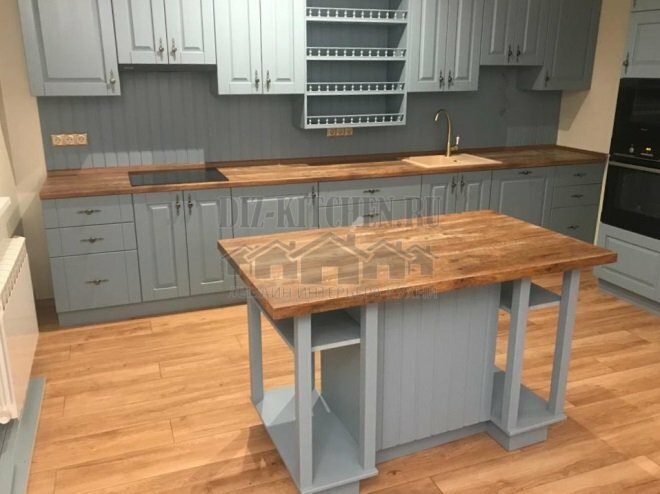
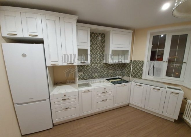
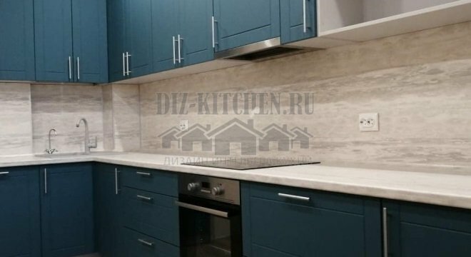
Finally we got an apartment in a new building, which we had been waiting for a very long time. And the first thing we did was to renovate the main, in our opinion, premises - the kitchen. Its area is small, so we decided on the style almost immediately.
Photo source - realty.tut.by
Attention! Earned on our website kitchen designer. You can familiarize yourself with it and design your dream kitchen for free! May also come in handy wardrobes designer.
Our opinions with my husband differed only in one thing, I wanted to decorate the kitchen in a romantic style, and my husband wanted a practical and functional room. But we didn't even argue that there must be an island in the kitchen. The basic colors were the classic ones - white and black. In order to give the room individuality, we chose a rich turquoise, which began to remind us of the sea so beloved by us.
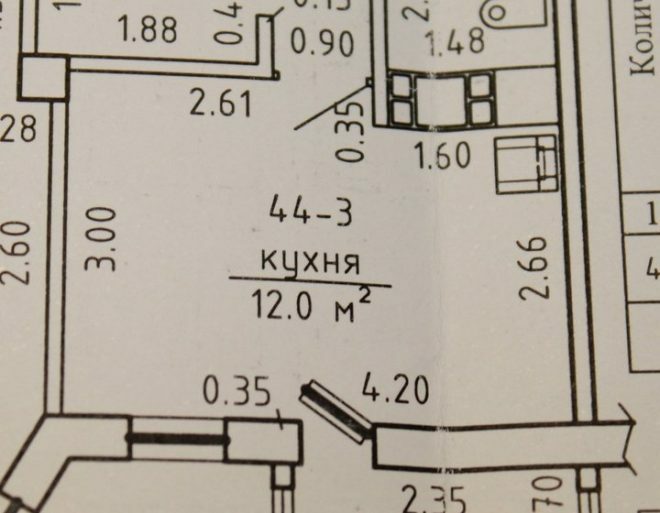
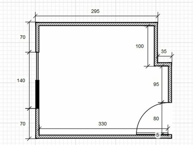
We had to start by moving the doorway to make it possible to fulfill the dream of the island. They were engaged in the project and design of furniture independently, the husband also carried out the assembly of furniture. We ordered only the preparation of chipboard for the island and the facades.
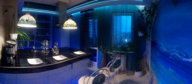
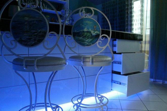
The resulting island contains as many as 16 drawers, decorated with guides, thanks to which they slide out easily.
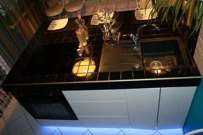
They chose a built-in sink, made of stone, they brought it from Poland. They put a glass-ceramic hob, under which an oven settled down. It has separate zones for preparing different dishes, and telescopic guides that make it convenient to use. A powerful island-type hood is installed above the hob.
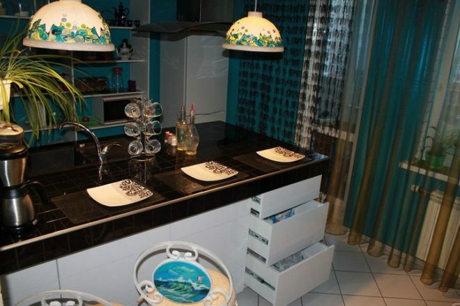
Cabinet doors, in my opinion, make the space heavier. Therefore, we settled on an open rack. Free access to the items stored there is an additional convenience.
The decor of the wall in the form of an arch looks interesting; I created it from the remains of decorative plaster and stones, which we previously brought from the sea. I used turquoise acrylic paint to create a picture of gorgeous sea waves.
We decorated the doorway and the next wall with torn clinker tiles, the beige color imitates the sandy shore. This turned out to be not only a practical solution, but also looks very interesting.
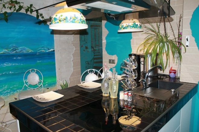
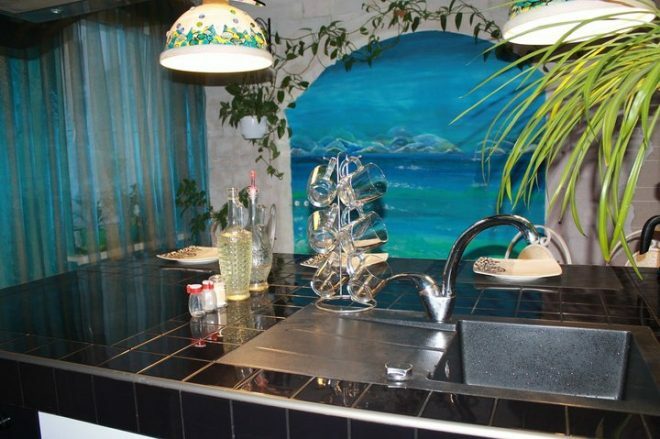
The table top is faced with glossy square tiles, based on a metal profile, moisture-resistant plasterboard and laminated chipboard. The glossy surface was not chosen by chance, it allows you to give the space lightness, and the large tabletop does not look so massive. The hob and sink are mounted at the level of the worktop.
The room is uneven, which was hidden by the white floor tiles. We laid it diagonally.
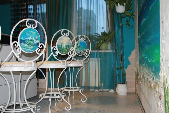
Chairs with painted backs are the highlight of our interior. They were made to order, the forged base looks light and elegant. I drew the drawings on the backs myself.
Black stretch ceiling, glossy. There is also a plasterboard construction. This is a forced measure that helped us to hide the corrugated pipe from the hood and the ugly protrusions of the supporting columns, they were too conspicuous.
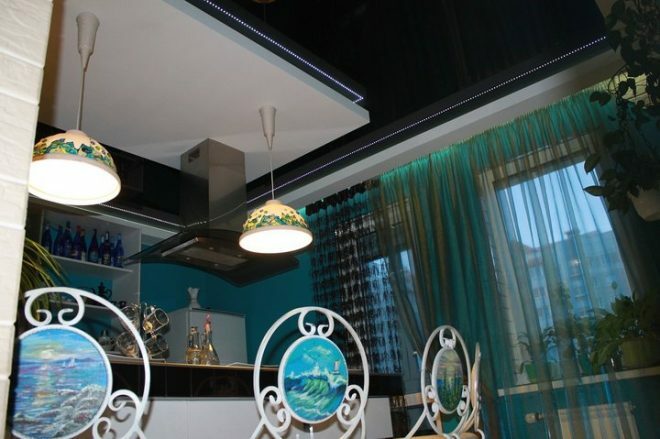
There is an LED strip along the ceiling and around the plasterboard ceiling structure; we made separate lighting over the island. They hung graceful lamps created by their flowerpots for flowers, decorated them with glass stones, designs a la sea stones and cords.
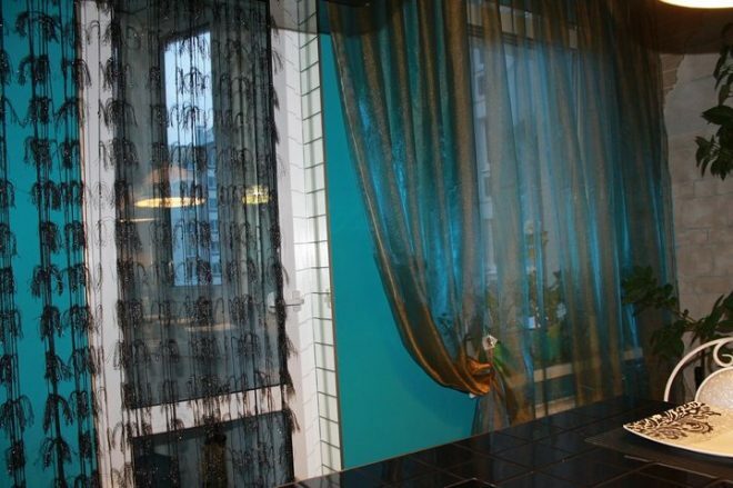
Mustard curtains look great with turquoise walls. Depending on the lighting, they change their shade, under artificial light they become turquoise, shading the color of the walls. The narrowness of the window and balcony door was visually hidden by the mirrored slopes. An interesting choice that we have not regretted.
The renovation budget was severely limited. The cost of equipment and materials was a little less than 200 thousand rubles. I believe that we have got an unusual, beautiful and stylish kitchen, comfortable and functional. This is our favorite island for relaxation, it helps to tune in to the positive in the morning, and in the evening we are happy to spend time here as a family.
average rating 0 / 5. Number of ratings: 0
No ratings yet. Be the first to rate.
